 Workflows
 Forms
Forms Data Sets
 Pages
Pages Process AI
 Automations
 Analytics
 Apps
Apps Integrations
 Property management
 Human resources
 Customer management
 Information technology


There’s only so many times you can read “the button is red which makes it stand out” before getting frustrated. “Yes,” I thought, “but what about everything else? Why is this call to action example where it is? Why isn’t it a circle?”
“What is this CTA designed to do, and how does it achieve this?”
I couldn’t find an easy answer to these questions, and that had to change. That’s why this post will take apart 24 CTAs in detail. No one-sentence summaries and vague details.
From landing pages to supermarket signs, you’ll see how these calls to action may play a larger part in the company’s strategy, how they are set up to achieve this, and therefore how to apply the lesson from each to your own.
Let’s begin.
What is a call to action?
A call to action is anything which tries to get the audience to take a certain action. Although usually associated with online marketing and clickable buttons, the term is applicable to everything from billboards to shop windows and SaaS pricing plans.
The whole point of marketing is to drum up interest in a product. Sales efforts take that interest, then explore and/or cement the deal.
A call to action is the bridge between marketing and sales.
It’s the thing that catches your eye and either convinces or allows you to take further action.
Not only that, but it’s possible to simplify the most valuable actions your audience can take, thus making the transition easier. You’ll see this in the later call to action examples, but let’s explore a situation to get the point across.
Imagine that you own a website. This website relies on regular traffic to make money. The main way of getting regular traffic to your posts is through email subscribers. Therefore, you’ll want to have an effective way of getting visitors to sign up to your blog so that they’re more likely to come back.
This is where your call to action comes in.
Instead of relying on a form tucked away at the bottom of your post, you could set up a popup which appears for non-subscribers halfway through your posts. For example, “Like what you see? Subscribe for blog updates!” along with a field for their email address and a colored button labeled “Sign me up” would result in more subscribers.
The sheer spread of call to action examples is hard to grasp, but by looking at the following you should be able to gain inspiration for your own purposes. Whether you want to get subscribers, sell a product or get survey responses, check out the examples below.
Call to action examples
Netflix
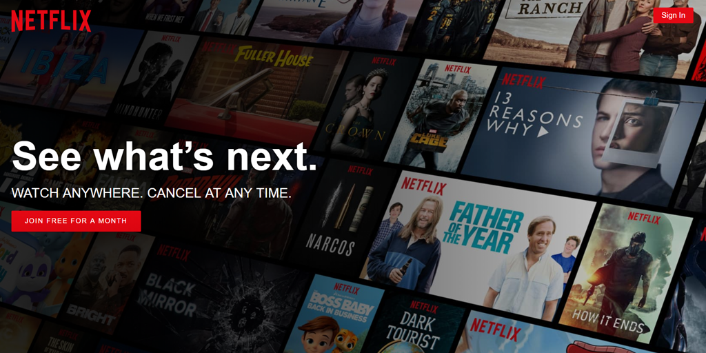
First in our call to action examples is Netflix. This is a typical example of how to structure a site landing page while drawing on the strengths of your product and brand.
Netflix knows that their audience doesn’t want to be stuck in long commitments with set contracts. They also know that, as a streaming service, their audience is looking to have easy and consistent access to a large library of shows and movies – hence the “Watch anywhere. Cancel at any time” tagline.
The unique value of the product is sold by the page’s background; a display of recent Netflix Original shows which can’t be viewed anywhere else. This helps to reinforce the value of signing up to the viewer, giving the call to action a better chance of working.
Finally, the call to action itself is a red button which contrasts against the black background to stick out from the rest of the page. This contrast is only present on three items, meaning that your eye is naturally drawn to the Netflix logo (brand recognition), the “Sign in” button for existing users, and the main button for new users.
It’s simple but effective.
Process Street
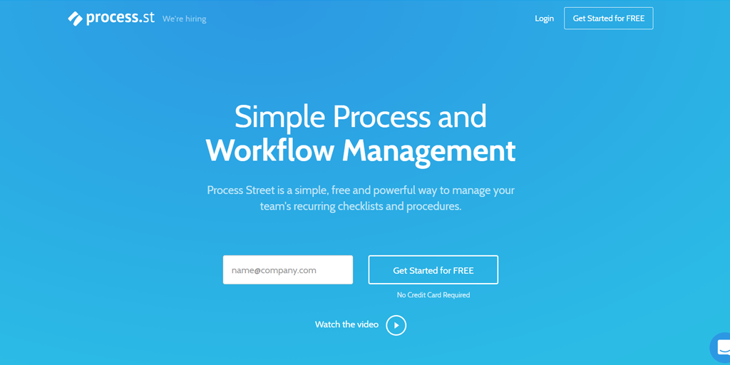
Here at Process Street, we use many of the same techniques on our landing page as Netflix. Indeed, these are fairly commonplace in call to action examples.
The main color use this time is to make the tagline and data field box stand out, along with the “Get Started for Free” button. This allows our audience to immediately understand that Process Street is all about process management and documentation.
However, we don’t just use calls to action to encourage our audience to do something. We also let it play a larger part in our overall marketing strategy.
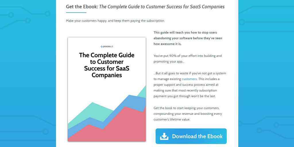
Above is a content upgrade for our customer success guide from our post What is Customer Success?. It uses the same tactics of making the button stand out and provides extra value for those interested in customer success if they sign up to our mailing list.
Downloading the guide also takes the audience to a special thank-you page, which reduces our bounce rate (since the viewer is moving to another page on our site) and shows that the page proved useful to them. In turn, this helps with our heavy focus on SEO and ranking for valuable keywords in order to get more viewers.
Lesson: Think about how your CTA play into your wider strategy and what can be done to make it benefit you more than as a button click.
Spotify
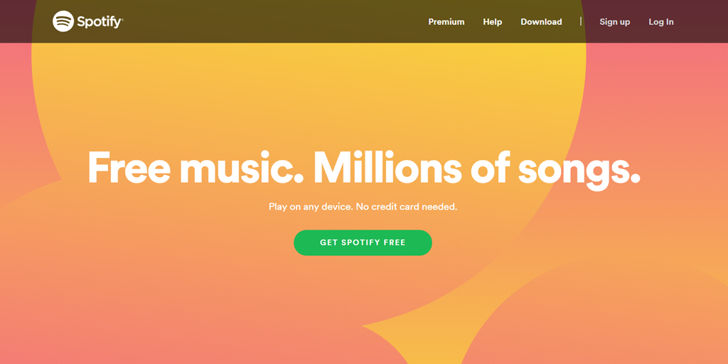
Much like Netflix, Spotify focuses on the simplicity and free nature of their service in the main call to action on their landing page. This time, however, we have a little more information to clue us in as to why they focus on this.
Spotify has an astounding 27% freemium conversion rate – a full 667% of Dropbox’s.
With such a massive success rate, there’s much less pressure to push their paid plan from the outset. As a result, it makes more sense to draw in as many users as possible with the free plan and then convert them to the paid option.
“No credit card required” and especially the “Get Spotify free” button show this, as they’re assuring the viewer that there’s no financial commitment required or necessary. That way there’s one less barrier to getting another user.
The button itself again uses contrasting colors to draw your eye, although it’s arguably a little better at doing so than Netflix. While the latter uses a black background with the signature Netflix red, Spotify’s green hue is set against a gradient pastel orange, letting the button stand out against several colors at once.
Lesson: Spotify plays to their strengths with this tactic. Knowing their high conversion rate, they can instead focus on a CTA with as wide an appeal as possible.
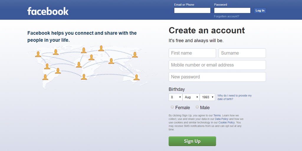
Facebook‘s landing page is more cluttered than many others in this post but in doing so they simplify the largest barrier to gaining new users.
Rather than having a “Get started” button or something similar, Facebook lays out the most basic form of their sign up process to serve as their main CTA. While there’s something to be said for putting off users by confronting them with a form first thing, it gets users signed up and using the product as quickly as possible.
The value is stated through the image and “connect and share” message, the viewer is assured that it’s free to use, and they don’t have to navigate through several pages in order to sign up.
Better yet, the user is being shown that they don’t have to enter pages of details and choose optional extras to get started. After all, the button isn’t “Create an account” or “Go to the next step” – it’s simply “Sign up” and you’re done.
Lesson: CTAs don’t have to be a button to start whatever process you want to get the audience to perform. They can also be used to simplify the process itself.
Amazon
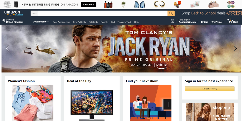
Amazon‘s landing page is, admittedly, a bit of a crowded mess when compared to the previous SaaS and website call to action examples. However, that’s only natural due to its nature as a storefront, marketplace, streaming service, tech company, and so on.
They offer almost everything under the Sun, and so they need to have several CTAs to appeal to the widest audience possible.
The more options they give, the more likely they are to catch the eye of whoever lands on this page.
From the “back to school” deals in the top right, through the Amazon Original series banner, down to their sections for women’s fashion, time-sensitive deals, and wider streaming service, there’s something for pretty much anyone who boots up their site. Not to mention the other categories as you scroll down the page.
Plus, Amazon doesn’t necessarily have “sign up users” as their top priority. They’re (mostly) a marketplace, and so their primary interest is in pushing purchases, hence why the CTAs are numerous and product-based while the “Sign in” options are small and pushed to one side.
Lesson: Multiple varied CTAs are useful for catching a wider audience but make it harder to push a single action (ex. getting sign-ups).
Evernote
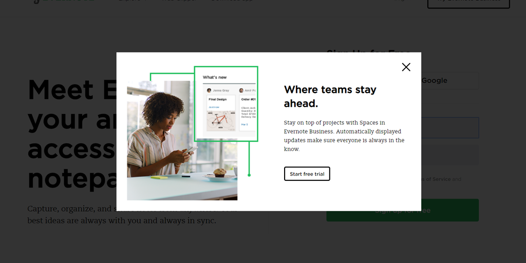
Above is a popup CTA which appeared on Evernote‘s homepage prior to logging in, which is an example of a halfway- approach to pushing several actions.
The primary call is to sign up for a free trial, but the main text of the popup focuses more on the Business (paid) plan. By doing this they can catch their audience’s interest with the attractive features of Evernote Business while still drawing in a wide audience.
The key is that they’re focusing on one action for their CTA.
They’re not pushing viewers to sign up for a Business account and then also for a free trial. Instead, the free trial is the only action being pushed (which is more attractive than asking for money from the get-go) while the seed of how useful upgrading to the Business plan would be.
Lesson: Focus on one action per CTA. Other options can be promoted, but don’t confuse your audience with what you want them to do.
Dropbox
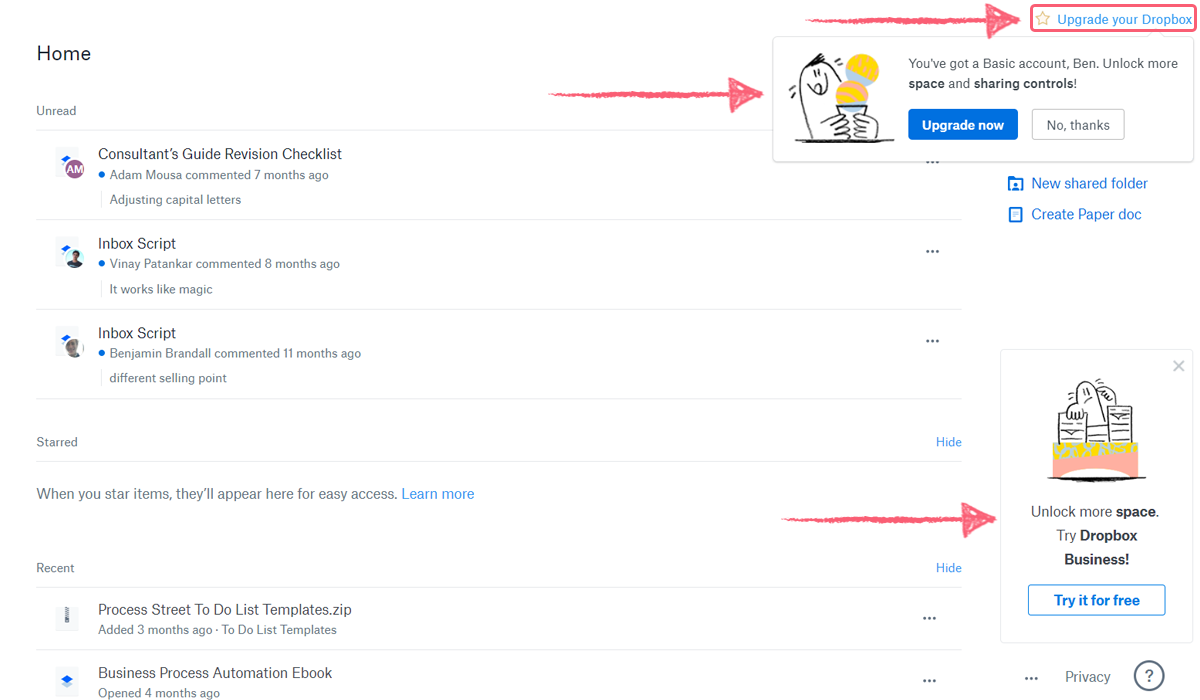
The Dropbox CTAs we’ll be looking at were displayed upon logging into the app for the first time in a number of months. For context, I’m using a Basic account, meaning that they know I’ve signed up and have been using the product for a while (even if I don’t use it often).
Knowing that, it’s useful to posture why Dropbox pushed three separate CTAs on me as soon as I logged in.
Remember; CTAs count as anything which is calling the audience to take some form of action. Knowing that, let’s think about what Dropbox would logically want to call their audience to do in order to make sense of why all three call to action examples are on this page.
Although it’s purely conjecture, Dropbox’s desired user actions might look like this:
- User signs up
- They explore the key features
- They use Dropbox with their team
- Dropbox’s value is proven through its features and use
- User upgrades to business plan to get more out of it
I’ve used Dropbox for a while now, have worked with my team through it and know the core features. Therefore, the three CTAs that are shown to me upon logging in are all designed to encourage the next key action they want me to take; to upgrade to the business plan.
The presence of three of them could also mean that they know how infrequently I use the service, and so are trying to reignite my interest with the Business features.
Lesson: CTAs don’t have to be the same for your entire audience. Tailored CTAs are a great way of encouraging the next step you want them to take, and can be strategically placed to help those showing interest in complex features and the like.
Google Drive
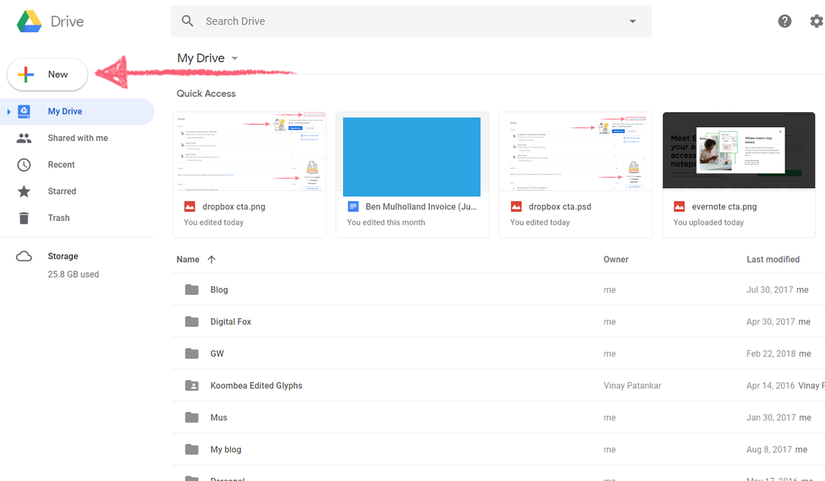
Google Drive, meanwhile, is a different story.
Since our Process Street accounts are all linked to the same team in Google, we frequently share files and work together without the need for prompts. All of us also sync our Google Drive to our local devices to make sure we can access files no matter what happens.
Knowing that my Drive account shows that I’m working with my team, have used Drive for years, am familiar with their biggest features, and am on a team which pays for a higher plan, there’s only one logical option for a CTA to show me.
The “New” button is the most valuable action to inspire for both myself and Google, as it means that I’m getting the most out of the product while further strengthening my continued use of it.
Lesson: You don’t always have to upsell or push a new feature. Sometimes the best CTA is one that makes it easy to perform the most basic, common action possible.
Close.io
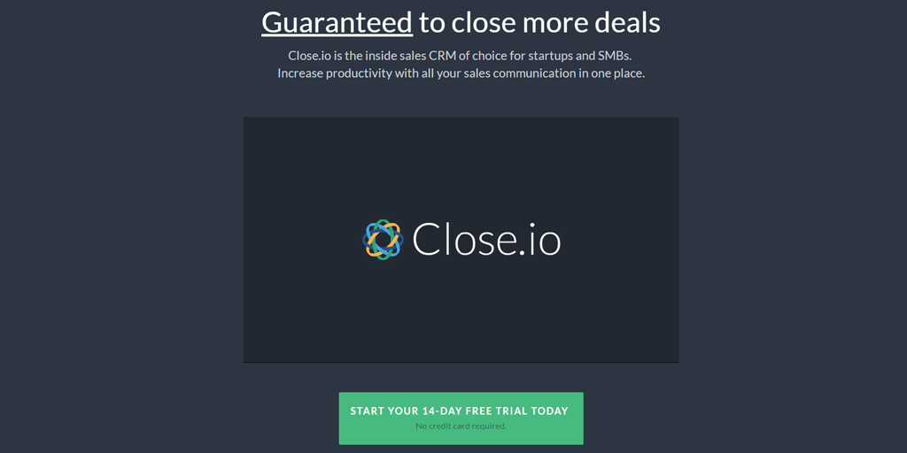
It’s easy to lose track of your CTAs and use too many. Whether you’re trying to encourage different actions or the same one through different approaches, overloading the audience with calls to action will result in them not knowing which to take.
If they don’t know what the best action to take is, they probably won’t take any of your options and go on to something less confusing.
Close.io circumvent this problem while still making full use of their home page by providing one CTA per full-page-spread. This means that they can appeal to their audience from multiple angles and encourage them to try their free trial, take a product tour, learn about their integrations, get their books, subscribe to the blog, and more without overwhelming them.
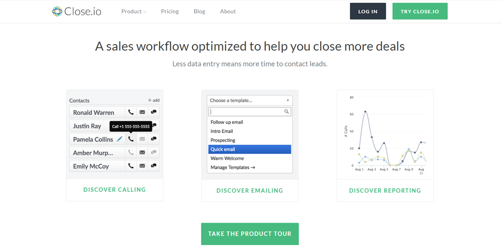
As you can see, each section of their home page serves a different purpose. If someone isn’t interested in their first offer, chances are they will be interested in one of the others.
Lesson: One great way of spacing out CTAs on your landing page is to have one per full page scroll. That way each can be accompanied with tailored marketing material and the viewer is always looking at one without being overwhelmed.
Freshbooks
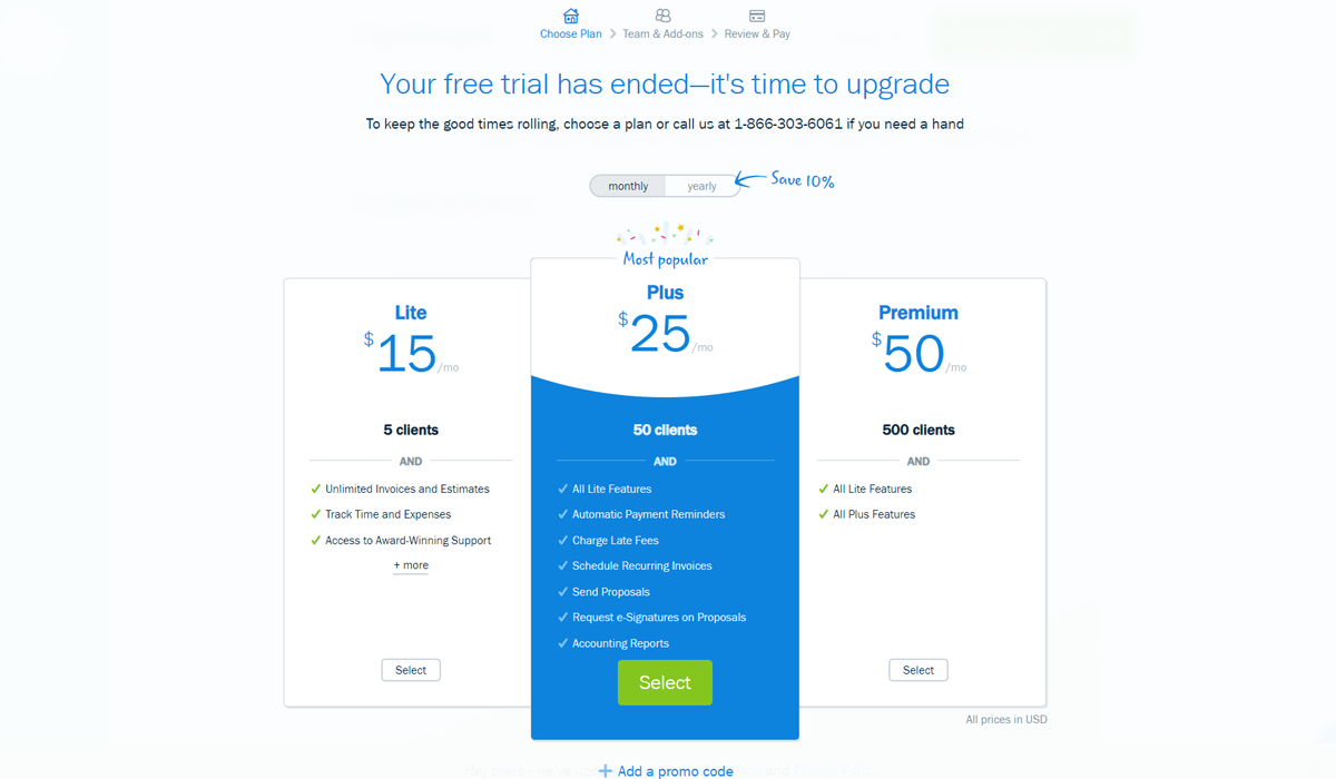
The Freshbooks screen above shows when a user attempts to log in after their free trial has expired. As you’d expect, the action they’re calling attention to is to upgrade to one of their paid plans in order to keep using the services. Nothing unexpected.
It is, however, a great example of how multiple CTAs can be arranged in order to draw attention to one over the others.
Two options are being promoted as superior here; the yearly payment method (with “Save 10%”) and the “most popular” Plus plan, which is the second-most-expensive and unlocks all Freshbooks features.
The Plus plan, in particular, is a tad larger than the other options, given more block color to make the text stand out, and its button is given a contrasting color to the rest of the box. Not to mention that it takes position in the middle of the page – the most natural place for your eyes to go.
Whether or not the Plus plan is actually their most popular, these options are likely to be the most valuable to the majority of Freshbooks’ audience and serve as a great commitment to the service.
Lesson: Pricing plans are great examples of multiple CTAs with a single preferred option being promoted above others. In reality, it’s good if the viewer takes any of the three options but the most likely or valuable one can still be promoted further.
Zapier
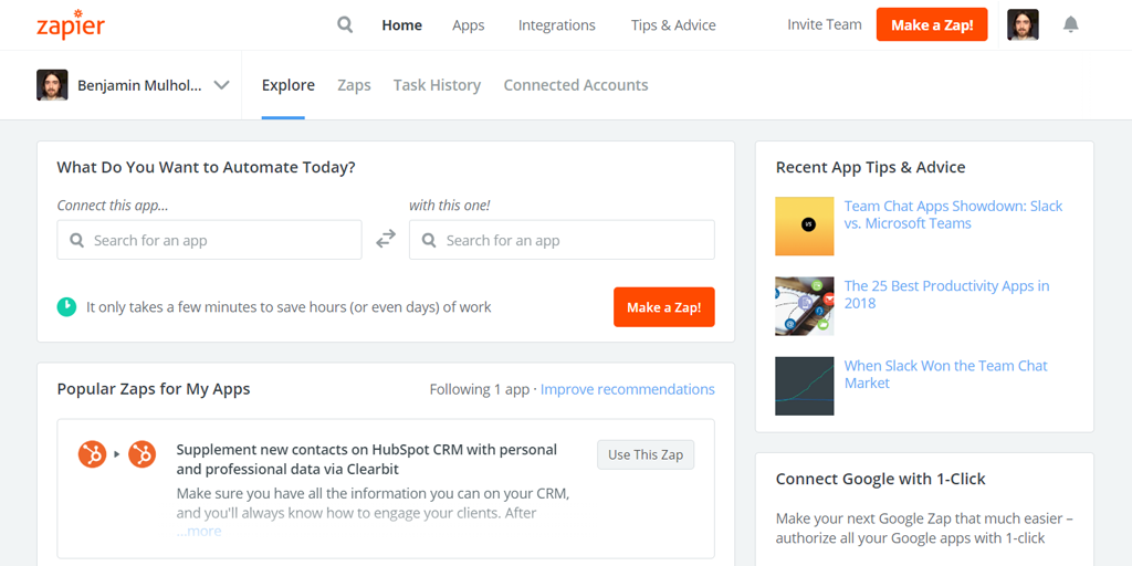
Business process automation is an incredibly powerful tool. It allows you to automate laborious tasks and complete them faster while achieving goals that otherwise wouldn’t be possible without a huge amount of human time and effort.
Unfortunately, one of the main automation platforms available, Zapier, can be a little difficult to understand and use at first.
Trust me. I literally wrote the book on it.
To help solve this problem, Zapier’s home page shows this CTA when a user has signed in. Instead of telling them to just “Make a Zap!”, they’re asked which two apps they want to connect together and what they want to happen.
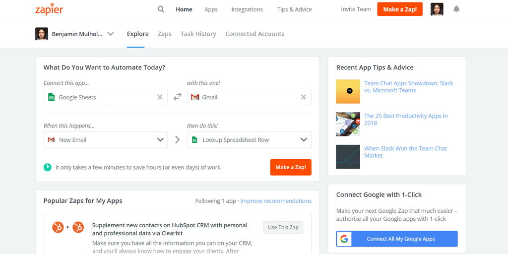
This then lets users create a Zap (integration) with the basic information already completed. It’s a fantastic way of simplifying what is usually a difficult process to describe into a couple of options in plain English.
Lesson: CTAs don’t always have to be promoting a particular action to provide value. Zapier shows how a CTA can instead be used as a simplified shortcut to a more complex, useful action.
Bodyweight365 (Will Owen)
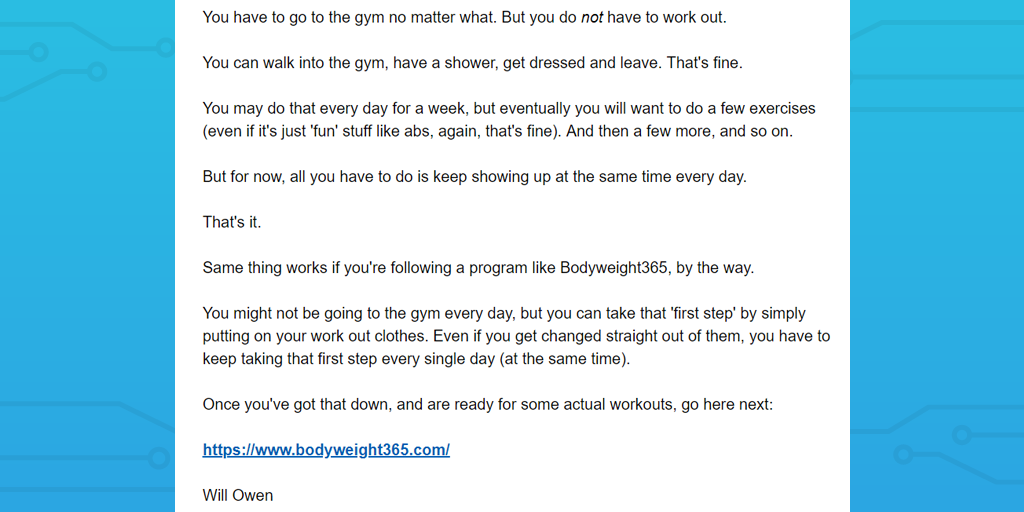
Email marketing is hard to get right at the best of times. People have low attention spans and tend to be reluctant to click links that will take them out of their inbox, so an effective CTA is a must-have in order to make the most of your cold emails and subscribers alike.
Most of the time this means emails get filled with large, highly contrasting images or buttons in an attempt to immediately draw the audience’s eye.
Bodyweight365 owner Will Owen takes a different (and very on-brand) approach.
The site itself focuses on simple exercise routines which serve to keep you fit and build muscle no matter your experience level or how much equipment you have. It’s actually the source for many of the office exercises (and routines) that I still use today to keep myself fairly in shape.
This no-nonsense attitude is reflected in Will’s email CTA, giving a sense that he and his brand are genuine and human rather than some kind of gym-focused upselling program.
Despite breaking most rules-of-thumb for effective CTAs, it fits with the target audience and so it works.
Lesson: CTAs can be used to reinforce a brand message or identity through presentation and wording. Conversely, one that is off-brand and poorly thought out could not only make the CTA ineffective but also slightly damage your brand image.
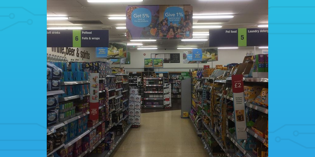
Co-op
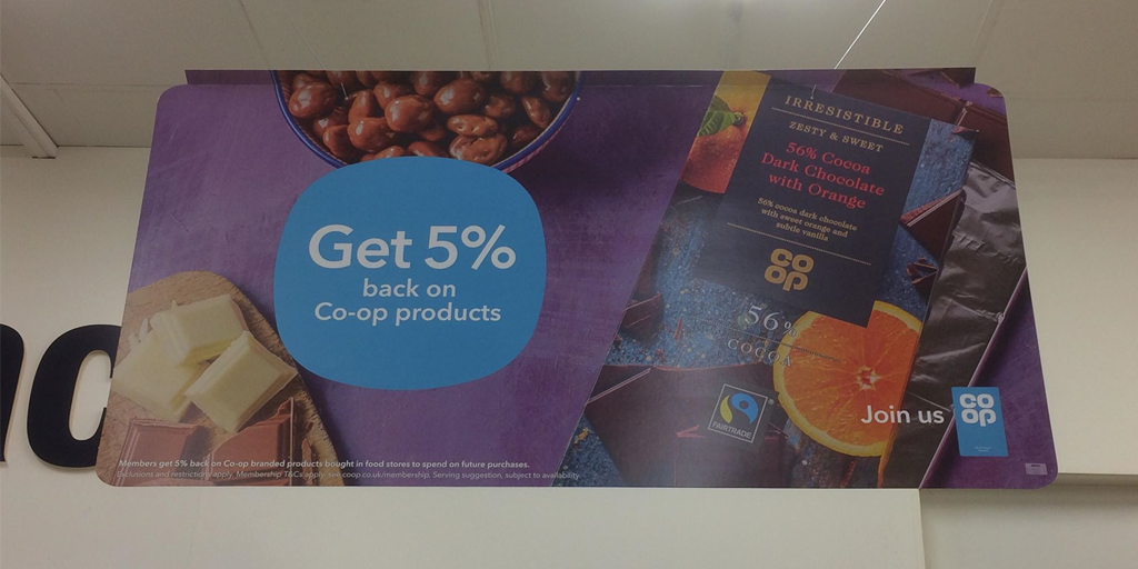
To mix things up, let’s take a look at an example of a physical call to action – one from my local Co-op.
The call this time is to sign up for their membership program, which grants minor rewards to their customers in return for repeated business. However, most telling about this call to action is how it is presented.
In order to see this, you have to already be in the store. If you’re in the store, you’re probably fulfilling the primary function they want their customers to do; buying their produce. They already know that you’re going to be a customer of theirs, so the need to push further action is reduced.
It’s still important to avoid driving away customers by being too pushy, hence why the call to action examples here are all either above your head as you shop or on small signs attached to shelves. Even on the larger signs, the actual call to action is pushed into the bottom right-hand corner.
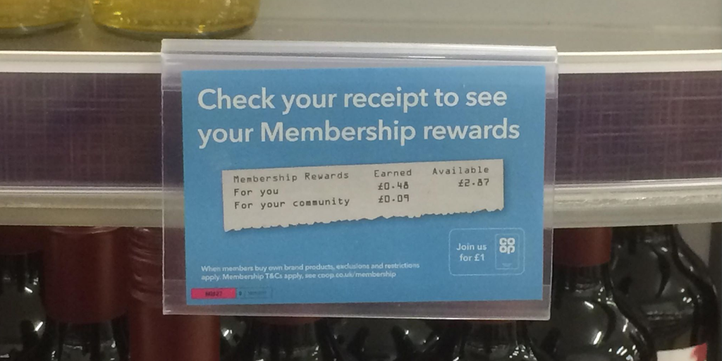
That’s not to say that it isn’t noticeable or doesn’t work. Every aisle has one of the larger boards advertising the benefits of the membership program above it, selling shoppers on the benefits as they make their rounds.
The takeaway here is that you don’t have to push your call to action in your audience’s face if they’re already providing you value. Yes, it would be preferable for every Co-op shopper signed up and had the incentive to come back again but the program isn’t necessary to generate the main share of their revenue.
Lesson: Multiple subtle CTAs can be a better choice than one or two intrusive ones if they’re not related to a key action. If the audience is already interacting with your business’ core value stream it’s better to be unintrusive than off-putting.
Optimization is always possible
These lessons are the kind which can be gleaned from literally any call to action example around you. The key is knowing where to look and getting in the habit of thinking about why they are where they are, what they’re promoting, and how they’re doing so.
Billboards, commercials, online videos, store as, CTAs can be found literally anywhere if you keep an eye out for them. Yet that doesn’t mean all of the lessons learned will work for you and your own uses.
The key is to have a solid AB testing process so that you can continuously improve the calls to action you have. That way you’ll be thinking not only about how effective they are in hard numbers, but also in terms of what they can do in your larger strategies.
Do you have any tips for improving calls to action or have any novel examples? Let me know in the comments below.
Ben Mulholland
Ben Mulholland is an Editor at Process Street, and winds down with a casual article or two on Mulholland Writing. Find him on Twitter here.