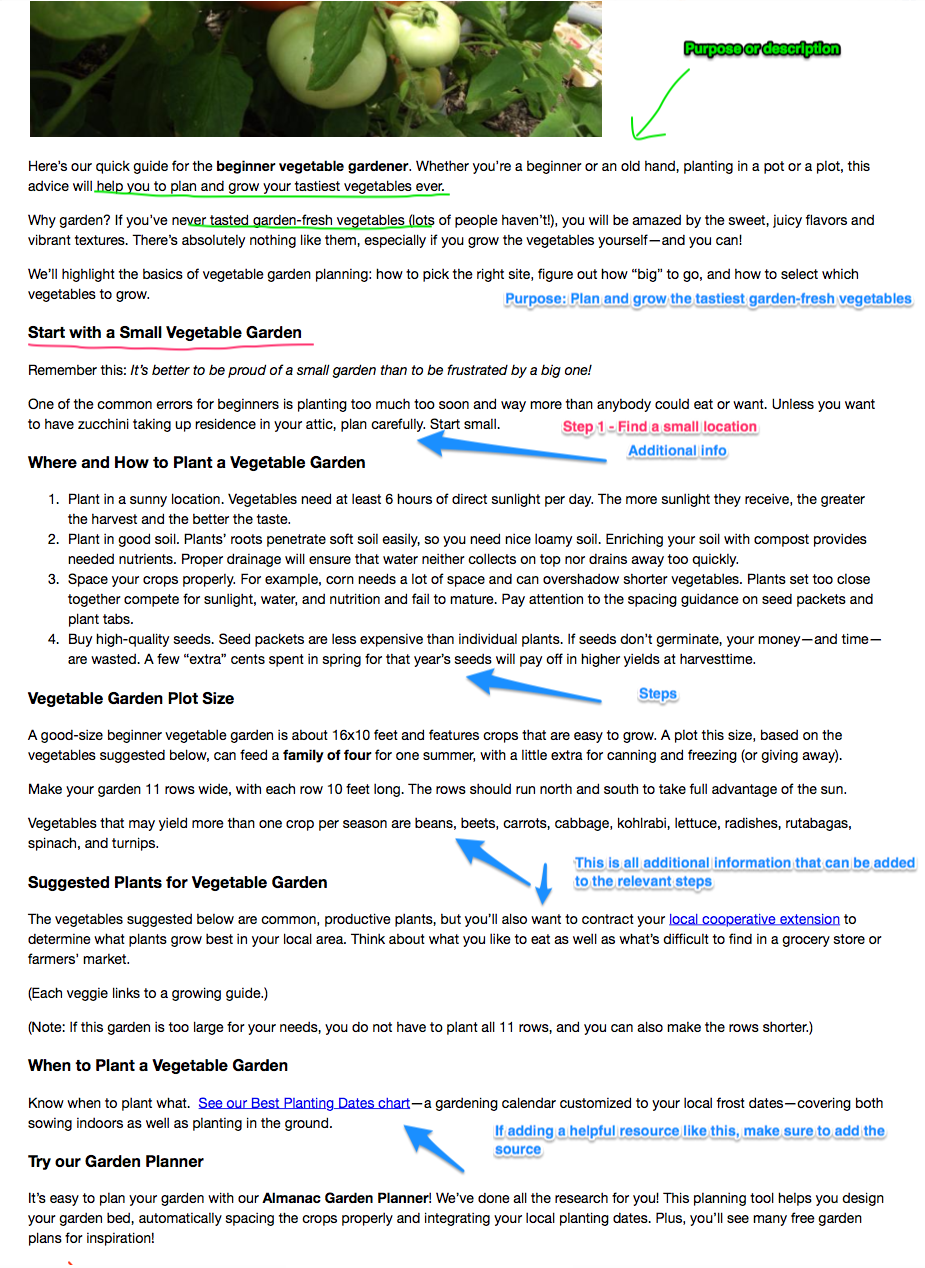
Using Our Colors
Colors play an integral role in communicating the brand and keep a consistent visual presence across all channels. As a result, Selflessly requires all of the following colors to be used in two formats: primary and secondary. All materials produced must utilize these colors to the exact specification.
Selflessly Reflex Blue or Pantone® Reflex Blue C should be the primary color utilized in all Selflessly communications.
Selflessly Periwinkle or Pantone® 2178 C should be the secondary primary color utilized in all Selflessly communications.
Both are available for your use at any time as it results in communicating the brand's image. You may consistently use these colors as it directly corresponds to materials created and used for the standardization of the brand and its assets.
Using Selflessly Reflex Blue
Reflex Blue is the most important color in our palette; it’s critical that we get it right. The official Selflessly Reflex Blue is PMS Reflex Blue C. That is the color you should specify with any vendors if you are producing merchandise, promotional, or specialty items.
However, almost all communications from Selflessly are printed using the four-color (CMYK) process, which cannot accurately produce PMS Reflex Blue C. Therefore, you should use the C-100, M-100, Y-26, K-24 CMYK breakdown when printing. If a printer requests a PMS color to guarantee a match for a four-color print job, you should specify PMS Reflex Blue not the CMYK, RGB, or Hexadecimal code.
For RGB palettes, use R-27, G-20, B-100.
For the web, use the hexadecimal code #1B1464.
Using Selflessly Periwinkle
Reflex Blue is the second most important color in our palette; it’s critical that we get it right. The official Periwinkle is PMS 2178-C. That is the color you should specify with any vendors if you are producing merchandise, promotional, or specialty items.
However, almost all communications from Selflessly are printed using the four-color (CMYK) process, which cannot accurately produce PMS 2178-C. Therefore, you should use the C-64, M-55, Y-0, K-0 CMYK breakdown when printing. If a printer requests a PMS color to guarantee a match for a four-color print job, you should specify PMS 2178-C not the CMYK, RGB, or Hexadecimal code.
For RGB palettes, use R-108, G-123, B-255.
For the web, use the hexadecimal code #6C7BFF.
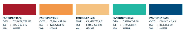
Secondary Palette
Because Selflessly’s branding appears in thousands of different places, one color palette simply isn’t enough to work in all circumstances. As our brand marketing needs grow more complex with numerous projects, we’ll inevitably need to use more than just our primary colors.
Selflessly Dark Red or Pantone® 187C is an acceptable color use for secondary accents only but should never replace it in the primary brandmark. You may utilize this in CMYK format as: C-24 M-100 Y-87 K-15. Alternatively, you may use the hexadecimal code for web as #AA1E2E.
Selflessly Goldenrod or Pantone® 157-C is an acceptable color use for secondary accents only. You should never replace it in the primary brandmark. You may utilize this in CMYK format as: C-5 M-41 Y-83 K-0. Alternatively, you may use the hexadecimal code for web as #EEA146.
Selflessly Yellow or Pantone® 155-C is an acceptable color use for secondary accents only. You should never replace it in the primary brandmark. You may utilize this in CMYK format as: C-4, M-21, Y-53, K-0. Alternatively, you may use the hexadecimal code for web as #F3CA87.
Selflessly Aquamarine or Pantone® 7465-C is an acceptable color use for secondary accents only. You should never replace it in the primary brandmark. You may utilize this in CMYK format as: C-66, M-0, Y-41, K-0. Alternatively, you may use the hexadecimal code for web as #468FAB.
Selflessly Blue or Pantone® 634-C is an acceptable color use for secondary accents only. You should never replace it in the primary brandmark. You may utilize this in CMYK format as C-66, M-0, Y-41, K-0. Alternatively, you may use the hexadecimal code for web as #00558B.
To view our secondary color palettes, please refer to Figure 2 below.