 Workflows
 Forms
Forms Data Sets
 Pages
Pages Process AI
 Automations
 Analytics
 Apps
Apps Integrations
 Property management
 Human resources
 Customer management
 Information technology


This article comes excerpted from Hiten Shah’s SaaS DNA Project: The Anatomy of a SaaS Marketing Site, a 30,000+ word research study on how users actually browse and experience SaaS marketing sites.
Hiten Shah has built products on the web for over 10 years, including Crazy Egg, KISSmetrics, and now Quick Sprout. He breaks down everything he’s learned about building companies in his weekly email newsletter here.
When it comes to price, customers want to know two things: what they’ll pay, and what they’ll get in return. But too many SaaS companies overcomplicate their pricing pages.
Your pricing page converts traffic into customers. But that only happens if visitors instantly understand what they’ll get from each of your plans, the value it will provide, and how much it’s going to cost them. Otherwise, they’ll never sign up for your service.
In a comprehensive look at SaaS pricing pages, we studied 30 different SaaS websites through 90 different user interactions, totaling over 1,800 minutes of user testing. With help from UserTesting.com, we guided participants to each company’s pricing page and instructed them to read through the plans the company offered.
We then asked them how easy it was to understand the company’s various offerings on a scale of 1-5 [1=very difficult, 5=very easy].
The experiment was straightforward, but the answers we received from users were hugely insightful. Let’s dive into which pricing pages users understood, which ones they didn’t, and see what they can teach you about your own pricing page.
How difficult or easy was it for you to understand the company’s various offerings?
Below, you can see a comparison of all the pricing pages we tested, and how users scored all 30 pricing pages.
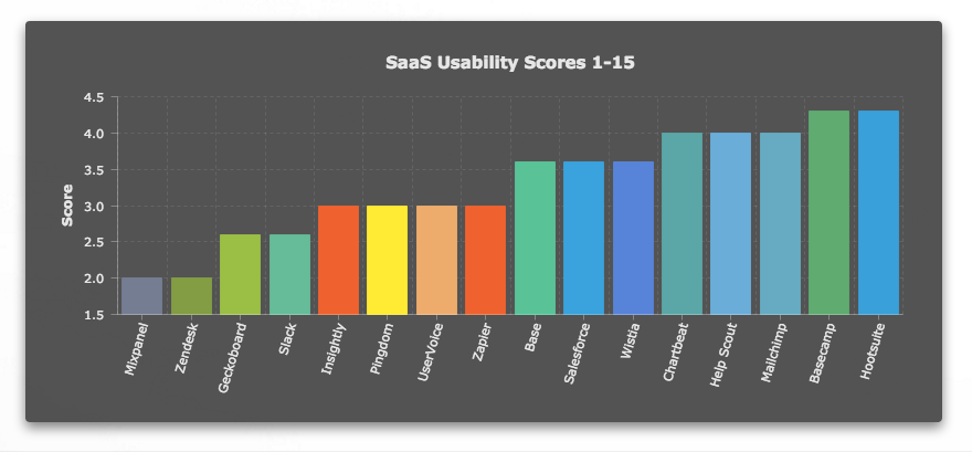
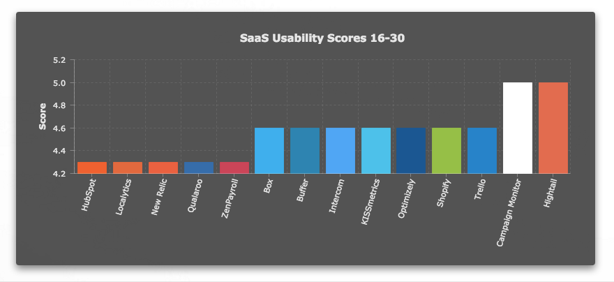
File sharing service Hightail was one of two to get a perfect score from all participants.
Highly-rated example: Hightail
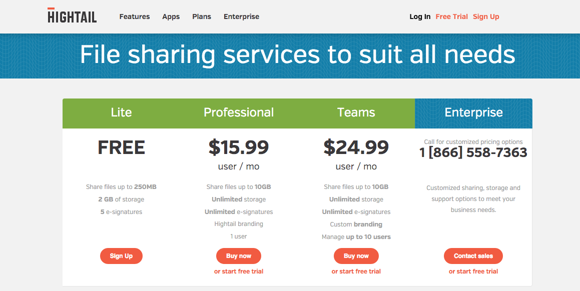
Users loved Hightail’s pricing page because of its simplicity. The pricing page offers 4 different plans—Lite, Professional, Teams and Enterprise—and it’s immediately clear what each offers.For instance, the Lite plan enables users to share files up to 250MB in size, along with 2GB of storage. Next, the Professional plan allows sharing files up to 10GB in size and unlimited storage, while the Teams plan offers everything the Professional plan does, plus team management options.
Hightail’s main value metric was totally obvious to users thanks to the pricing page’s clear descriptions. In SaaS, a value metric is what you’re charging users for. In this case, Hightail charges based on file storage per month and allowable file size—that’s what changes between plans. Even though these users were initially unfamiliar with Hightail, they were quickly able to grasp that value metric, and understood each plan’s offerings.
Further down the page, you get a simple FAQs section and a selection of the features you get with each plan. The uncomplicated layout and clear value metric means that Hightail’s pricing is easy to understand—even for new users.
Quotes from the responses:
- It was very easy actually for me to understand the company’s various offerings because as you scroll down you are able to compare the services or the plans.
- It was very easy. Very, very easy.
Low-rated example: Mixpanel
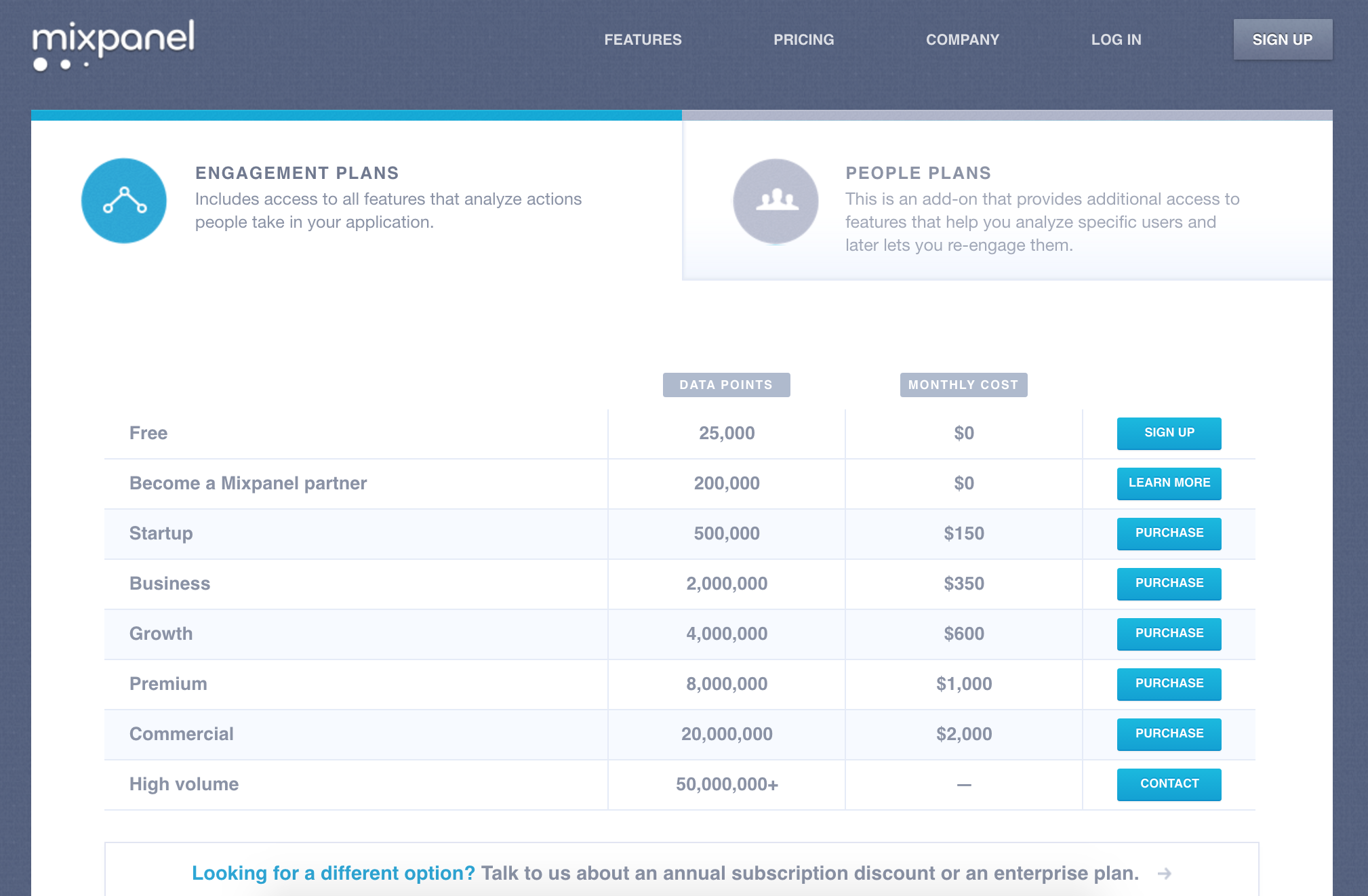
Users rated Mixpanel’s pricing page low because they didn’t understand the company’s value metric, which is represented by “data points.” Mixpanel’s product measures in-app activity, and each data point represents a tracked event.
But that wasn’t clear to users. They didn’t know what “data points” were, or how they could help their business. That meant the pricing plans didn’t make sense to them, so they were unlikely to sign up.
Another source of confusion: Mixpanel offers two different plan options—engagement plans and people plans. So not only were users unsure about the value metric, but they also didn’t know whether they needed an engagement plan, a people plan, or both. The people plans are also listed as an add-on, leading some users to question the value of the Engagement plans.
Quotes from the responses:
- How does pricing work for something like 50 million data points? Oh god. Yeah, I’m lost already.
- I get that there are different data points, and they’ll cost different amounts but I guess I’ve got to learn more—maybe it has more explanation. Nope, it doesn’t. OK, I might get it, but not really.
- What the hell are data-points?
- Maybe this is really kind of in beta where they’re looking for people to try the thing.
- So finally down here, I get some examples of some problems that I might be having, but this is all just marketing fluff to me.
Key Takeaways for Ease of Understanding
- Pricing needs to be simple. Users just wanted to know what they would pay for each plan, and what they would get in return. The more complex the pricing page, the harder it was for users to understand that, making them less likely to sign up. Make your pricing page as simple as possible.
- No jargon, please. Users didn’t want to wade through a bunch of technical jargon—they just wanted plain English. Clear, benefit-focused language lets companies communicate their value propositions more effectively.
- Users liked FAQs. The best pricing pages separate the main pricing matrix from the explanatory information on the features that come with each plan. That makes it easy to compare the different plans, but also means there’s enough information there for users to make an informed decision.
In Process Street’s comprehensive analysis of SaaS pricing pages, they examined 250 pricing pages from SaaS leaders and found some similar takeaways. The average number of pricing options is 3.5, because users don’t like too many choices.
Conclusion
When it comes to your pricing page, users want one thing: a simple explanation of how much they’re going to pay, and what they’ll get in return. Complicated structures, product-specific jargon, and unclear value metrics will scare prospective customers off. Use plain English and keep the focus on benefits so users can more easily make a purchase decision.
Think about it from the customer’s perspective. They probably found your site searching for a solution to a specific problem. They don’t want to sit around deciphering a messy pricing structure. But if they immediately understand what you’re offering and how much it costs, your pricing page will boost conversion and maximize revenue.
Hiten Shah has built products on the web for over 10 years, including Crazy Egg, KISSmetrics, and now Quick Sprout. He breaks down everything he’s learned about building companies in his weekly email newsletter here.
Vinay Patankar
CEO and Co-Founder of Process Street. Sign-up for his free systems masterclass or find him on Twitter and LinkedIn.