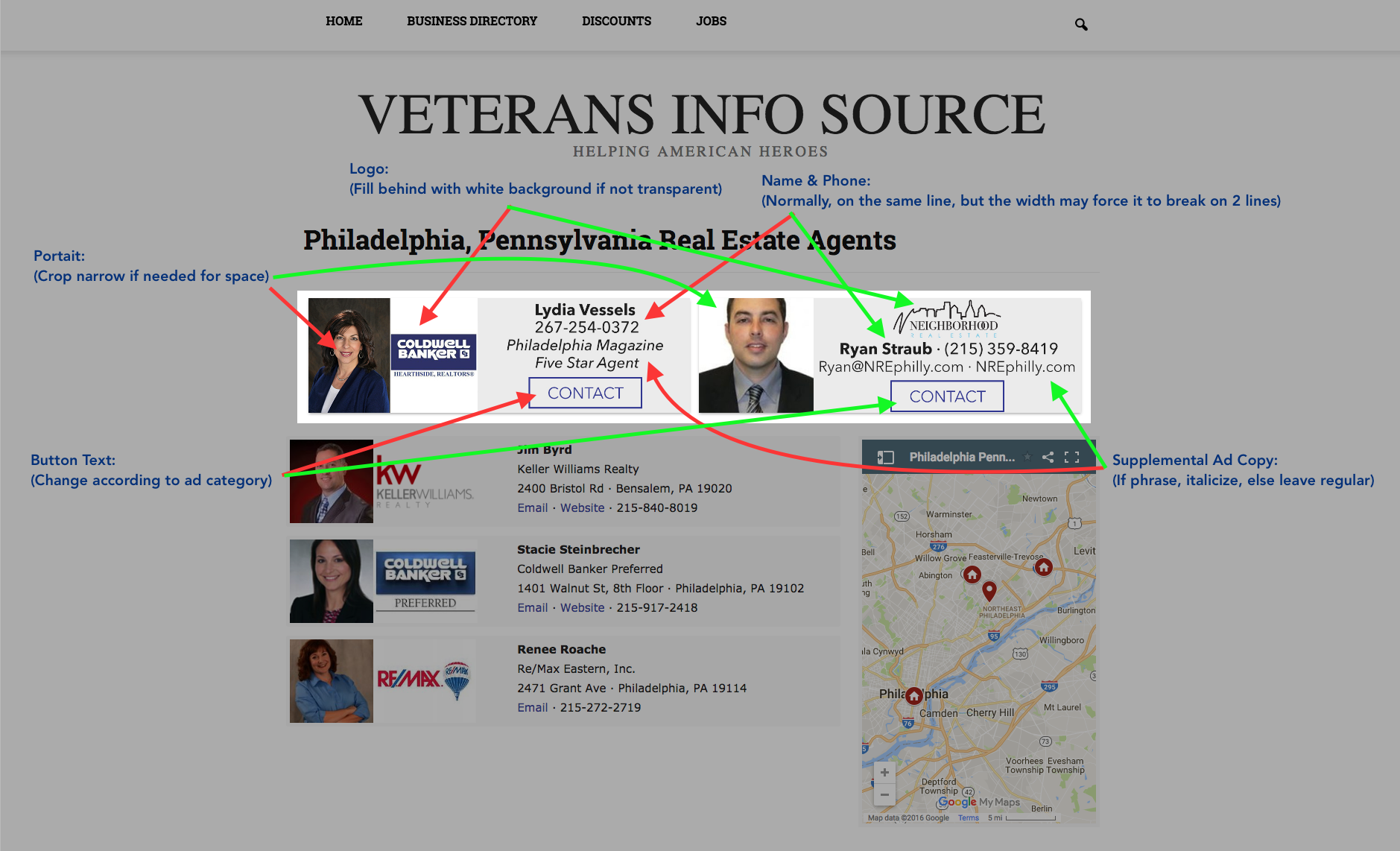
There are two variations of image ads that you may need to create. Use your best judgement when determining which type of ad to create based on the graphics provided.
Wide Logo Variation
Use the wide logo variation when the provided logo is considerably wider than it is tall. e.g. Ryan Straub's ad in the image above.
Notes about the Wide Variation:
- The Name and Phone Number should be on the same line, separated by a "middle dot" (·)
- Supplemental Ad Copy should fall on the line below
- Phrases always take priority over email, address and websites.
- If a phrase (e.g. Military and Veteran Special Offers) is provided, italicize the text.
- If an email, website, or physical address is provided, do not italicize.
- With the logo above, ad text should only occupy 2 lines and be positioned between the pseudo button and logo.
Narrow Logo Variation
Use the narrow logo variation when the provided logo is square or narrow rectangular. e.g. Lydia Vessel's ad in the image above.
Notes about the Narrow Variation:
- The Name and Phone Number should be on the same line whenever possible, separated by a "middle dot" (·): however, if space is unavailable, it may be split into two lines.
- Supplemental Ad Copy should fall on the 2-3 lines below
- Phrases always take priority and appear above the email, address and/or website.
- If a phrase (e.g. Military and Veteran Special Offers) is provided, italicize the text.
- If an email, website, or physical address is provided, do not italicize.
Other Notes
- Depending on the information provided by advertisers, you may need to reduce the font size of some text.
- Distribute text, buttons and wide logos evenly.
- The font used in ads is Avenir Next. Download the attached font file if needed: https://drive.google.com/file/d/0B9zNEa5CFomoVDVMUy1TYnROUE0/view?usp=sharing
- The standard font-size used is 10px.
- Each ad is created at 1000px by 300px and should be saved in jpeg format.
- Use an existing ad as a template to save time (Download Below).