Templates /
Pareto Chart Process Checklist

Pareto Chart Process Checklist

Use this checklist to create a Pareto chart which allows you to see what the most significant defects are, within an issue, and prioritize actions.
1
Introduction:
2
Complete checklist details
3
Chart Set-Up Tasks:
4
Identify the problem
5
List the contributing factors
6
Decide on the measurement
7
Establish a time period
8
Collect the data
9
Create & Plot the Bar Chart:
10
Draw the Y-axis & the X-axis
11
Construct and label bars for each category
12
Draw the Z-axis
13
Plot the Cumulative Percentages:
14
Calculate cumulative percentages
15
Plot the cumulative percentage line
16
Establish the Focus:
17
Establish what your focus should be
18
Approval:
19
Implement the changes/improvements
20
Related Checklists:
21
Sources:

Introduction:

Pareto charts are most useful for identifying what the biggest issues regarding your business are” – How to Do Pareto Chart AnalysisTallyfy

What is the Pareto chart? 

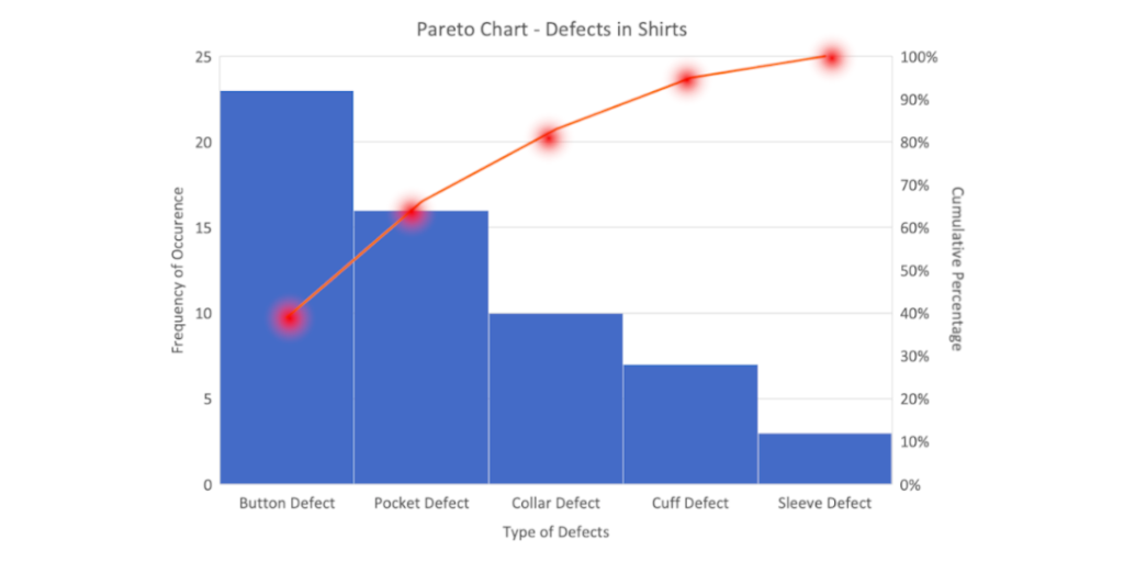
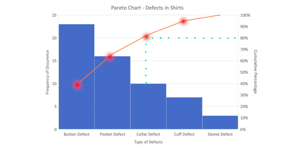
A Pareto chart, in its simplest form, is a bar chart that arranges the bars from largest to smallest, from left to right. The bigger bars on the left are more important than the smaller bars on the right.

They are used by businesses to identify where the biggest opportunities for quality and process improvement lie. 

By graphically separating the aspects of a problem, an organization can instantly see where to direct its improvement efforts. Focusing its efforts on reducing the largest bars in the chart, will do more for overall improvement than reducing the smaller ones.

It’s a tool that’s been used for decades by problem solvers to separate the vital few factors from the trivial many and prioritize actions.

It’s a visual representation of the 80/20 rule. 

The 80/20 rule states that 80% of the results are determined by 20% of the causes.

The Pareto chart displays the few, most significant defects, that make up most of the overall problem.

How to use this Pareto Chart Process Checklist 

This Pareto Chart Process Checklist takes you through the process of creating a Pareto chart.  Run the checklist each time you’ve discovered an issue or need to make improvements, to determine where to focus your efforts. 

Before you run this checklist, make sure you’re prepared:

  • Have Excel open (or a similar tool or program that allows you to create graphs, or even a pen and paper would suffice!), ready to draw your Pareto chart 
  • Have a calculator handy so you can work out cumulative percentages (this will become clearer as we move through the process)
When & where to use this Pareto Chart Process Checklist: 

Below are a few examples of when and where you might use this Pareto Chart Process Checklist to create a Pareto chart and identify the best, most impactful areas to focus your attention on. 

  • You could use it to work out which top 20% of your company’s processes are causing 80% of the problems and focus on refining those processes.
  • You could use it to establish which 20% of your clients are responsible for 80% of your sales and create a high-touch program for them.
  • You could use it to assess all your upcoming projects, decide which ones will make the most difference, and start those first.
  • You could use it to decide which tasks to prioritize, like the CEO of Dell does. He uses a Pareto chart on a daily basis to make sure he spends 80% of his time on the 20% of tasks that will generate the biggest results.
Who is Process Street? 

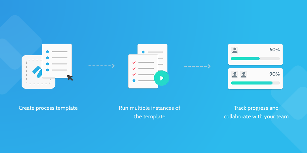
Process Street is super-powered checklists.

Our state of the art business process management (BPM) software allows you to create templates, run individual checklists, and manage recurring tasks faultlessly.

You can check tasks off as you work through them, set deadlines, request approval from colleagues, assign tasks, and track each team member’s progress. You can also connect to thousands of apps through Zapier, webhooks, or API integration.

Complete checklist details

Confirm the basic checklist details in the fields below so there is a record of who is running this process and when they’re running it, which people can refer back to if they need to in the future.

Chart Set-Up Tasks:

Identify the problem

The first step when creating your Pareto chart is to summarize the problem you’re facing and want to resolve.

For example:
Is it a problem with customer service? A delayed project? Low-quality production? Escalating costs?
 

List the contributing factors

Now you’ve identified the problem, you need to determine what factors are contributing to the problem.

For example:
Is it a lack of resources? A lack of training?  Too many staff?  Not enough time?  

List anything that’s contributing to the problem, even if you feel it’s only a small contribution. 

List all the factors that are contributing to the issue of {{form.The_problem_is…}}, in the fields below. 


If you need to add more fields to list your contributing factors, do so by following these instructions

Decide on the measurement

Next, you need to establish how you will measure the impact of each contributing factor.

This is so you can get an accurate representation of the impact each contributing factor is having on your issue of: {{form.The_problem_is…}}

Measurements are usually either the frequency of the contributing factor or the cost.


Establish a time period

Next, you need to decide what period of time your Pareto chart will cover, so you can generate a graph that represents the issue and its contributing factors over a set period of time.

This, again, creates a true representation of the issue and the severity of each contributing factor. 

For example:
Will it be a sprint? a full day? a week? a year?


Collect the data

Now you have to collect data for each of the contributing factors so you can plot your graph accurately. 

The data you need to collect will be measured in {{form.Contributing_factors_measurement}} and you will need to collect data over the course of {{form.Time_period}}.

 Record your data for each contributing factor below.

{{form.Contributing_factor_#1_2}}


{{form.Contributing_factor_#2}}


{{form.Contributing_factor_#3}}


{{form.Contributing_factor_#4}}


Create & Plot the Bar Chart:

Draw the Y-axis & the X-axis

Now you’ve got your data, you’re ready to draw your Pareto chart. 

In Excel (or whatever tool you are using to draw your graph), start by creating a simple bar chart structure with a Y-axis and an X-axis. 

Like this: 

Label the Y-axis with the {{form.Contributing_factors_measurement}}

Label the X-axis with each of the following contributing factors: 

{{form.Contributing_factor_#1_2}}

{{form.Contributing_factor_#2}}

{{form.Contributing_factor_#3}}

{{form.Contributing_factor_#4}}

Construct and label bars for each category

Now you’ve got your basic graph structure, it’s time to draw the individual bars that will represent each of your contributing factor and the {{form.Contributing_factors_measurement}}.

Using the below data you have collected, plot your bars. 

{{form.Contributing_factor_#1_2}}: {{form.Contributing_factor_#1_data:}}

{{form.Contributing_factor_#2}}: {{form.Contributing_factor_#2_data:}}

{{form.Contributing_factor_#3}}: {{form.Contributing_factor_#3_data:}}

{{form.Contributing_factor_#4}}: {{form.Contributing_factor_#4_data:}}

Then, place the tallest bar at the far left, then the next tallest to its right, and so on.

This is so you can see the contributing factors in order of severity.

Like this: 

Draw the Z-axis

Now you’ve plotted the bars, and they are in descending order of impact, you can draw your z-axis and label it with percentages. 

Like this: 

Plot the Cumulative Percentages:

Calculate cumulative percentages

Now you’ve drawn your bar chart, and percentage axis, it’s time to work out your cumulative percentages. 

Use this calculation to work out the cumulative percentage for each contributing factor:

Total frequency of all contributing factors / The frequency of each contributing factor
x 100


Plot the cumulative percentage line

Now you have your cumulative percentages for each contributing factor, you can plot them into your graph.

Top tip! Make sure that the last dot reaches 100% on the Z-axis (as all cumulative percentage must reach 100%)

Cumulative % for contributing factor #1: {{form.Cumulative_%_for_contributing_factor_#1}}

Cumulative % for contributing factor #2: {{form.Cumulative_%_for_contributing_factor_#2}}

Cumulative % for contributing factor #3: {{form.Cumulative_%_for_contributing_factor_#3}}

Cumulative % for contributing factor #4: {{form.Cumulative_%_for_contributing_factor_#4}}

Your chart should look like this when you’re done: 

Establish the Focus:

Establish what your focus should be

Now it’s time to see what you should put your focus to get the biggest improvements. 

Find 80% on the Z-axis and draw a horizontal line until it hits the cumulative percentage line.

Whatever lies to the left of that point is what you should focus on.

Like the below example:

Once you’ve found your focus, upload your graph into the field below, so you, or anyone else in the team can refer back to it at any point.

Then, confirm what you will focus on to solve the problem of {{form.The_problem_is…}}, so you can get this approved in the next task.

Approval:

Will be submitted for approval:

  • Establish what your focus should be

    Will be submitted

Implement the changes/improvements

Now you’ve established where you will focus your efforts to improve/rectify the {{form.The_problem_is…}} issue, and you’ve received approval, you can use change management processes like the Lewins Change Management Model, or the ADKAR Model to implement these changes and make your improvements. 

Sources:

Take control of your workflows today.