When we say ‘thank you’, it’s often at the end of a conversation.
In the marketing world, there’s no reason to see it that way. In fact, if you’re using your thank you page to signal the end of your customer’s path on your site, you’re doing it wrong.

First of all, let’s look at when to use thank you pages.
When should you use thank you pages?
Obviously, a thank you page is a pretty specialized site element. Your visitors aren’t going to see it every day.
Here’s when they might crop up:
- When your visitor has just subscribed to your email list
- When your visitor has downloaded a bonus (PDF, video course, checklist)
- When a customer has converted
- … Any time you get your visitor’s email address, money or some other kind of ‘currency’ / conversion (social shares, etc.)
When you make a thank you page, you’ve just put all your energy into getting the visitor to convert, so it’s obvious why we see thank you pages that have had little dedicated design time.
Here’s a visual summary of the upcoming post before I get more in-depth:
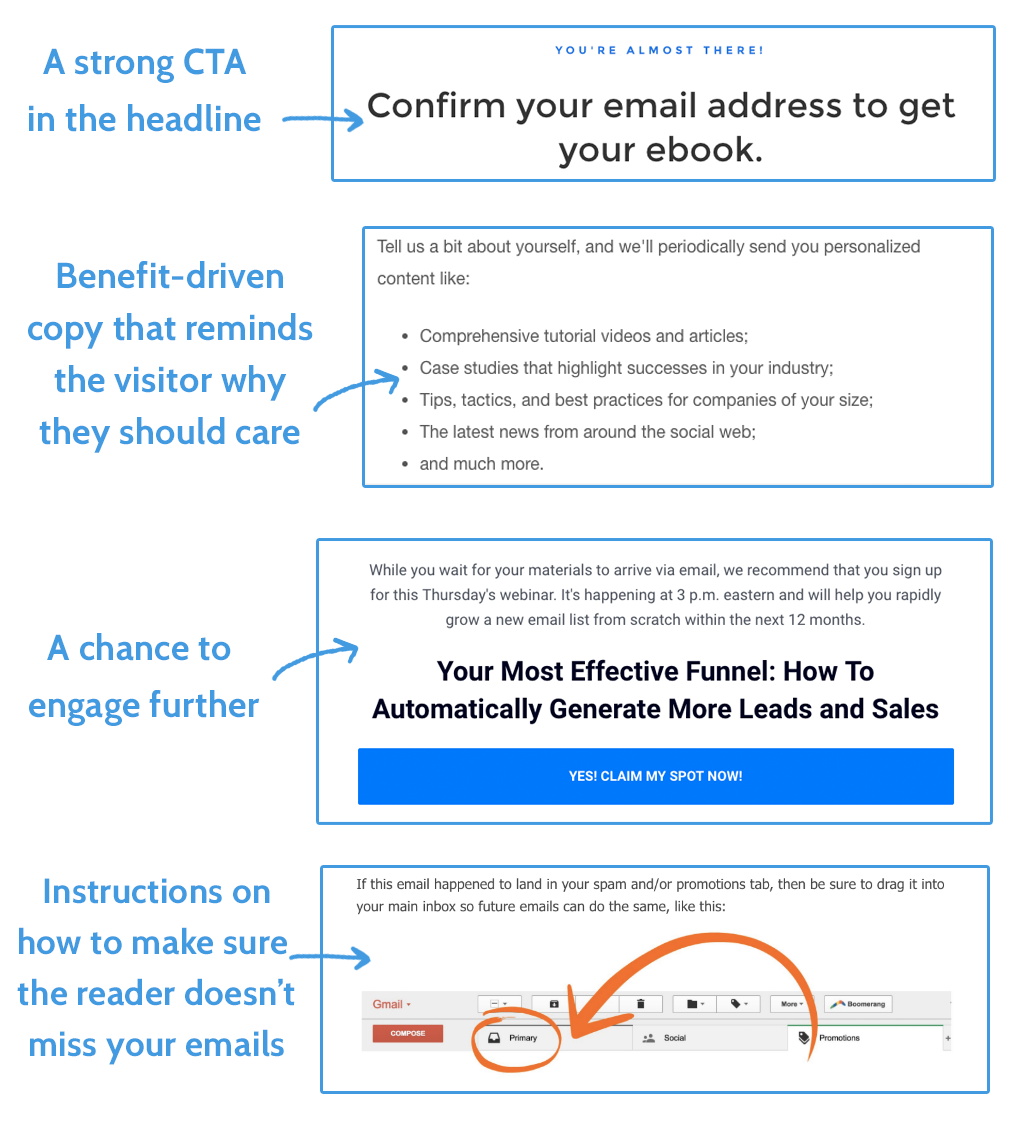
As you’ll see if you look at any savvy marketer’s thank you pages, they don’t just say thank you. They push a secondary objective, and that’s something you need to think about.
Define your thank you page’s secondary objective
Your secondary objective can be anything. From asking the visitor to tweet the opt-in they just came in on (this works especially well for an ebook), to pushing whatever you’re promoting at the moment, whether that’s a podcast or a new product launch.
Here are a few tactics:
Generating referrals
Once you’ve got that initial commitment, research shows that saying yes a second time is easier. Use this opportunity to turn leads into referrals by asking them to invite 3 friends to try whatever they just opted into. You can even offer bonus content for their trouble.
Connect with your leads on social media
Like I was saying before about gradual commitment, you can use this opportunity to connect with them while they feel happy to have gained something from you. It’s as easy as putting a few social buttons there. Like on Facebook, Follow on Twitter, or focus on whatever you’re trying to push for at the moment.
Share the opt-in they just used
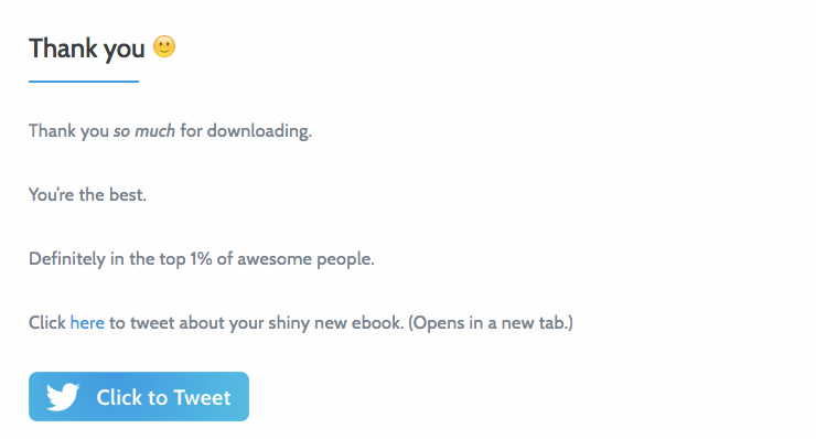
When we launched our business process automation ebook, we put a ‘click to tweet’ on the thank you page, which drove a bit of social traffic back and converted those visitors to new emails on our list. 🙂
Promote your latest product (ebook, podcast, etc)
Once you set your thank you page, that’s not it forever. You can use it to leverage traffic elsewhere, especially if you’ve got one thank you page which is fed by every opt-in on your site.
Use the opportunity to promote your new product. Whether it’s an ebook or a new podcast, you can use a section of your page to drive traffic elsewhere, perhaps again using bonus content as another incentive. Taking visitors on a journey of constant rewards is a powerful technique, as we’ve seen from video games.
What’s your visitor’s mindset by the time they reach your thank you page?
Even though you’re thanking them, they’re the ones that are grateful for the offer. Whether that’s bonus content or being part of your awesome email list, if you’re thanking them for something it’s because they think you have value to offer.
By the time your visitor hits that thank you page, they’ve already built up momentum.
If the next page they see if a dead end or looks like it has been cobbled together with off-brand graphics and other such nonsense, the spell will be broken.
So…
You need to use your thank you page to keep the momentum going
Like I said, when a visitor converts in some way, they’ve got momentum. Their journey probably looks something like this:
Google search —> Your blog post —> Your opt-in box —> Thank you page —> Confirming email —> Low lifetime engagement 🙁
What you want it to look like is this:
Google search —> Your blog post —> Your opt-in box —> Thank you page —> Confirming email —> Moving email out of their Promotions box —> Replying to the email —> Reading more content —> Engaging with you on other platforms / Reading more content / Commenting, etc. 🙂
Can you see where the roadblock is? The thank you page.
Let’s take a look at an awesome thank you page I stumbled upon today that keeps the momentum up and encourages future engagement.
Entrepreneur on Fire’s excellent thank you page
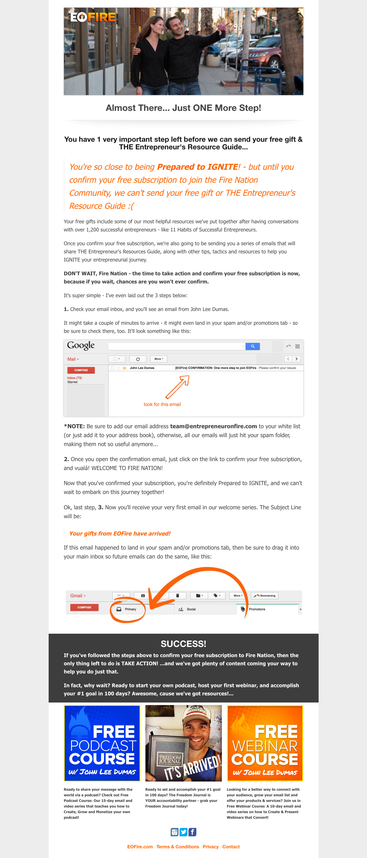
Now we’ve seen a best-in-class example, let’s break it down bit by bit.
The anatomy of an engaging thank you page
Why does this thank you page work well? It has several key elements that correspond quite closely to what makes up a good landing page. Namely:
- A clear call to action (CTA)
- Headline & subheading
- Emphasis on simplicity
- Tangible benefits
- Social proof
However, there are definitely some elements that are more common on thank you pages:
- A feeling that this page is just one part of a bigger process
- Language not optimized towards signing up, but promoting engagement
- Social media icons
Let’s look more closely at these elements and some excerpts from various thank you pages.
Thank you page element #1: A clear CTA
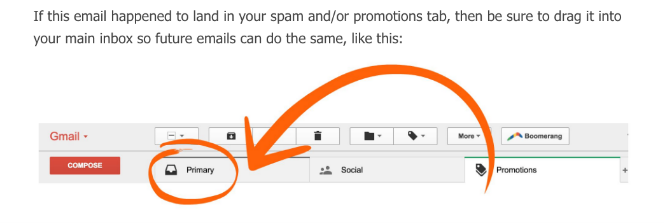
What do you want your new subscriber to do now they’ve given you their email? In almost all cases, you’re going to want to make sure they confirm their email address and unbundle it from their promotions tab.
As you can see, EOFire’s page does exactly that. The instructions for both actions are clearly laid out, step-by-step, to ensure visitors don’t get confused.
If your main aim is to make sure that your marketing emails don’t get swept under the rug, then having them appear next to emails from the recipient’s mum is easily the best way to do it.
Side note: There’s a much easier way to get out of the ‘Promotions’ tab. Get the reader to ‘star’ the email.
Here’s the CTA from the EOfire thank you page:
Thank you page element #2: Compelling headings
What do you think the headings of a thank you page should look like? Something like this?

NOPE!
And I’ll tell you why that’s terrible: it ends the conversation. Thank you for signing up. Quit off this page and go to your inbox.
After seeing this copy, there’s no reason for a visitor to have anything else to do with your site. You’ve lost your chance to keep up the momentum, increase the time they spend on the page and further build engagement.
Instead, go for something like this:

This is a thank you page, no doubt about that. But, as you can see by comparing Smart Passive Income’s page above with EOFire’s, they seem to treat it as an ‘Almost there’ page.
You’re not terminating the conversation with a ‘thank you’, but providing a milestone for your visitor and making sure they know there’s still more to do.
Thank you page element #3: Benefit-driven copy
As much as we’d like to think otherwise, visitors don’t always stick to the path you’ve laid out for them. They probably have a billion other tabs open and flick between them during loading times.
For that reason, you need to make sure your thank you page hits the following criteria:
- It uses the same design language as the rest of your site
- It explains why they should bother confirming
- It makes a promise for the future
This might seem like a lot to take in for such a simple page, but it’s important that you get your visitors to take the next step. The copy on your opt-in popup might’ve been persuasive as hell, but putting in your email address is arguably less work than going into your inbox and confirming the subscription, so you should pay just as much — if not more — attention to the next bit of copy.
Here’s an example of ProBlogger‘s thank you page which does a great job of reiterating the benefits:
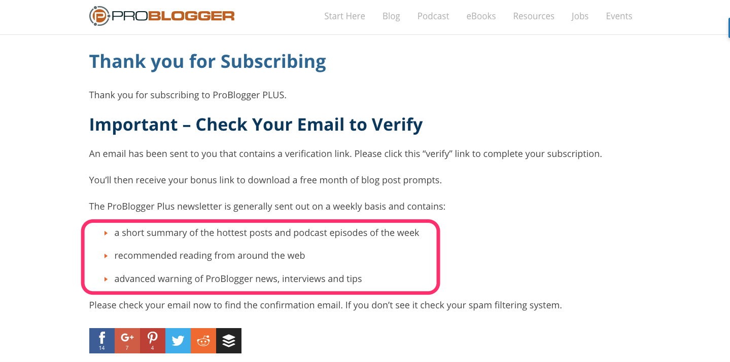
So, to recap, you should tell the visitor:
- WHAT they need to do (verify their email)
- WHY they should do it (a bunch of benefits)
Thank you page element #4: Building engagement in the future
I don’t think that getting the user to confirm their email is the only thing you should do with your thank you page. Like empty states and 404 pages, they can be used to engage the user even though they’ve just hit a logical endpoint.
So, instead of letting your user bounce, give them something else to do. It could be as simple as showing them a list of your popular blog posts, or even a CTA to attend a webinar, like this example from Leadpages:
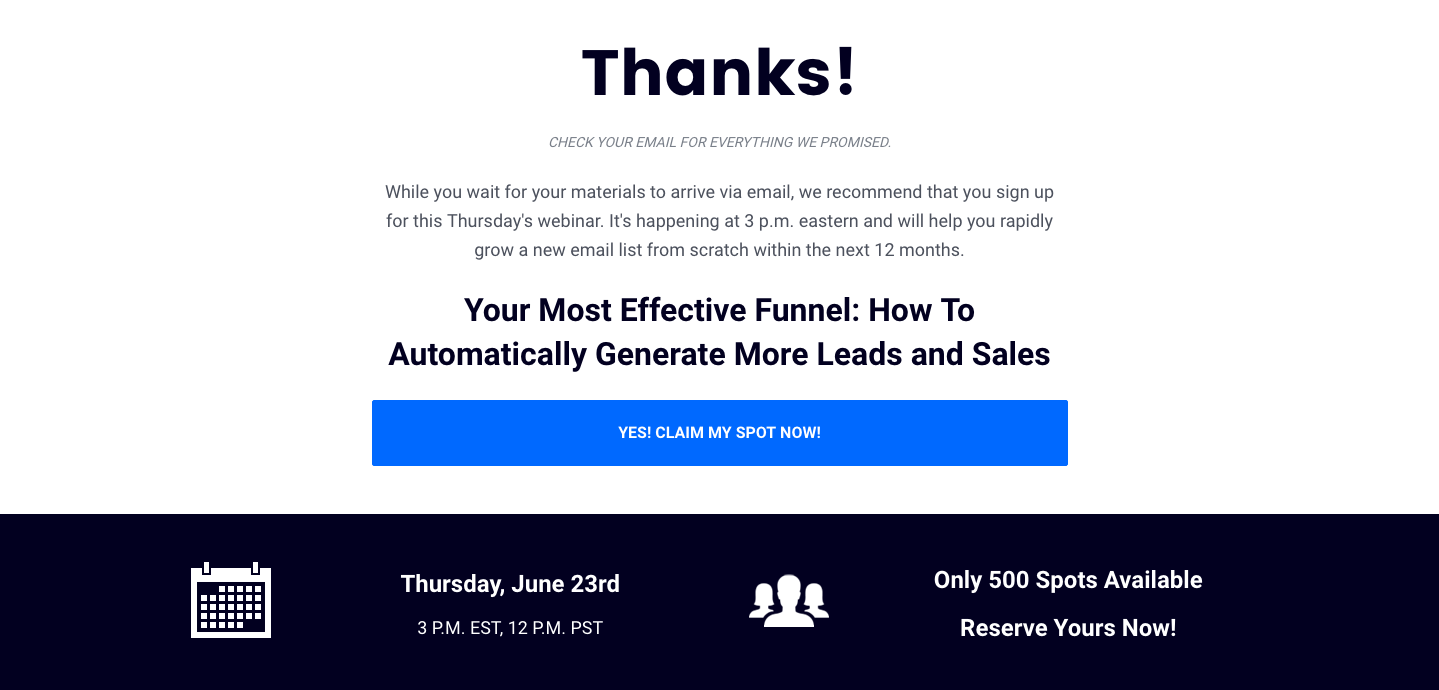
Cheeky. But it does work. Your visitors are excited about your content, so they’re greedy for more. Don’t let that excitement die down — make another ‘ask’ in the heat of the moment.
Treat thank you pages as opportunities, not end points
Seeing thank you pages as another stage — not the end — of the customer journey is what I’m trying to get at here. I hope this has helped you in designing or optimizing your thank you page. Leave your examples in the comments, I’d love to see them. 🙂
