

Turn every policy into automated workflows with built-in enforcement and audit-ready proof.



Operations Dashboard
An operations dashboard is a single live view of the work, metrics, and exceptions that keep a business running. It pulls status from the processes a team runs every day and shows, at a glance, what is on track, what is late, and what needs a decision now.
Where a report tells you what happened last month, an operations dashboard tells you what is happening right now. It is built for action: spot the stalled order, the overdue onboarding, the approval nobody has signed, and route it to the right person before it becomes a customer problem.
This guide explains what an operations dashboard is, how it differs from strategic and analytical dashboards, which operational metrics and KPIs belong on one, and how to build a dashboard that reflects real execution instead of stale spreadsheets. It is written for operations leaders, team managers, and anyone responsible for work getting done on time.
In this article, we are going to cover:
- What is an operations dashboard?
- Operational vs. strategic and analytical dashboards
- Why teams need an operations dashboard
- Operational metrics and KPIs to put on an operations dashboard
- How to build an operations dashboard
- Operations dashboard best practices
- Operations dashboard examples by team
- FAQs
What is an operations dashboard?
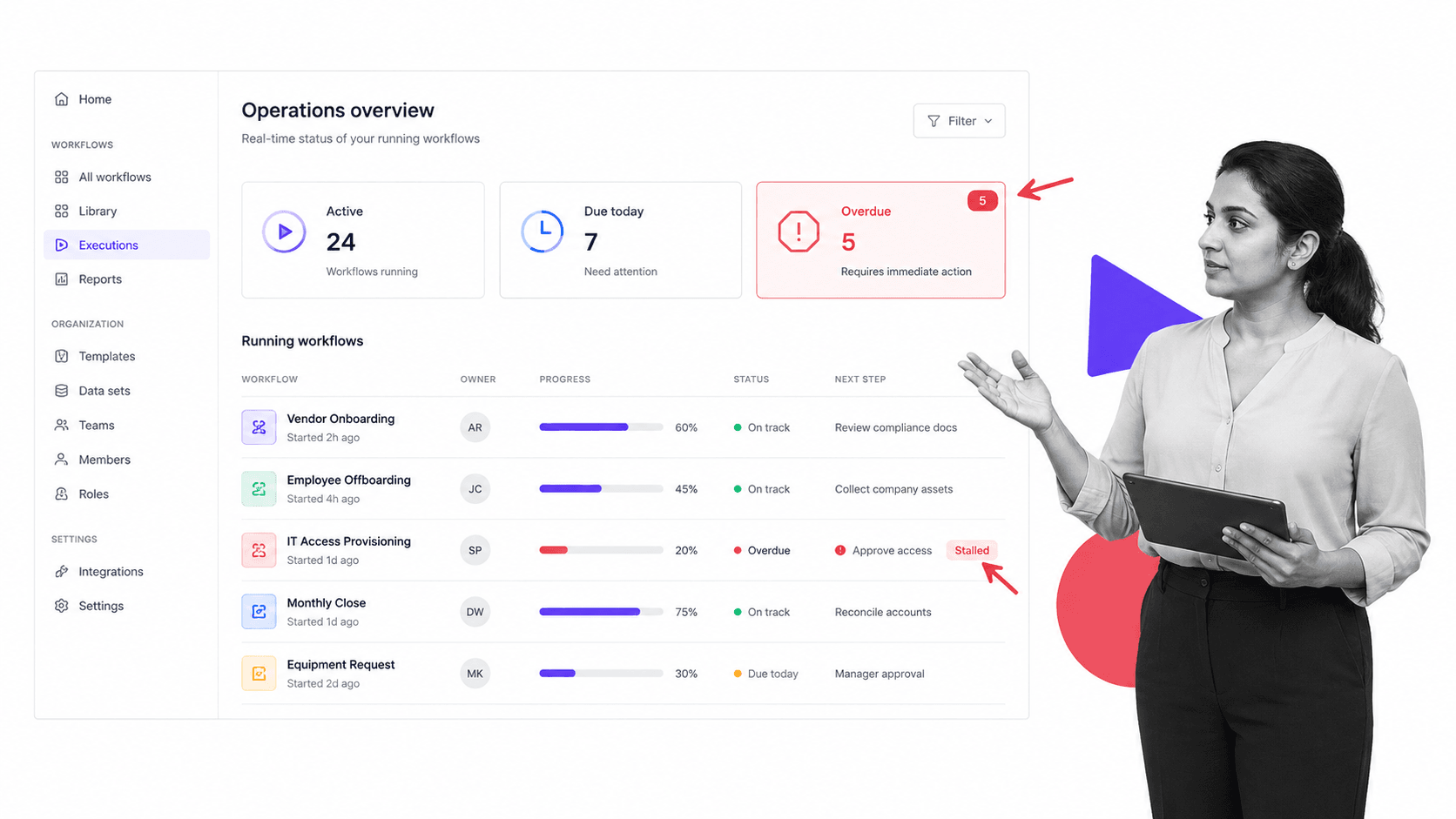
An operations dashboard is a real-time monitoring surface that consolidates the signals from a team’s day-to-day work into one screen. Instead of checking five tools, a spreadsheet, and a chat channel to understand where things stand, a manager opens one view and sees the current state of operations.
The data behind it comes from the processes the team actually runs. When work is structured as a what a workflow is, each run produces status: which step is active, who owns it, when it is due, and whether it is blocked. An operations dashboard reads that live status and turns it into tiles, counts, and lists a person can scan in seconds.
Three properties separate an operations dashboard from a static report:
- Real time: it refreshes as work moves, not once a month. The number you see is the number right now.
- Operational granularity: it shows individual runs, tasks, owners, and due dates, not just rolled-up totals.
- Built for response: exceptions are visible and actionable, so a stalled item can be reassigned or escalated immediately.
Because the dashboard is only as trustworthy as the execution beneath it, the strongest operations dashboards sit on top of a workflow management system rather than on manual status updates. When people update work in the same place they do the work, the dashboard stays accurate without anyone maintaining a separate tracker.
Operational vs. strategic and analytical dashboards
The word dashboard covers several different tools with different jobs. Confusing them is the most common reason a dashboard fails to get used. It helps to separate three types.
Operational dashboards
Operational dashboards monitor current activity and are refreshed constantly. They answer the question, what is happening right now, and who needs to act. Their audience is frontline teams and the managers who run daily execution. A support queue view, a fulfilment board, and a live onboarding tracker are all operational dashboards.
Strategic dashboards
Strategic dashboards track progress toward long-range goals for executives and leadership. They update weekly or monthly, summarize performance at a high level, and are designed for review meetings rather than minute-to-minute response. Think quarterly targets, growth trends, and department scorecards.
Analytical dashboards
Analytical dashboards support investigation. They let an analyst slice historical data, compare segments, and find the cause behind a trend. They favor depth and flexibility over speed, and they are used to answer why something happened rather than to trigger immediate action.
An operations dashboard is firmly the first type. It is optimized for freshness, granularity, and response, which is why it usually lives next to the workflows that generate the work rather than in a separate business intelligence tool. General-purpose reporting suites such as KPI dashboards can render any of the three, so the type is defined by how the view is used, not by the software it is built in.
Most teams end up running all three side by side. The operations dashboard drives the day, the strategic dashboard frames the quarter, and the analytical dashboard is opened when a number moves and someone needs to understand why. Problems start when a team tries to make one view do all three jobs: a screen crammed with historical trend analysis is too slow to act on, and a screen tuned for real-time response is too shallow to explain a root cause.
Why teams need an operations dashboard
Teams adopt an operations dashboard when scattered status stops being good enough. As soon as work crosses more than a couple of people or systems, no single person can hold the true state of operations in their head, and the cost of a missed handoff rises.
The problems an operations dashboard solves:
- Blind spots: work sits in inboxes, chats, and spreadsheets where nobody can see the whole picture until something breaks.
- Missed handoffs: a task finishes but the next owner does not know it is their turn, so the work stalls silently.
- Reactive firefighting: problems surface from angry customers instead of from an early warning on a screen.
- No shared truth: two people quote two different numbers because each is reading a different tracker.
A good dashboard replaces status meetings with a glance. When task automation moves work forward and the dashboard reflects it live, the standing update call gets shorter because everyone already sees the same reality. The conversation shifts from what is the status to what should we do about the two items that are red.
The payoff compounds when the dashboard is tied to enforced execution. If a process requires approvals before an order ships, the dashboard can surface every order waiting on a sign-off, so the bottleneck is visible the moment it forms rather than at the end of the week.
There is a cultural benefit too. When the same live view is visible to everyone, accountability stops being about who to blame and starts being about which item to move next. People can see their own work in context, spot when a teammate is buried, and pick up a stalled task without waiting to be asked. A shared operations dashboard turns status from a thing managers chase into a thing the whole team reads together.
Operational metrics and KPIs to put on an operations dashboard
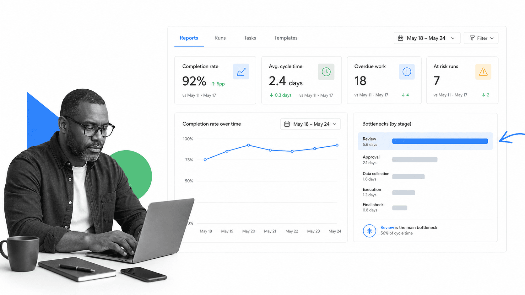
The metrics on an operations dashboard should map to decisions a team can make today, not to vanity numbers. Good operational KPIs are specific, current, and owned. The list below is a starting set; adapt it to your work, and use references such as operational KPI dashboard guidelines and operational metrics and KPIs to pressure-test your choices.
Throughput and volume
How much work is moving through the system: items started, items completed, and work in progress. A sudden drop in completions or a spike in work in progress usually signals a jam somewhere downstream.
Cycle time and on-time rate
How long work takes from start to finish, and how often it lands by its due date. Rising cycle time is an early warning that capacity or a specific step is under strain. Tracking on-time rate keeps the team honest about commitments to customers.
Overdue and aging work
The count of items past due and how long they have been stuck. Aging work is where customer problems are born, so a dedicated overdue tile is one of the highest-value elements on any operations dashboard.
Bottlenecks by stage
Where work piles up. Breaking volume down by step shows which stage is the constraint. Pairing this with operational KPI examples style benchmarking helps a team decide whether a stage is genuinely slow or simply under-resourced.
Quality and rework
How often work has to be redone, returned, or corrected. Rising rework hides inside throughput numbers that otherwise look healthy, so it deserves its own metric. Standard quality and performance terms give teams a shared vocabulary for defect and rework rates, which keeps the definition consistent as more people read the dashboard.
Backlog and workload balance
How much unstarted work is waiting, and how evenly it is spread across the team. A growing backlog on one person while others sit idle is an operational problem a dashboard should make impossible to miss. Watching workload alongside throughput stops a team from celebrating high completion numbers while quietly burning out the person carrying the queue.
A simple rule for choosing metrics: if a number changes and nobody would do anything differently, it does not belong on an operations dashboard. Reserve the screen for signals that drive action.
How to build an operations dashboard
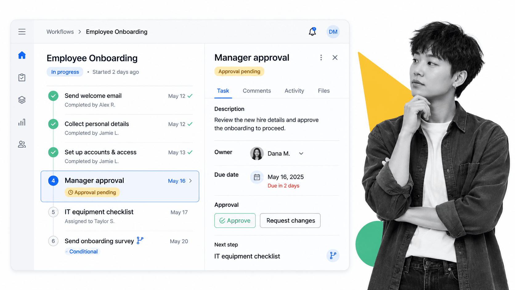
Building an operations dashboard is less about picking a charting tool and more about structuring the work so it produces trustworthy live data. The steps below work regardless of which platform you land on.
1. Structure the work as processes
A dashboard needs a source of truth. Turn recurring work into repeatable processes with clear steps, owners, and due dates. When work runs as a workflow management software flow, every run emits status automatically, so the dashboard has real data to read instead of manual updates. Solid process documentation underneath keeps each step unambiguous.
2. Define the questions the dashboard must answer
Start from decisions, not widgets. Write down the three to five questions the team needs answered every day: What is overdue? Where is work stuck? Who is overloaded? Each question becomes a tile or list on the dashboard.
3. Pick the metrics that answer them
Map each question to one operational metric from the section above. Resist the urge to show everything. A focused operations dashboard with six well-chosen signals beats a wall of forty charts nobody reads.
4. Wire in live status and automation
Connect the dashboard to the systems where work happens so it updates itself. Use task automation to move work forward and conditional logic to route exceptions, so the dashboard reflects real execution rather than someone’s end-of-day summary.
5. Assign owners and exception paths
Every red item needs a name and a next action. Decide in advance who watches which tile and what happens when a threshold is crossed. A dashboard that shows problems but assigns nobody to fix them just spreads anxiety.
A dashboard built this way is not a reporting project that finishes; it is a byproduct of running the work well. Get the underlying processes right and the operations dashboard largely maintains itself, because every status it shows is generated by real execution rather than typed in by hand.
6. Review, prune, and improve
Treat the dashboard as a living product. Every month, remove metrics nobody acts on and add the signal you wished you had during the last fire. The best operations dashboard is the one the team actually opens each morning.
Operations dashboard best practices
A few practices separate an operations dashboard that drives action from one that becomes wallpaper.
- Show exceptions first: put overdue, blocked, and at-risk work at the top. Green can wait; red needs a person.
- Keep it to one screen: if the team has to scroll or drill to understand the state of operations, the dashboard is doing analysis, not monitoring.
- Make every tile owned: a metric with no owner is a metric nobody will act on.
- Prefer live data over manual entry: any number a human has to type will eventually go stale. Read status from the work itself.
- Set thresholds, not just numbers: color and alerts should tell people when a value has crossed the line, not force them to remember what good looks like.
These practices are easier to hold when the dashboard sits on structured execution. Whether the underlying work is customer onboarding, a fulfilment process, or a compliance review, connecting the dashboard to operations management tools that enforce the steps keeps the numbers honest.
Operations dashboard examples by team
Operations dashboards look different for every function, but the pattern is the same: monitor the live work, surface the exceptions, and route them to an owner. The examples below show how the same idea takes a different shape depending on what a team is responsible for, and what a late or blocked item costs when nobody catches it in time.
Customer operations
A support or success team watches open tickets, response and resolution times, and accounts at risk. Tying the view to a repeatable employee onboarding checklist process means every new customer’s progress is visible, and a stalled onboarding shows up before the customer churns.
Project and delivery operations
Delivery teams track milestones, blocked tasks, and workload across people. A project management template feeding the dashboard keeps timelines and owners current, and pairing it with project management software makes dependencies visible so a slip in one task is caught early.
Compliance and quality operations
Regulated teams monitor overdue reviews, missing evidence, and approvals waiting on a sign-off. Because the dashboard reads from enforced steps and business process documentation, it doubles as an audit trail: proof that each required control actually ran.
Back-office and shared services
Finance, HR, and IT operations watch request queues, aging items, and SLA breaches. A simple task list template standardizes intake so every request lands in the same place and the dashboard can show the full backlog at a glance.
FAQs
What is an operations dashboard?
An operations dashboard is a live view that consolidates the status, metrics, and exceptions from a team’s day-to-day work into one screen. It is refreshed in real time and built for immediate action, so managers can spot late, blocked, or at-risk work and route it to the right owner before it becomes a problem.
What is the difference between an operations dashboard and a KPI report?
A KPI report summarizes what happened over a past period and is usually reviewed on a schedule. An operations dashboard shows what is happening right now at the level of individual runs, tasks, and owners, and it is designed to trigger a decision today rather than to inform a monthly review.
What metrics should an operations dashboard include?
Focus on operational metrics that drive action: throughput and work in progress, cycle time and on-time rate, overdue and aging work, bottlenecks by stage, and quality or rework. A good rule is to include a number only if the team would do something differently when it changes.
How do you build an operations dashboard?
Structure recurring work as processes with owners and due dates so it produces live status, define the three to five questions the dashboard must answer each day, map each question to one metric, wire in live data and automation, assign an owner and exception path to every signal, then prune the dashboard monthly.
What is the difference between operational, strategic, and analytical dashboards?
Operational dashboards monitor current activity and refresh constantly for frontline response. Strategic dashboards track progress toward long-range goals for leadership and update weekly or monthly. Analytical dashboards support deep investigation into historical data to explain why a trend occurred.
Do you need special software to run an operations dashboard?
You need a reliable source of live status more than a specific charting tool. When recurring work runs on a workflow or operations platform, each run emits status automatically, so the dashboard stays accurate without manual updates. Many teams surface the view directly from the same platform that runs the work.