


Turn every policy into automated workflows with built-in enforcement and audit-ready proof.



Workflow Visualization Tools
Workflow visualization tools turn a process into a picture, so a team can see how work moves from the first request to the final result. Instead of describing a process in paragraphs, these tools show the steps, owners, decisions, handoffs, and outcomes as connected shapes on a shared canvas.
A clear visual answers questions that text rarely settles. Where does work start, who touches it next, which decision changes the path, where does it wait, and how do you know it finished correctly. When a process is only written down or held in memory, those answers stay hidden until something breaks.
This guide explains what workflow visualization tools are, the main diagram types, the capabilities that matter, how the tools work, where they create value, and how to choose one that connects the picture of work to real execution and proof.
In this article, we are going to cover:
- What workflow visualization tools are
- Types of workflow visualizations
- Core capabilities in workflow visualization tools
- How workflow visualization tools work
- Where workflow visualization delivers value
- How Process Street turns visualization into execution
- How to choose and implement workflow visualization tools
- FAQs
What workflow visualization tools are
Workflow visualization tools are platforms that map a process as a connected diagram. They let a team draw the sequence of steps, mark who is responsible, show the decisions that change the route, and highlight the points where work moves between people or systems.
The idea builds on something simple. Once you understand what a workflow is, the next question is how to see it. A written procedure lists steps in order, but it hides parallel work, exceptions, and the moments where a process stalls. A visual makes those patterns obvious at a glance.
A picture of the work, not just a list
A list says step three follows step two. A visual shows that step two splits into two paths, that one path needs an approval, and that a rejected item loops back to the submitter. That structure is hard to feel in prose and easy to read on a map.
This is why teams often move from a plain document to a diagram when a process grows. The map exposes the shape of the work: the long waits, the repeated handoffs, the steps that only one person understands, and the decisions with no clear owner.
Visualization is the first half of the job
Drawing the process is valuable, but a picture alone does not run anything. The strongest tools connect the visual to execution, so the same map that describes the work also drives it. That connection is what separates a drawing tool from a workflow management system that actually operates the process.
For that reason, this guide treats visualization as the starting point of a larger operating loop. First you see the process. Then you run it. Then you use what you learned to improve the next version.
Types of workflow visualizations
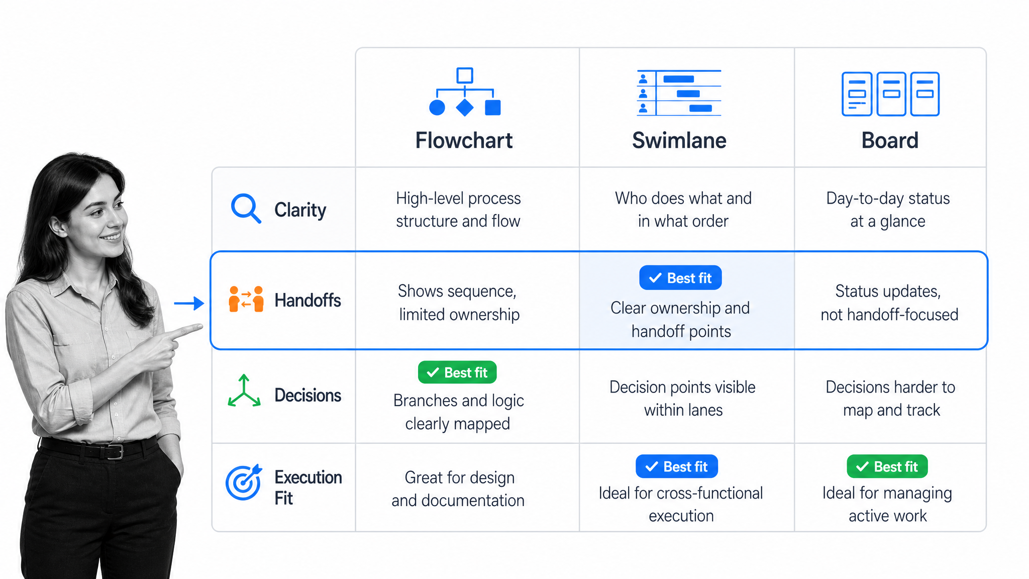
Not every process needs the same kind of picture. The right visualization depends on what you are trying to see: the sequence, the handoffs, or the current state of live work. A few formats cover most business needs.
Flowcharts
A flowchart shows steps as boxes and decisions as diamonds, connected by arrows. It is the most familiar format and works well for a single process with a clear beginning, middle, and end. Flowcharts are strongest when the goal is to agree on the sequence and the decision points.
Swimlane diagrams
A swimlane diagram places each role or team in its own lane, then routes the process across lanes as work changes hands. This format is built to expose handoffs, which is where recurring work most often breaks. When you can see how many times a request crosses a lane, you can see where delay and confusion accumulate.
BPMN process models
Business Process Model and Notation is a formal standard for diagramming processes. The BPMN specification defines a shared set of symbols for events, tasks, gateways, and flows, so a model means the same thing to everyone who reads it. BPMN is useful when a process is complex, cross-functional, or needs to be understood the same way by analysts, operators, and auditors.
Kanban and status boards
A board shows work as cards moving through columns such as to do, in progress, and done. Unlike a flowchart, a board visualizes the current state of live work rather than the abstract design of the process. Boards are strongest for seeing what is in flight, where the backlog is building, and which items are stuck.
Value stream and process maps
A value stream map or a broader process map captures the end-to-end flow, including the wait time between steps. These views help a team separate the time spent doing work from the time work spends waiting. Pairing a map with solid process documentation keeps the picture and the written detail in sync.
Most teams do not need every format. Choose the view that answers your current question. Use a flowchart to agree on the sequence, a swimlane to expose handoffs, a board to track live work, and a formal model when the process must be precise and shared widely.
Core capabilities in workflow visualization tools
Feature lists look similar across workflow visualization tools. The practical test is whether the tool helps you understand the process, keep the picture accurate over time, and connect that picture to how the work actually runs.
An easy, flexible canvas
A non-technical owner should be able to build and edit the diagram without special training. Look for drag-and-drop shapes, clean connectors, reusable templates, and the ability to reshape a process quickly as it changes. If editing the map is painful, the map will drift out of date and stop being trusted.
Roles, handoffs, and decision points
The tool should make ownership visible. Every step needs a responsible role, every handoff should be clear, and every decision should show its branches. A diagram that hides who does what is a pretty picture, not an operating tool.
A shared, current source of truth
Processes change, so a static export goes stale fast. The visualization should live where the team works, support comments and versioning, and stay linked to the underlying business process documentation. A current shared map beats a polished diagram that only one person can edit.
From diagram to execution
The highest-value capability is the bridge from picture to practice. A drawing describes the work, but the same structure should be able to run it with assigned tasks, forms, required fields, and conditions. The Process Street documentation for conditional logic shows how the branches in a diagram can become real routing in a live run.
Control, evidence, and history
For work that carries risk, the tool should support more than arrows. Built-in approval tasks keep review decisions inside the process, and a record of what happened supports compliance as proof of control. A visualization that also captures evidence is far more useful during an audit than a diagram no one updated.
AI assistance with guardrails
AI can help draft a first diagram, summarize a messy process, or suggest where a workflow could be simplified. High-impact changes still need oversight. The NIST AI Risk Management Framework is a useful reference when you decide how much review an AI-assisted process change should require.
How workflow visualization tools work
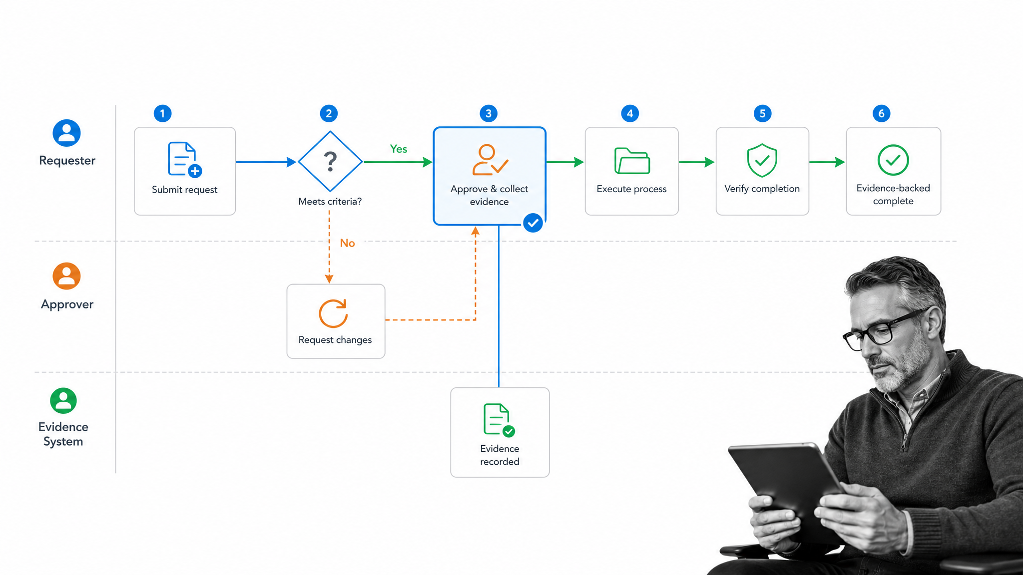
Workflow visualization tools work by separating the design of a process from each live run of it. The diagram holds the standard path, the roles, and the decision rules. A live run follows that path with a specific request, real decisions, and a record of what happened.
1. Map the standard path
Start by drawing the process as it should run: the trigger, the ordered steps, the roles, and the decisions. This first map is a shared agreement about how the work is supposed to move, not a final answer.
2. Mark decisions and branches
Add the points where the path changes. A low-risk request might follow a short route, while a high-risk one adds review. Marking these branches on the diagram is what turns a straight line into an accurate picture of real work.
3. Expose handoffs and waiting
Use lanes or a value stream view to show where work crosses between people or systems and where it waits. Handoffs and idle time are the usual sources of delay, and they are almost invisible in a written procedure.
4. Connect the map to a live run
The best tools let the diagram drive execution. The steps become assigned tasks, the decisions become conditions, and the process runs the same way each time. That is the moment a picture becomes a working workflow management software process rather than a reference drawing.
5. Capture evidence and outcomes
As the run proceeds, the tool should record who did each step, which branch applied, what was approved, and what was attached. This history is what lets a team answer questions later without reconstructing the process from memory.
6. Improve the next version
Run data feeds the next diagram. Bottlenecks, rework, and frequent exceptions show where the map is wrong or the process is weak. Teams can sketch the improved version with a business process analysis template or model it formally with a business process flow before rolling out the change.
Where workflow visualization delivers value
Workflow visualization pays off most when a process is repeatable, crosses more than one role or system, and hurts when a step is missed. A few common areas show the value quickly.
Onboarding and cross-team processes
An employee onboarding checklist touches HR, IT, finance, and a manager. A swimlane view exposes every handoff and makes it obvious where a new hire waits on access, equipment, or approvals that no one clearly owns.
Operations and service delivery
Recurring operational work benefits from a shared map that everyone follows. Visualizing these flows alongside the right operations management tools helps a team spot the steps that create delay and the ones that add no value. The Atlassian workflow automation guide is a useful reference for turning a mapped flow into automated actions once the sequence is clear.
Compliance and audit readiness
A clear process map plus a record of each run is a strong foundation for audits. Reviewers can see the intended path, confirm the controls, and check the evidence that each control was applied, rather than trusting that the process was followed.
Continuous improvement
Visualization turns improvement into a repeatable habit. A process improvement checklist and a current diagram let a team compare the designed process with what actually happens, then remove the steps that only add friction. Wider process automation examples show how a mapped process becomes a candidate for automation once the flow is clear.
How Process Street turns visualization into execution
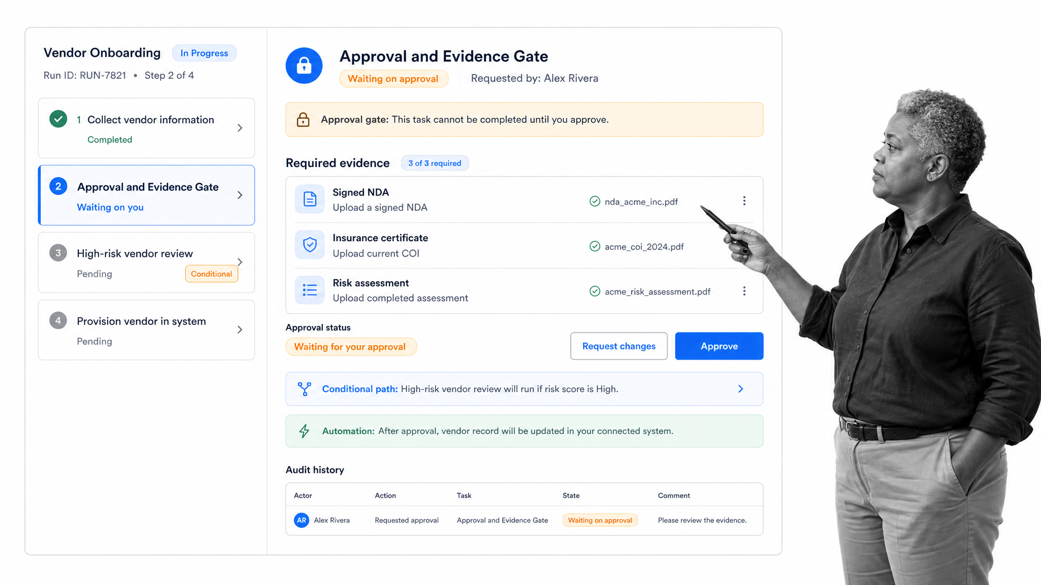
Process Street is a Compliance Operations Platform for recurring work that must run correctly and leave proof. It closes the gap between visualizing a process and running it, so the structure a team draws becomes the workflow they actually execute.
That connection matters because a diagram on its own cannot enforce anything. A map can show an approval gate, but only a live workflow can stop the work until the right person signs off. Process Street carries the map into execution with tasks, forms, conditional routing, approvals, automations, and audit history in one path.
Turn the diagram into a runnable workflow
The steps in the picture become assigned tasks with owners, due dates, instructions, and required fields. The decision points in the diagram become conditions that show or hide work based on the request, so the branch a team drew on the map is the branch the run actually takes.
Enforce the control the picture implies
When a diagram shows a review before a high-risk action, the workflow can require it. Approvals hold the protected step until a reviewer decides, required fields capture the evidence, and nothing advances just because a message was sent or a box was checked out of order.
Connect the operating stack
Process Street has direct, universal integrations to 5,000+ systems. Need a new one? An AI agent builds it on the fly.
Keep the map and the proof together
Every run preserves the task history, form data, comments, attachments, approvals, and outcome. Leaders can inspect the work itself instead of reconstructing it from chat and disconnected logs, which is what makes a mapped process trustworthy rather than merely tidy. Teams can start from a workflow management template and adapt it into a controlled process that matches their own standard.
How to choose and implement workflow visualization tools
Choose workflow visualization tools by testing a real process, not a blank canvas. The right tool should make the process easy to see, easy to keep current, and easy to connect to how the work actually runs.
Map one real process first
Start with a single workflow that matters. Draw the trigger, steps, roles, decisions, handoffs, and outcome, grounded in your existing process documentation. A real process reveals whether a tool can handle branches, exceptions, and ownership, which a tidy sample never tests.
Decide how much rigor you need
A simple team routine may only need a flowchart. A cross-functional or regulated process may need a formal model and the discipline described in the IBM business process management overview. Match the notation to the stakes rather than defaulting to the most complex option.
Check the path from picture to execution
Ask whether the diagram can become a live run without rebuilding it in another system. A tool that only exports a static image leaves a gap between the map and the work. A platform that connects the two turns the picture into process automation you can actually operate.
Test control before convenience
Confirm that the tool can require a step, hold an approval, and capture evidence when the process demands it. A fast, pretty diagram that cannot enforce a control is a downgrade for any process where a missed step creates real risk.
Plan for a living map
Name the owner of each workflow, decide how often the map is reviewed, and keep it beside a business process management software record so the picture stays current. A diagram no one maintains becomes misleading, which is worse than no diagram at all.
Measure the operating result
Judge the tool by whether the process improved. Track cycle time, waiting time, missed steps, rework, and how quickly a new teammate can follow the flow. If visualization only produces nicer pictures without changing how work runs, it has not solved the underlying problem.
A good selection process ends with proof from a pilot: the team agreed on the map, the diagram drove a real run, the controls held, and the record explained what happened. That evidence is a stronger buying signal than any feature list.
FAQs
What are workflow visualization tools?
Workflow visualization tools are platforms that map a process as a connected diagram of steps, roles, decisions, and handoffs. The strongest tools go beyond drawing and connect the picture to execution, so the same map that describes the work can also help run it and record what happened.
What is the difference between a flowchart, a swimlane diagram, and a Kanban board?
A flowchart shows the sequence of steps and decisions for one process. A swimlane diagram adds roles or teams as lanes to expose handoffs. A Kanban board shows live work moving through columns, so it visualizes the current state of items in progress rather than the abstract design of the process.
Which workflow visualization tool capabilities matter most?
The capabilities that matter most are an easy and flexible canvas, clear roles and decision points, a shared and current source of truth, a bridge from diagram to execution, and support for approvals, evidence, and history. For risky work, control and proof matter more than cosmetic diagramming.
Who needs workflow visualization tools?
Operations, compliance, HR, finance, IT, customer success, quality, and legal teams often need them. The clearest signal is recurring work that crosses more than one role or system and becomes painful when a handoff is missed or a step is skipped.
How does workflow visualization support compliance and audits?
A clear process map shows the intended path and the controls, and a record of each run shows that the controls were applied. Together they let reviewers confirm the process was followed with evidence, instead of trusting that it happened.
How should you choose a workflow visualization tool?
Map one real process first, decide how much rigor the work needs, and confirm the tool can connect the diagram to a live run with controls and evidence. Then pilot it end to end and judge it by whether the process became faster, clearer, and easier to trust.