


Turn every policy into automated workflows with built-in enforcement and audit-ready proof.



Quality Management Tools

Quality management tools are practical methods for defining problems, collecting evidence, understanding variation, identifying causes, prioritizing action, testing relationships, and mapping how work flows. The classic set gives a quality team a shared way to move from a vague concern to a defensible improvement decision.
The seven tools are a cause-and-effect diagram, check sheet, control chart, histogram, Pareto chart, scatter diagram, and flowchart. Some classic lists use stratification or a run chart in the seventh position. The core idea stays the same: make process behavior visible before choosing a corrective action.
This guide explains what each tool is best for, how it works, where it can mislead you, and how to connect analysis to assigned work. It treats the tools as a sequence you can combine, not isolated charts created for a presentation.
In this article, you will learn:
- What are quality management tools?
- Quality management tools at a glance
- 1. Cause-and-effect diagram
- 2. Check sheet
- 3. Control chart
- 4. Histogram
- 5. Pareto chart
- 6. Scatter diagram
- 7. Flowchart
- How to choose quality management tools
- How to operationalize quality management tools
- FAQs
What are quality management tools?
The American Society for Quality definition describes a quality tool as an instrument or technique that supports quality management and improvement. That broad definition matters because a tool can be a paper tally sheet, a statistical chart, a process map, or a digital workflow. The format is secondary. The analytical job is primary.
The seven basic quality tools
ASQ identifies the classic seven as the cause-and-effect diagram, check sheet, control chart, histogram, Pareto chart, scatter diagram, and stratification, with flowcharts or run charts often used in updated versions. These seven basic quality tools cover the most common needs in frontline quality work: cause discovery, structured collection, stability monitoring, distribution analysis, prioritization, relationship testing, and process understanding.
Analysis is only the first half
A diagram does not improve a process by itself. Improvement happens when the finding becomes a decision, the decision becomes an assigned action, the action changes the operating process, and the team checks whether the result stayed better. That closed loop is where quality management moves from analysis into control.
A broader quality management system connects objectives, documented procedures, responsibilities, measures, audits, and improvement. The tools on this page help teams reason inside that system.
Quality management tools at a glance
Use this comparison as a diagnostic starting point. Choose the tool that matches the question you need to answer, then combine it with another tool when the problem moves from observation to cause, priority, or process change.
| Tool | Best for | Standout feature | Pricing |
|---|---|---|---|
| Cause-and-effect diagram | Organizing possible causes of a defined problem | Branches group causes around one observed effect | Free method; template or software optional |
| Check sheet | Collecting consistent occurrence data at the source | A structured tally surface makes patterns countable | Free method; template or software optional |
| Control chart | Monitoring process behavior over time | A time series with center and control-limit lines | Free method; statistical software optional |
| Histogram | Seeing the shape and spread of measured results | Adjacent frequency bars reveal distribution patterns | Free method; spreadsheet or software optional |
| Pareto chart | Prioritizing the few categories driving most impact | Ranked bars pair frequency with cumulative contribution | Free method; spreadsheet or software optional |
| Scatter diagram | Testing whether two measured variables move together | Paired observations reveal the direction and strength of a relationship | Free method; spreadsheet or software optional |
| Flowchart | Making process steps, decisions, loops, and handoffs visible | A connected process map exposes rework and control gaps | Free method; mapping software optional |
1. Cause-and-effect diagram
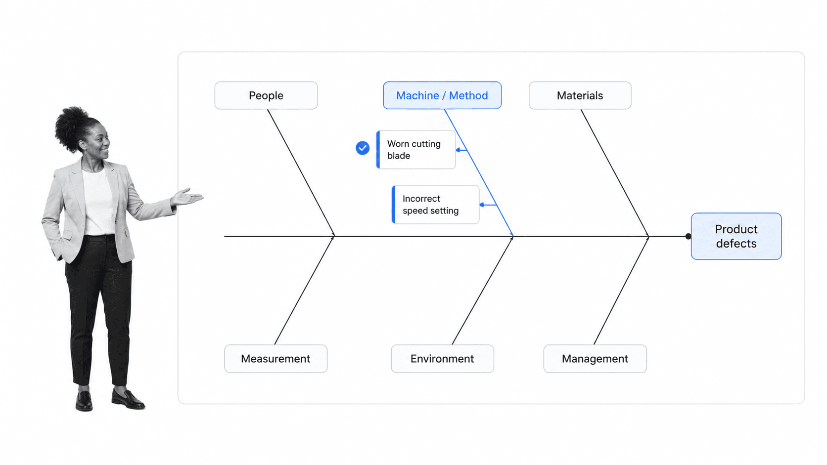
Best for: Organizing possible causes of a defined problem.
A cause-and-effect diagram, also called a fishbone or Ishikawa diagram, organizes possible causes around a clearly stated effect. Teams typically group causes into categories, then keep branching until each idea is specific enough to investigate with evidence.
When to use a cause-and-effect diagram
Use it early in an investigation when people have different theories about why a defect, delay, complaint, or control failure occurs. It creates a shared map of hypotheses without pretending that brainstorming has already proven the cause.
Limits of a cause-and-effect diagram
Its limitation is confirmation bias. A clean branch can look persuasive even when the underlying cause has not been tested. Follow the diagram with a check sheet, scatter diagram, experiment, or direct observation before approving corrective action.
A fishbone root cause analysis workflow keeps problem definition, cause categories, evidence checks, approvals, corrective action, and follow-up in one record. A broader root cause analysis template supports investigations that combine several techniques.
2. Check sheet
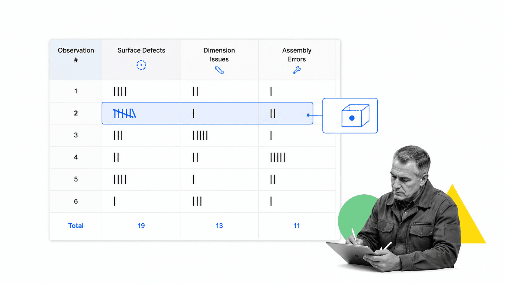
Best for: Collecting consistent occurrence data at the source.
A check sheet is a structured data-collection form used to record occurrences consistently at the point where work happens. It is not simply a checklist of tasks. Its purpose is to create countable observations by category, location, time, source, or defect type.
When to use a check sheet
Use one when the team is arguing from anecdotes or when data arrives in inconsistent notes. Define the observation unit, categories, time window, sampling rule, and recorder instructions before collection begins. The surface should be simple enough to use during real work.
Limits of a check sheet
The main risk is collecting biased or incomparable data. If shifts, teams, products, or inspectors use different definitions, the totals will not support a reliable conclusion. Pilot the sheet, review ambiguous categories, and train recorders on the same operational definition.
The ASQ check sheet reference emphasizes structured data collection. A digital form can add required fields, ownership, and timestamps while keeping the observation surface simple.
3. Control chart
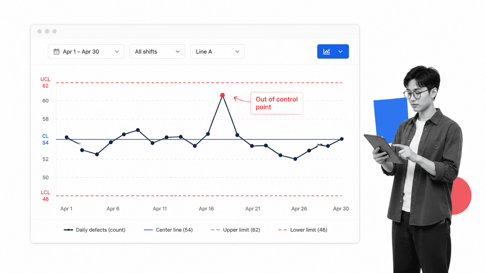
Best for: Monitoring process behavior over time.
A control chart places process results in time order with a center line and calculated upper and lower control limits. Its job is to distinguish routine process variation from signals that suggest a special cause may have entered the system.
When to use a control chart
Use it for a process that produces repeated measurements or counts over time, such as cycle time, error rate, temperature, yield, response time, or defects per unit. It helps a team avoid reacting to every small movement as if it were a crisis.
Limits of a control chart
A control limit is not the same as a customer specification. A process can be stable and still produce unacceptable results. It can also meet specifications while showing an unstable signal. Interpret the chart with process knowledge and a consistent sampling plan.
Control charts fit the process approach described in the ISO quality management overview: plan work, do it, check outcomes, and act on the findings. The chart makes the checking step disciplined.
4. Histogram
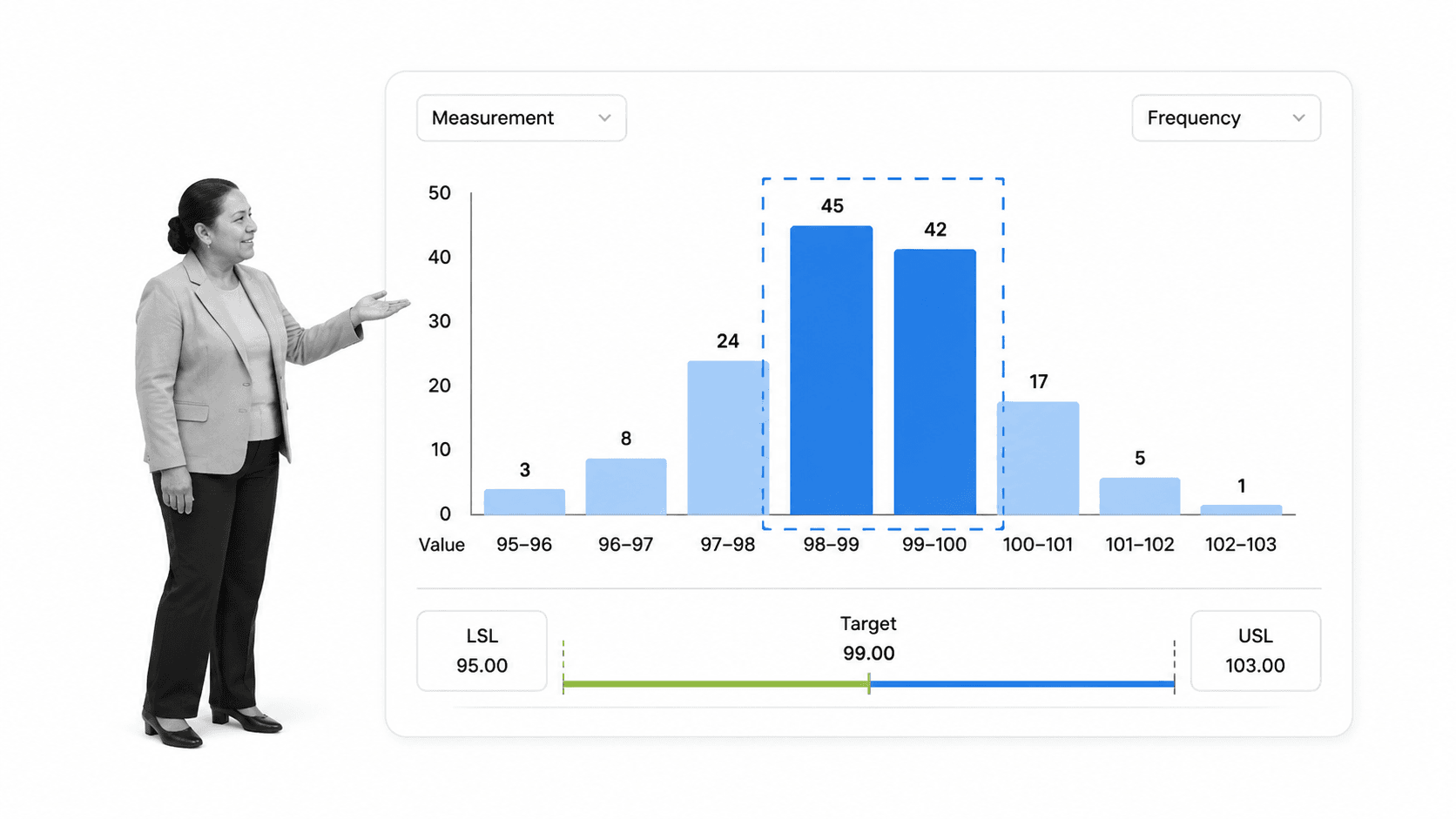
Best for: Seeing the shape and spread of measured results.
A histogram groups numerical observations into adjacent intervals so you can see the distribution’s shape, center, spread, gaps, peaks, and tails. It answers a different question from a run chart because it summarizes frequency rather than preserving time order.
When to use a histogram
Use it after collecting enough comparable measurements. It is useful for spotting skew, multiple populations, wide variation, or a cluster near a specification boundary. Compare the distribution with how the process is supposed to perform, not just with an attractive bell shape.
Limits of a histogram
A histogram can hide sequence. Two shifts may produce the same combined distribution even though one is drifting. Bin width also changes the visual story. Pair the histogram with a control chart, stratification, or separate views by source when timing or subgroup differences matter.
Use a quality management workflow to connect measurement design, quality controls, analysis, approval, improvement planning, and periodic review.
5. Pareto chart
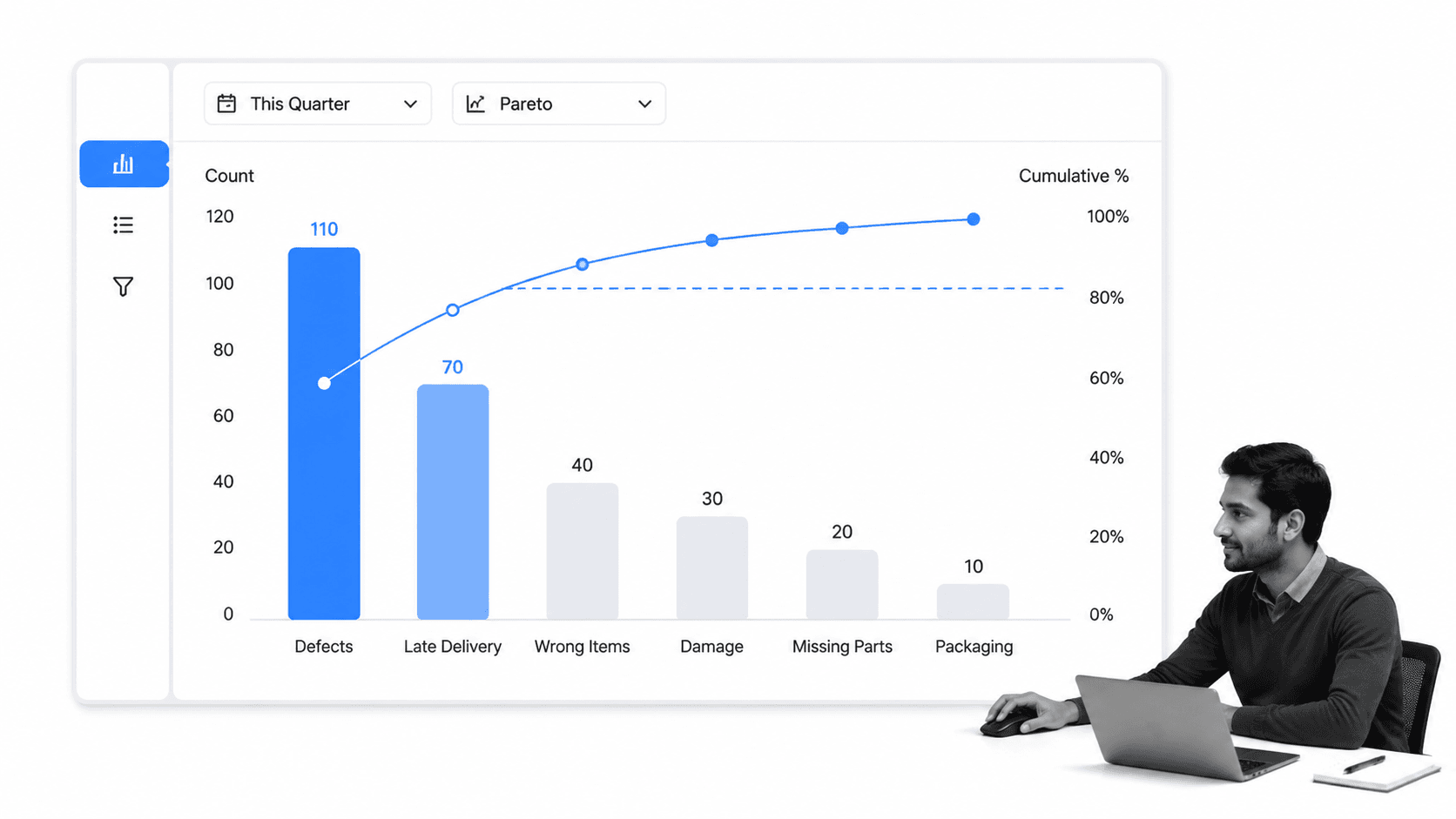
Best for: Prioritizing the few categories driving most impact.
A Pareto chart ranks categories from highest to lowest frequency or impact and adds a cumulative line. It helps a team focus on the small number of categories that account for the largest share of a measured problem.
When to use a pareto chart
Use it when resources are limited and the team must choose where to investigate first. Defect type, complaint reason, rework cause, failure location, or delay category can all work if the categories are mutually understandable and based on comparable data.
Limits of a pareto chart
Do not treat the tallest bar as proof of root cause. It identifies where impact concentrates, not why the problem exists. Low-frequency categories can also carry severe safety or compliance risk. Add severity, cost, or risk context before final prioritization.
Once priorities are chosen, a continuous improvement process assigns solutions, approvals, monitoring, documentation, and the next review cycle.
6. Scatter diagram
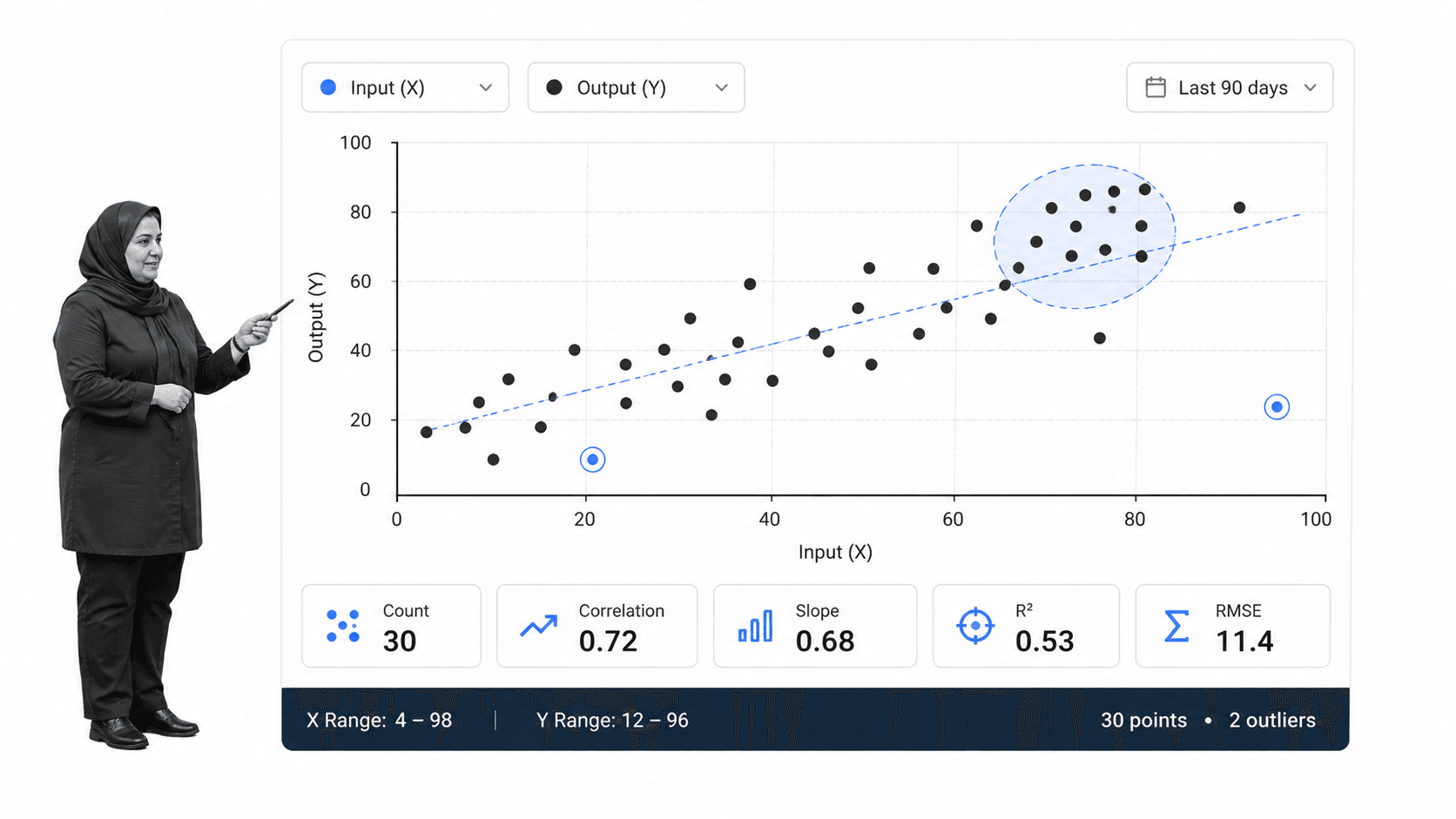
Best for: Testing whether two measured variables move together.
A scatter diagram plots paired observations for two numerical variables. The pattern can suggest a positive relationship, negative relationship, no clear relationship, clusters, thresholds, or unusual points that deserve further investigation.
When to use a scatter diagram
Use it when a plausible input or condition may influence an output, such as training time and error rate, temperature and defect count, workload and response time, or equipment age and failure frequency. Each point must represent a genuinely paired observation.
Limits of a scatter diagram
Correlation does not prove causation. A third variable may drive both measures, the relationship may be nonlinear, or a small sample may exaggerate a pattern. Use the plot to sharpen a hypothesis, then test the mechanism with process knowledge and controlled investigation.
A structured root cause analysis process helps teams test relationships before they commit to a permanent correction.
7. Flowchart
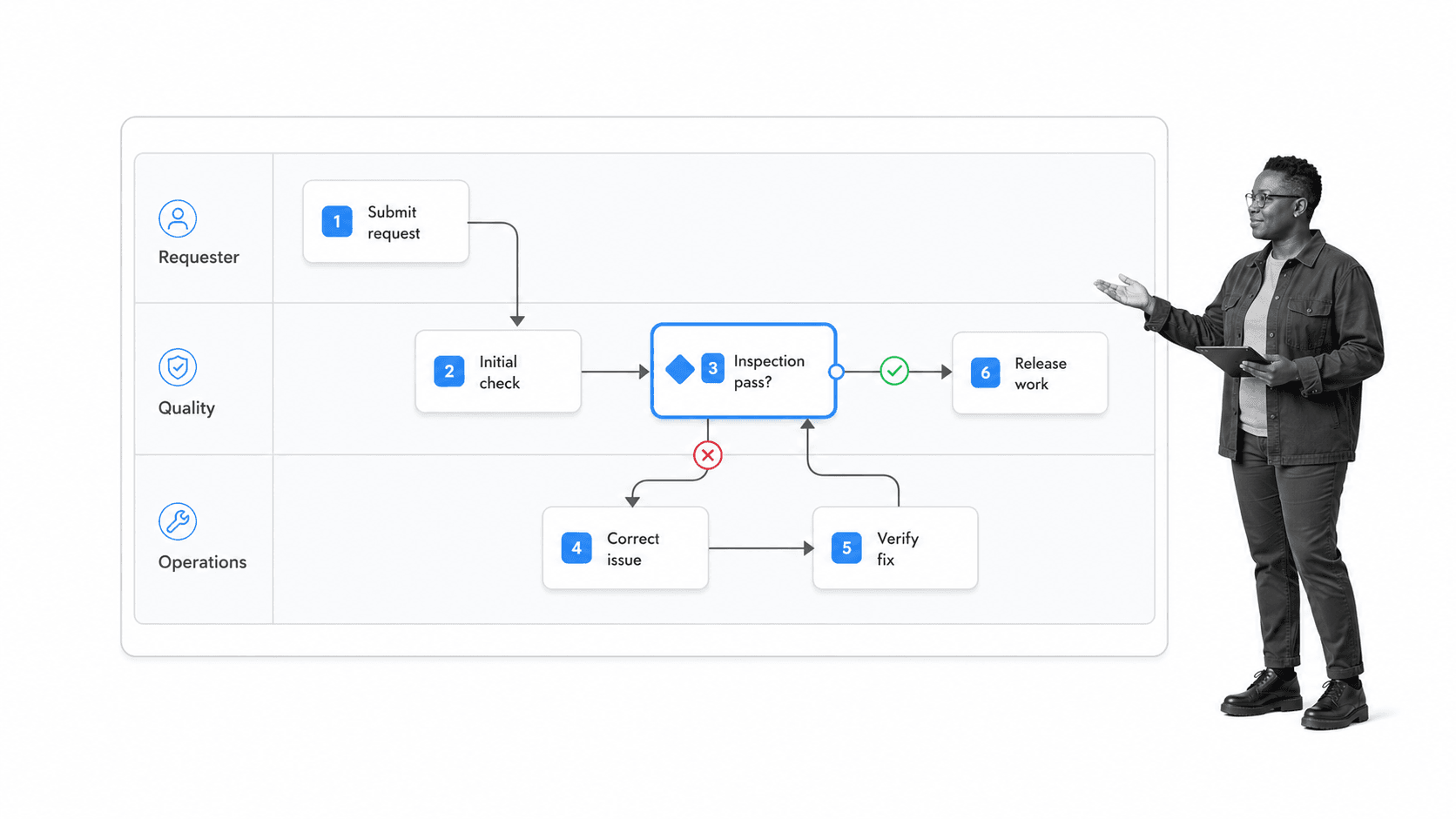
Best for: Making process steps, decisions, loops, and handoffs visible.
A flowchart maps the sequence of work using connected steps, decisions, loops, starts, and endpoints. A swimlane version can also show who owns each action. The map exposes how the process actually moves across people and systems.
When to use a flowchart
Use it when defects or delays may come from handoffs, missing decisions, unclear entry criteria, repeated loops, or unofficial workarounds. Build the current-state flow with the people who run the process, then compare it with the intended procedure.
Limits of a flowchart
A polished map can preserve a bad process. Keep the scope bounded, observe real work, and test whether every decision has clear criteria and ownership. Convert the approved future state into an executable workflow so the map does not drift away from daily practice.
The quality control workflow library provides starting points for inspections, batch reviews, quality plans, and corrective work across different operating contexts.
How to choose quality management tools
Start with the question, not the chart. A clear problem statement prevents teams from reaching for the tool they know best and forcing the evidence into its shape.
- Use a cause-and-effect diagram when you need a structured set of causal hypotheses.
- Use a check sheet when the missing ingredient is consistent occurrence data.
- Use a control chart when the question is whether a process is stable over time.
- Use a histogram when you need to see the distribution of measured results.
- Use a Pareto chart when you need to rank categories by frequency or impact.
- Use a scatter diagram when you need to examine a possible relationship between two measures.
- Use a flowchart when the process sequence, decision rules, or handoffs are unclear.
Combine tools in a logical sequence
A practical investigation may start with a flowchart to understand the process, use a check sheet to collect observations, display the distribution in a histogram, rank defect categories in a Pareto chart, organize hypotheses in a fishbone diagram, test paired variables in a scatter diagram, and monitor the improved process with a control chart. You rarely need every tool, but each tool should produce the input for the next decision.
Match rigor to risk
A minor service delay and a safety-critical defect do not need the same evidence or approval path. The NIST Baldrige comparison with ISO 9001 stresses alignment between the management system, strategic direction, and improvement. Raise the rigor when the consequence of a wrong conclusion is high.
How to operationalize quality management tools
Process Street is a Compliance Operations Platform that connects quality analysis to controlled execution. Teams can run an investigation, assign evidence collection, require review, approve corrective action, update the procedure, and retain an execution history in one workflow.
Turn a finding into assigned corrective work
Capture the problem statement, evidence, selected tool, analysis result, owner, action, due date, and effectiveness measure. Required fields prevent the team from closing the investigation with a chart but no decision. Approval tasks give quality or process owners a clear point to accept, reject, or request more evidence.
The same pattern supports teams evaluating quality management software, implementing an electronic quality management system, or connecting tools to ISO 9001 quality management system software. The analytical method stays recognizable while software adds control, repeatability, and evidence.
Route exceptions without losing control
Conditional logic can route work by defect type, severity, location, or risk. Approvals create governed decision gates. The current workflow execution surface keeps tasks, forms, ownership, and history together.
Close the improvement loop
A completed corrective action is not proof that the process improved. Schedule a verification step, compare the new evidence with the baseline, update the controlled procedure, and continue monitoring. The principles of continuous improvement make this repeatable rather than episodic.
FAQs
What are quality management tools?
Quality management tools are methods used to define problems, collect data, understand variation, identify possible causes, prioritize work, test relationships, and map processes. They help teams base quality decisions on visible evidence instead of opinion.
What are the seven basic quality tools?
The classic seven are the cause-and-effect diagram, check sheet, control chart, histogram, Pareto chart, scatter diagram, and stratification. Many current lists use a flowchart or run chart in the seventh position.
How do you choose the right quality tool?
Choose the tool that matches the question. Use a check sheet for collection, a histogram for distribution, a control chart for stability over time, a Pareto chart for priority, a fishbone diagram for causal hypotheses, a scatter diagram for relationships, and a flowchart for process structure.
What is the difference between quality assurance and quality control tools?
Quality assurance focuses on designing and governing the processes intended to prevent problems. Quality control focuses on checking outputs and process results. The seven basic tools can support both, depending on whether they are used to design, monitor, investigate, or improve work.
Can quality management tools be used in service businesses?
Yes. Service teams can use them for response times, complaints, missed handoffs, rework, onboarding errors, approval delays, billing issues, and other repeatable outcomes. The tools analyze process behavior, so they are not limited to manufacturing.
How does software support quality management tools?
Software makes quality tools easier to repeat, govern, and connect to action. A workflow can assign data collection, require evidence, route approvals, trigger corrective work, preserve history, and schedule effectiveness reviews after the analysis is complete.