We all want our audience to do something, be it to sign up for a new product or download an ebook.
This is why landing page best practices exist – to boost conversions.
That’s why this post brings you 15 of these tips in detail, covering everything from how the ideal headline formulas to how to design and position your call to action (CTA).
But first, the basics.
What is a landing page?
Like many marketing terms, “landing page” means different things to different people. Some think that it’s any page on your website which is reached from a search engine. Others define them as pages which capture visitor information through lead forms.
All of these descriptions are untrue. Heck, if they were then any blog post with decent SEO would be a “landing page” from Google, which would include so many results as to make the term useless.
Landing pages are lead generators – they’re a single page which is aimed to make the visitor perform a single action.
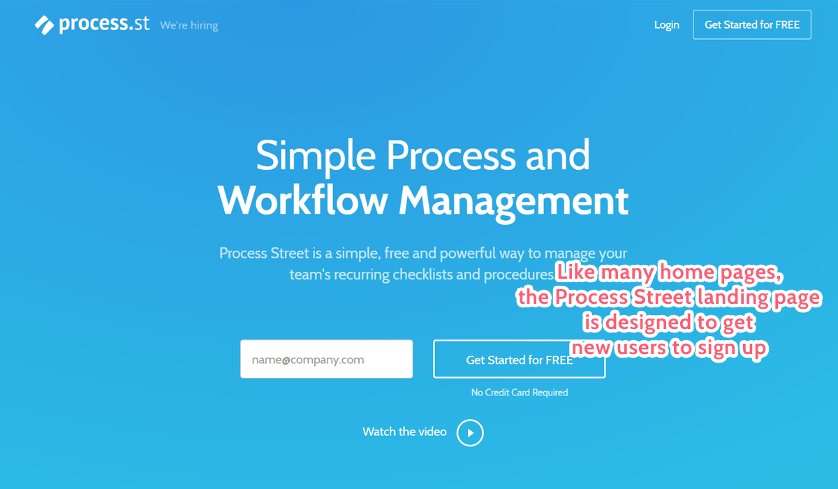
This could include (among other things):
- Signing up to a mailing list
- Creating a new product account
- Buying a product
- Booking a demo
- Browsing the rest of a website
Think of them as a focal point in your audience’s journey to do what you want them to do. Each landing page is tailored to both market and sell visitors on taking the action you want them to, whether it’s by entering their information, signing up for a new account, or paying to subscribe to a service.
The purpose of a landing page
Landing pages exist to promote a single course of action – they don’t try and push the audience to do everything that could benefit their creator at once.
It’s not about explaining every last detail or teaching new concepts. Visitors should “land” on the page and, through seeing the content, perform the desired action as soon as possible.
That’s not to say that you’re trying to trick the audience. An audience which genuinely wants to perform and benefits from the action is leagues more important than duping a greater number of signups who will never look at your stuff again.
Achieving this is where things get complicated as, even though you’re only trying to inspire one action, you need to account for the different users, backgrounds, interests, and experience levels that your audience will have. No matter who they are, if they fall into your intended audience, they should all want to perform the action you’re promoting.
That’s where the following 15 landing page best practices come into play.
Landing page best practices
Have a single purpose
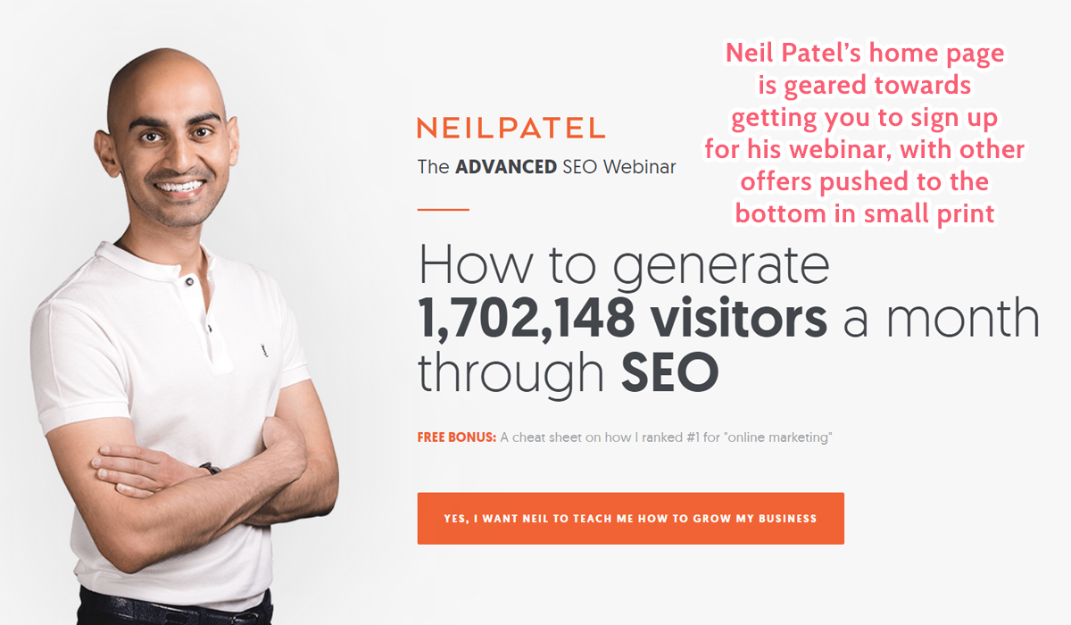
One of the most important things to do when creating a landing page is to make sure that is has a single purpose. Don’t confuse the viewer by trying to make them do more than one thing.
If you want them to sign up to your mailing list, get them to enter their details. If you want them to buy a product, sell the product.
Don’t split their attention and try to make them do more than one thing.
I understand – it’s tempting to try and get your viewer to do everything you’d like them to while you have their attention. You’ve done the hard work of getting them to go onto your website, so why not capitalize on it while you can?
Two words; audience retention.
If you bombard the viewer with too many calls to action on a single page (especially a landing page) the only thing they’ll reliably do is to hit the back button and contribute to your bounce rate. It’s the same principle behind pop-up ads – you might get some more conversions but when the entire web page is designed to do that anyway you’ll push away more people than you convert.
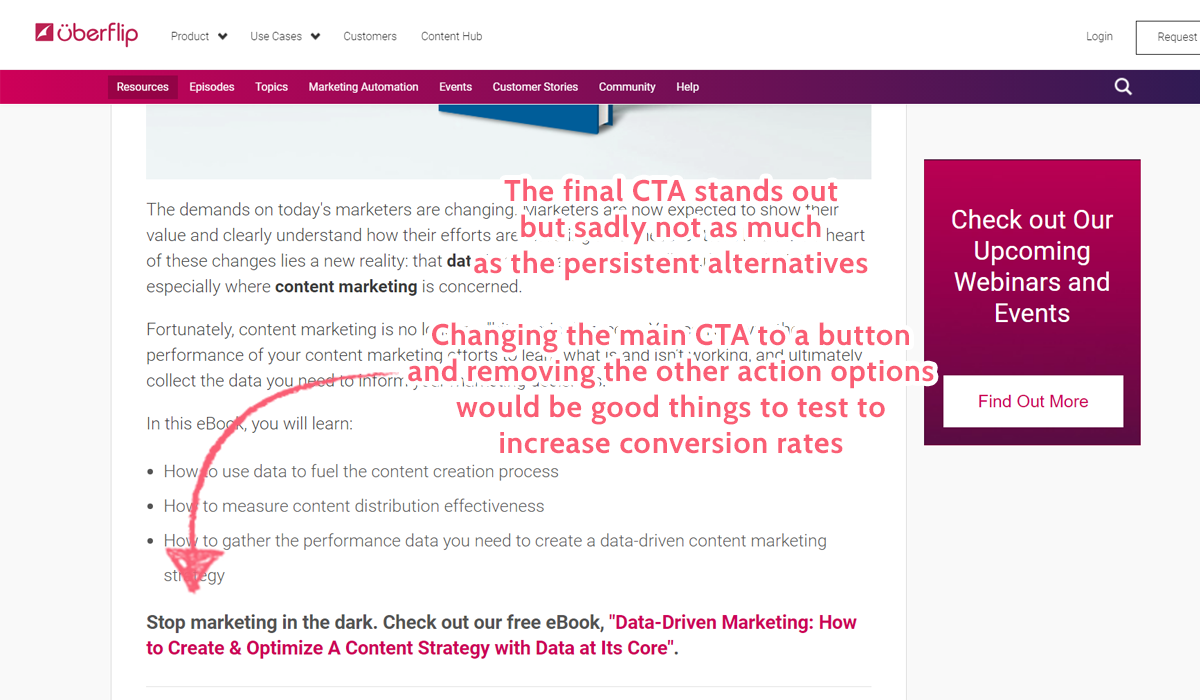
Make the CTA obvious
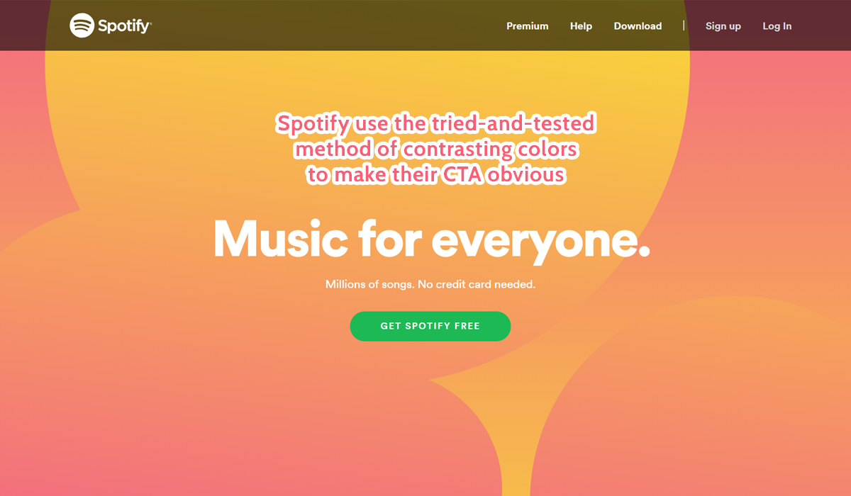
One of the more obvious landing page best practices, it’s vital to make sure that your CTA is the most obvious thing on the page. If the audience can’t see it, they won’t do it.
The method for doing this will change based on the type of landing page and action being promoted but there are a couple of tried-and-tested techniques:
- Make your CTA a large button with clear text
- Use contrasting colors to make the CTA stand out
- Put the CTA in the center of the page
- Use arrows (or people) to point to the CTA
- If it’s a large page, have one CTA for your action visible on every full page scroll length
- Grey out the rest of the page for pop-ups
Most of these are self-explanatory but I’ll clarify the last two a little more.
Let’s say you have a homepage (which is a core example of a landing page). Chances are that you’ll want to include lots of information, pictures, videos, social proof, and so on to convince the audience to sign up (your one chosen action).
Instead of having just one CTA to “Sign Up” at the top and bottom of the page, include enough so that the user can see one of these buttons no matter what part of the page they’re scrolled to. That way the action is always there, ready to be taken as soon as the user is convinced.
Again, pop-ups aren’t ideal for a landing page but if you absolutely must have them they serve as a good example of drawing attention to a specific part of the screen.
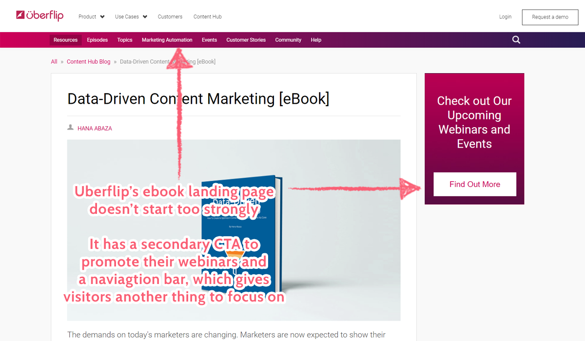
Remove all unnecessary action options
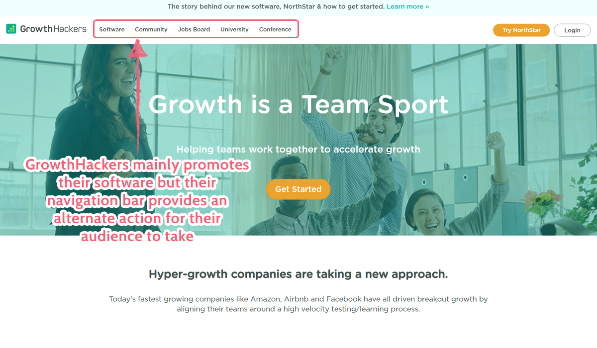
While this follows the same thinking as “stick to one purpose per landing page”, you can go one step further and remove the potential for other actions to be taken.
Think of it as the other half of the equation; first, you stop telling your audience to do more than one thing, then you follow up by limiting their options to that one thing. You’re limiting the active CTAs and the passive opportunity to do something else.
Yuppiechef did just that when trying to optimize their Wedding Registry service landing page performance. Using Visual Website Optimizer (who also published the Yuppiechef case study), they tested the conversion rate of their landing page as it was compared to if they removed the website navigation bar.
This alone increased their conversion rate by 100%.
While you don’t have to remove literally every option, it’s certainly worth weighing up the value of each and every action opportunity on your landing pages and assessing whether they’re worth keeping. If they’re not at least equal in value to the main landing page purpose, get them out of there.
Use videos (where appropriate)
Videos are a fantastic way to promote a certain action while providing extra information, persuading arguments, social proof and more in an easy-to-view format. They’re also criminally under-used.
In a study of 1,000+ landing pages, Crayon found that only 14% of them used some kind of video content. Considering that videos have shown to improve conversion rates by up to 80%, that seems woefully low.
The lack of video content is probably due to how difficult it is to balance their function with how distracting they are. When using them on a landing page you need to be very careful and make sure that they fit with the flow of the page rather than hinder the audience from taking the action you want them to.
Ted Vrountas has written an excellent breakdown of video landing page examples and what they do (and don’t do) well. To summarize a few key points;
- Directly show the product/action you’re promoting
- Use screenshots if applicable
- Explain and demonstrate what the desired action will entail
- Have a CTA at the end of the video matching that of the landing page
- Try to avoid distracting or misleading content (eg, irrelevant animation)
- Have an obvious “play” button to show that it’s a video immediately
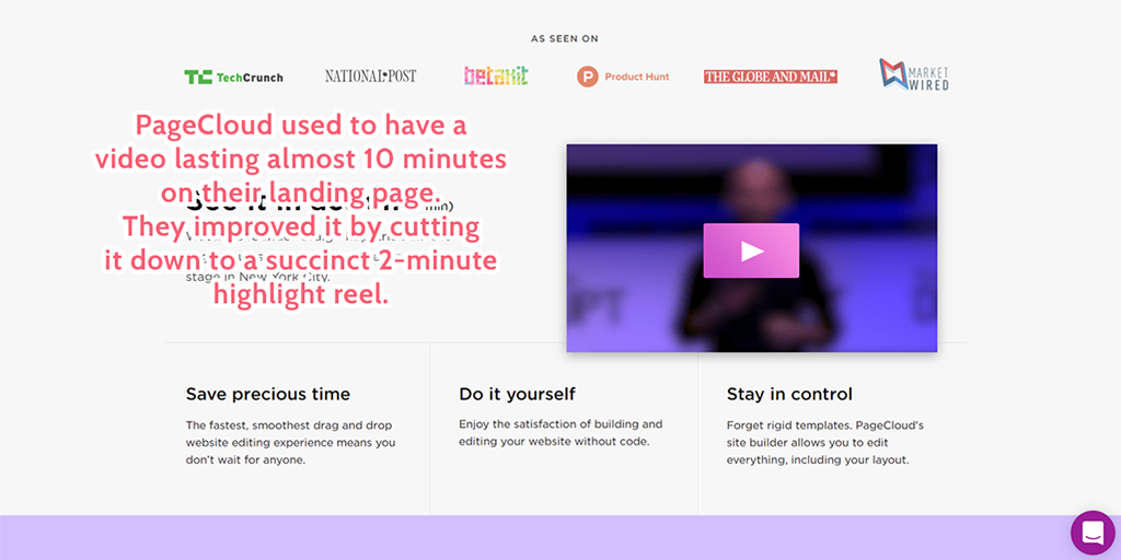
- Keep it short and sweet – have a 2-minute demonstration, not a 10-minute presentation
Show social proof
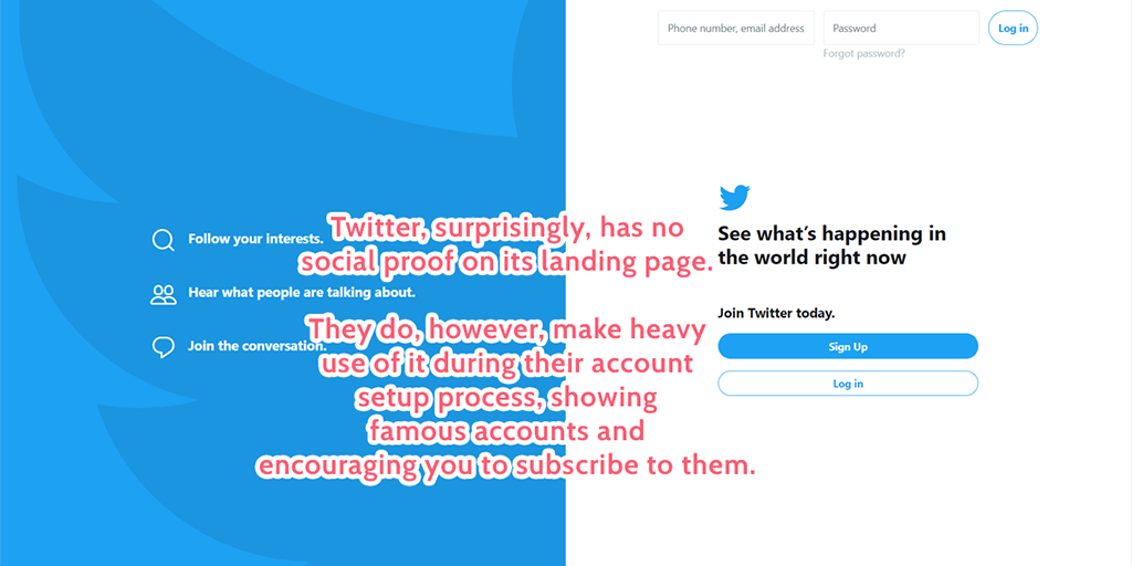
Social proof is powerful and widespread. Showing your audience what others think of you helps to reassure them that your action is the right one to take. Whether it’s from the mouth of a celebrity, a large brand which is also a customer or simply a collection of your current users, showing social proof is a tried-and-tested way to increase conversion rates.
However, that’s not to say that every landing page needs it.
Take our study of the top 100 startup homepages. This showed that, despite their success, a significant 29.29% of all examined pages did not contain social proof. This number increased to 40% when looking at homepages for non-developer tools.
This is because social proof is less useful when it comes to services like Amazon, Crunchyroll, and Postmates. Companies which serve as marketplaces (for products or online content) or to promote other services stand to gain more by leaping directly into the meat of their offer rather than providing a supporting comment.
It’s worth noting, however, that these are also exceptions to many of these landing page best practices. For example, a marketplace wants to provide as many CTAs as possible on its main landing (home) page to show the variety of goods or services on offer.
Branding should be immediately visible
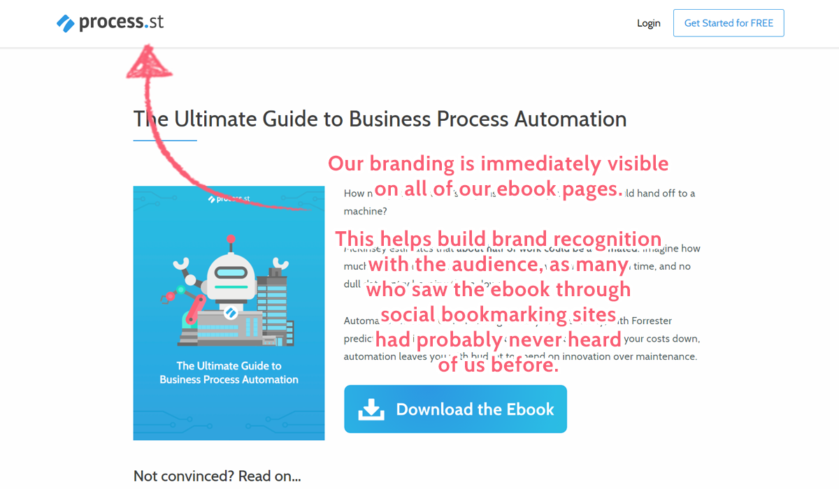
While not every startup homepage had social proof, absolutely every example we examined had their branding elements immediately visible.
Whether by showing the brand name, logo, or another branding element, landing pages are a great opportunity to build brand recognition with the audience and make it more memorable in future. If people recognize and remember you, they’re more likely to come back and interact further, maybe purchasing another product or referring you to their friends.
It’s not difficult and is very hard to make distracting to the detriment of your landing page’s purpose. All that you usually need to do is include your brand’s name and/or logo at the top of your page.
As a quick note, it’s worth considering whether to make your branding elements link back to your homepage. On one hand, this gives the audience a chance to further familiarize themselves with you and take more direct action with the brand.
However, it’s not always worth giving the extra option. Remember; if navigating to your homepage isn’t much more valuable than the single purpose of your landing page, it might be worth cutting out that extra option. Not to mention that they don’t need a link to your homepage if they’re already on it – you’ll just be giving them an extra chance to lose interest.
Offer a demo (where possible)
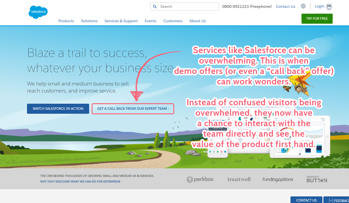
Although it’s not always relevant, offering a demo is a great way to get your audience to interact further and calm any fears they have. This is vital, as landing pages that need a demo video (or offer) often come at a major point in the viewer’s buying decision.
Demos are best used when your audience has learned a little about what you’re offering (a service, some software, a SaaS product, etc) and knows what the general benefits are. The demo helps to clear up any remaining confusion about how the product works, what it does, and so on.
Again, not every landing page needs to offer a demo, but providing the opportunity to book one on a product’s homepage or alongside your “Create an account” button can truly work wonders for your conversion rate.
Show contact information
While this counters the “focus on one thing” practice from earlier, it’s still worth including some contact details on the landing page, even if they’re small and tucked away at the very bottom in smaller print.
Yes, your landing page is designed to fulfill one purpose, not to get people to “do X and then chat with us about it”. However, getting in contact with your company is almost always a good sign.
You want people to be curious about your brand and what it can offer. You want your audience to have a direct experience with your team because that means they’re more likely to remember you. This is especially true if your customer support services are up to scratch.
It also helps to limit your audience’s fears and/or confusion.
Think about it; if you’re interested in a subscription service but aren’t sure about the delivery details, you’ll want to clear that up before signing up. To do that, you need the contact information of the brand behind the landing page.
Admittedly, it’s better to have a landing page that answers all of your audience’s questions and fears without the need to contact you but this is another good part of giving contact information out. If you get a lot of questions about a certain landing page’s offer, you’ll be able to change the page in reaction and improve it.
Remove risk factors
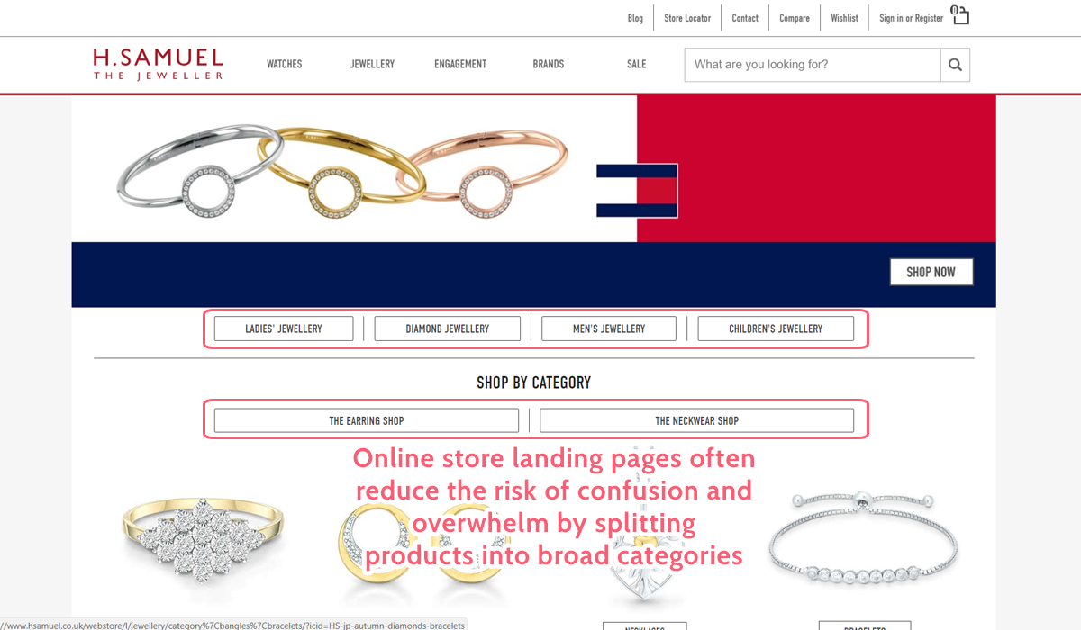
While we’re on the topic of risk factors, it’s worth taking time to think about your landing page to examine what a viewer might be concerned or confused about.
Whether their confusion or fear is warranted or not, the more you can do to quell those feelings before they take root and scare away the viewer, the more likely they are to stick around and consider your offer further.
For example, some common risk factors which can be covered with a bare minimum of information are:
- Contents of the offer
- What the viewer needs to do
- Price points
- Benefits
- Social proof
- Timescale
These factors will change depending on the landing page and offer but the theory is the same for all. Provide enough information to satisfy perceived risks, as most viewers won’t take action otherwise.
Have 500+ words of content
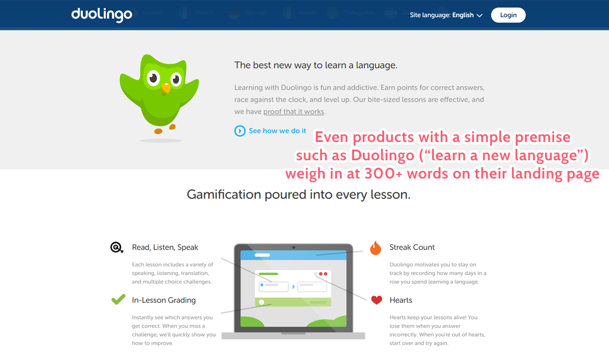
You need enough information on a landing page to promote and explain what you want your viewer to do. Even though it’s preferable to make sure that they know everything beforehand, you should always prepare for every eventuality.
For example, let’s say that you want to promote a specific product. You write a Facebook post with a good photo and brief description, along with any offer currently available, pair it with a blog post and email to your mailing list, all of which have links to your product’s landing page.
Despite all of those links being surrounded by the relevant information, you can’t guarantee that everyone who clicks through will know everything they want or need to before making a final decision.
Whether a viewer reads everything before going to the landing page or just sees a photo they like and clicks on it, you need to provide all of the information required to let them make an informed decision. As such, it’s rare for a good landing page to have less than 500 words of content.
There’s no set upper limit to the word count but you don’t want to waffle on longer than necessary. Use 500 words as a rough minimum guideline, cover everything they need to know while promoting the action you want them to take, then quit while you’re ahead.
Use simple language
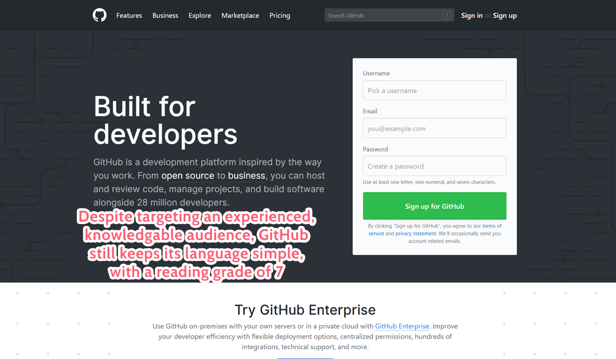
Another easy mistake to make is using language which is too complicated to easily read. The harder you make it for viewers to easily get the information they need, the more likely they are to click away and never come back.
This was another aspect we saw in our study of the best homepages for startups, where we found that the average reading grade for 100 pages was 6.61. Even the developer tool homepages aimed at a more specific and experienced audience only had a reading grade of 7.31.
It’s yet another case of making it easy to see what action you want them to take and why they should take it. The harder it is to see that, the worse your conversion rate will be.
As for some general tips:
- Simplify your words
- Use short sentences
- Avoid passive sentences
- Have a reading grade below 7
Test your own user flow
This best practice is more common sense than an industry secret. If you don’t test your own user flow on the landing page, how can you be sure that a new viewer will follow your own logic?
First, take note of all of the links that lead to the landing page. Consider the context of these links, what surrounding information is there, how specific and experienced your audience is, and whether you want to account for those who stumble across the page or link without reading around the topic first.
Next, boot up your landing page. With the notes about your audience, think about how obvious your CTA is and where your eyes are initially pulled. Try to imagine a viewer’s movements and logical progression, along with any points where they might hesitate or ask themselves a question.
These points of friction are the things you need to iron out.
If you find that the CTA isn’t the first thing your eyes are drawn to, the layout of the page or CTA needs to change. If you’re stopping to ask important questions or are left wanting for information, it’s time to add that into your copy without taking attention away from the main CTA.
Create multiple landing pages
Landing pages aren’t limited to being homepages or product descriptions. In fact, the more landing pages you can create for different purposes, the better.
Don’t take my word for it – Krista Bunskoek over at Wishpond has shown that websites with 30+ landing pages get seven times the leads of those with only 10.
If the action is important enough to promote to your audience, give it a landing page.
This isn’t just a bonus in terms of giving you things to promote in your own content – it gives your team a library of catered landing pages to draw from in almost any situation. Be it in casual conversation, customer support or as part of a new campaign, having specific landing pages is only ever a good thing.
Segment landing pages by user and traffic source
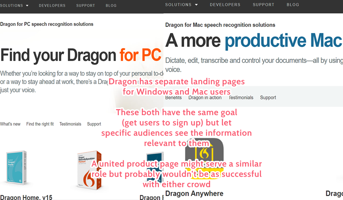
If you want to take your landing page web one step further, consider creating multiple landing pages for the same purpose but aimed at different audiences. This then lets you segment your user and traffic sources to send different people to specialized pages.
For example, let’s say you update your service and send out an email to let your mailing list know about the new features with a link to the landing page promoting them. You know, however, that not all of your mailing list is already using the service in general.
The solution? Send non-users the link to a landing page promoting the service in general. Highlight the updates along with the most powerful/commonly used features to show everything your service has to offer.
Then, instead of sending current users to the same generic landing page, consider pushing them towards a landing page geared towards promoting a higher paid plan using some of the benefits of the new features. That way you’re encouraging new signups while also promoting upgrades to your existing audience.
All it took was an extra landing page and a little segmentation.
Consider the nine headline formulas for startups
Pretty much everyone knows that your headlines matters. After all, nailing a good headline instead of settling with a generic or bad one can make your traffic vary by up to 500%.
The same is true of landing pages.
Just because you’re creating a page to promote a single type of action doesn’t mean that you can pay any less attention to your headline than in your blog posts and other content. If anything, you need to put more effort into honing and perfecting the headline than usual, as these are the pages which will be responsible for the majority of your conversions.
Thankfully, we’ve already done the legwork for you to work out a great headline formula.
After analyzing the copy of 87 startup landing pages here at Process Street, Ben Brandall found that their headlines all fell into one of nine categories:
- [Software] for [target]
- The [superlative] way to [goal]
- [Imperative][benefit]
- Better [purpose]
- [Software] that [benefit]
- [Benefit]. [Benefit]
- [Benefit] without [drawback]
- [Question]
- [Purpose]
Create and update landing pages as you grow
Landing pages aren’t static – you can’t leave them as they are and expect them to perform anything but worse over time. Not to mention that even the best landing pages can step up their game through continuous improvement.
Whether you try out a new headline, update your copy, redesign the page entirely or test out one of the landing page best practices mentioned above, there are hundreds (if not thousands) of ways you can change, test, and improve your landing pages. All that’s left to do is go out and test them!
Do you have any landing page tips to share? I’d love to see them in the comments below.


