I’ve talked at length in the past about the user onboarding process, the difficulties of first-time use and how empty states can solve some of these problems.
While this is all well and good when you’re trying to tackle user drop-off after the first session, what about the later stages?
Assuming that everything else has clicked into place for your user and they’ve made it all the way up to the purchase, you must have made a good first impression! Unfortunately, it’ll be all for nothing if your app is hard to use, awkward, inflexible or disappointing over the long term, or if your premium plan’s onboarding isn’t tight.
Post-sale UX optimization isn’t something I’ve looked at before, or even heard about. But writing a guide about SaaS customer success is not a small task and UX is definitely a big deal, especially because good UX makes it easy for Customer Success to do their job.
In fact, a good SaaS user experience takes the weight off customer support, too. Overall, you don’t want to put a barrier between your users and your app and most importantly for revenue, you don’t want to put a barrier between your paying users and your app.
Here are some SaaS user experience optimization pointers to think about which will make the lives of your Customer Sucess team easier.
– As a free bonus, check out our podcast episode talking about customer success.
Don’t create a disconnect between the product and the packaging
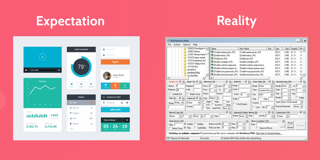
I’d bet that the disconnect between product and packaging — or marketing material and in-app experience — is a huge reason for drop-off both in the early usage stages and when upgrading. Since premium versions of products will often have new features and your landing pages will emphasize these features as incentives to become a paying customer, it’s important not to overplay it.
While the image above is an extreme example, we’ve all experienced something similarly disappointing. The solution is to be honest — it might be that you’re getting conversions based on your features, not your design. But when the design doesn’t match expectations, users can feel cheated — especially if you made the paid version look infinitely cooler.
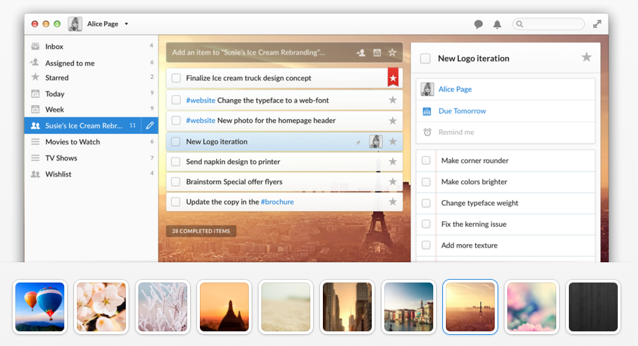
A neat trick some apps implement, such as WorkFlowy and Wunderlist (above) — both of which have subscripion pricing structures — is to offer visual personalization of the app in the premium version. This gives the user ownership over their design, and makes them feel like it’s ‘their’ product.
Design for the full, unrestricted app
SaaS is extremely young, but UX as a thing people care about or speak about is even younger. It wasn’t until around 2002 that it was even in public discourse, with the publication of The Elements of User Experience.
What I’m getting at is that SaaS and UX should have grown up together, hand in hand. That’s because the nature of SaaS is that when you buy a product (unless you buy the most expensive edition) you only see a fraction of it.
When a user upgrades, parts of the app which were previously hidden reveal themselves. The user will need re-onboarding with these elements in mind or could get buyer’s remorse.
Since this guide looks at concierge onboarding (otherwise known as high-touch onboarding), you’re probably going to be giving 1 on 1 demos of these features instead of in-app, self-service tours. With that in mind, you still want to make sure that the transition isn’t jarring, overwhelming or hard to commit to memory after the demo (see the next tip for more help with that).
This post on UX tools from Usability Geek starts out with tools that help with research and includes app like UsabilityTools, Woopra, and Usabilla. These tools are designed to monitor usage and collect user feedback, which is great for a more self-service approach. However, a big benefit for you when working closely with customers is being there to hear feedback first hand and have a dialog with your users.
Use little hints to introduce new features
As I’ve looked at before, Slack is fantastic at getting users onboarded — not only during the first session but also for new features. While Slack certainly has a customer success team helping its big customers set the app up properly, it helps every user to get a subtle note about new features.
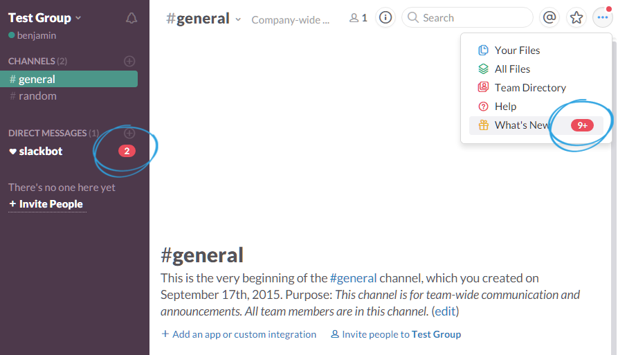
Slackbot pops up in direct messages during the first run, but the What’s New notifications appear as new features are introduced. Inside the menu, here’s what it looks like:
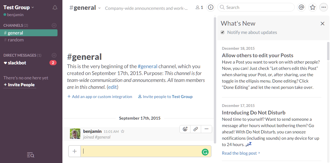
Slack has a whole host of in-app and external help material, including a huge database of support articles and feature announcements on their blog. Onboarding existing customers with new features is a process of making users aware and having information available on several channels.
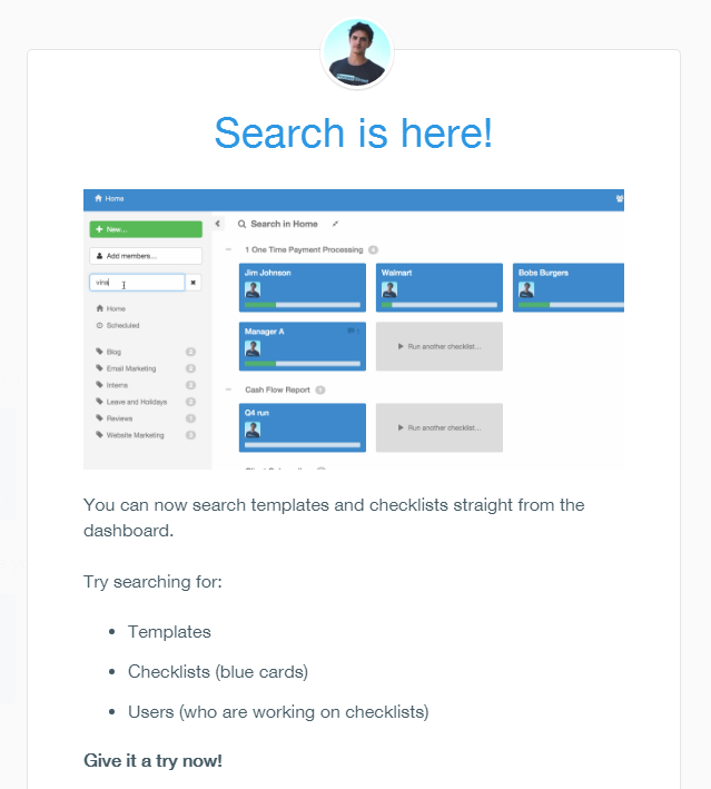
At Process Street, we send out emails announcing the features so we can alert existing customers to the cool stuff incoming and reactivate users that are in danger of churning out.
Additionally, for regular app users, we have a popup conversation box powered by Intercom to announce the feature and see if users have any questions.
Here’s our latest announcement for Search, appearing in the app’s support area:
Throw a party for your successful user
If a user has grasped a concept, made a leap in learning your product or just completed the action you can strongly link to conversions, it’s time to celebrate.
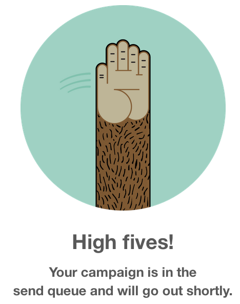
Samuel Hulick‘s Help Scout post on user onboarding mistakes points out how that MailChimp’s success screen that it shows when you’ve sent an email is an actual high-five — which is what it should feel like when a user succeeds with your app.
Now, we know that for SaaS products with several thousand users, things like 1 on 1 contact for everyone isn’t possible. Even though it won’t scale, being directly in touch with your high-value customers is vital.
Even though it won’t scale, being directly in touch with your high-value customers is vital.
For example, you could call or email high-value users directly to let them know you saw they reached some kind of milestone with a new feature and see if they need any more help.
Alternately, if it looks like they got stuck while playing with it, call to see if you can offer a helping hand.
What’s the link between SaaS user experience and customer success?
The idea behind improving user experience with customer success in mind is this:
- If you can make it easier for your customers to interact with your app, they will achieve success more quickly, firmly and… long-lastingly.
- Users should be primed for success from the moment they discover your app. This means that they should know what to expect by reading your copy and seeing your screenshots. It means they should have great interactions with the sales team who should try and teach the users about every feature they’ll need.
- User experience — how it feels to use your app — should be optimized to make sure your users want to stick around, learn the new features, interact with your customer success and support staff
We’re getting close to the end of our customer success guide for SaaS companies! With the 7 chapters so far on the blog, I’ve gone through the prerequisites for setting up customer success. Over the next 3 weeks, we’re going to jump right into creating a reusable concierge onboarding process, testing and adjusting it, and managing customer accounts into the future.


