

Turn every policy into automated workflows with built-in enforcement and audit-ready proof.


8 Best Operations Management Dashboard Tools

An operations management dashboard should do more than display attractive charts. It should show whether recurring work is running correctly, where exceptions are building, which commitments are at risk, and who needs to act next.
The right platform depends on the job. Some teams need a workflow control surface that connects metrics to execution. Others need a business intelligence layer that combines data from many systems. The strongest setup often pairs both: one system runs the process, while another supports deeper analysis.
- What is an operations management dashboard?
- Which operations management dashboard tools are best?
- Which tool fits each operating model?
- How do you choose an operations management dashboard?
- What should an operations dashboard track?
- How to implement an operations management dashboard
- Operations management dashboard FAQs
What is an operations management dashboard?
An operations management dashboard is a shared view of the signals that tell a team whether day-to-day work is healthy. It combines operational metrics, work status, exceptions, ownership, and trends so managers can detect a problem and move from insight to action.
That makes it different from a static monthly report. A report explains what happened. A working dashboard helps the team decide what to do now. It might expose an overdue approval, a growing queue, an unstable cycle time, a quality issue, or a capacity constraint. The useful question is not “How many charts can we fit?” It is “Which decision becomes faster or safer because this signal is visible?”
There are two broad product categories. Execution dashboards sit close to the work itself and show workflow runs, tasks, owners, due dates, approvals, and exceptions. Analytics dashboards combine data from several systems to support comparisons, trends, and drill-down analysis. An operations management platform is the better starting point when the dashboard must also shape how recurring work is performed.
Which operations management dashboard tools are best?
The best tool is the one that matches the operating problem. This shortlist covers workflow execution, flexible work management, governed business intelligence, and focused KPI display. Process Street leads because it connects the dashboard to the process that creates the data, instead of asking managers to chase status after the fact.
Process Street
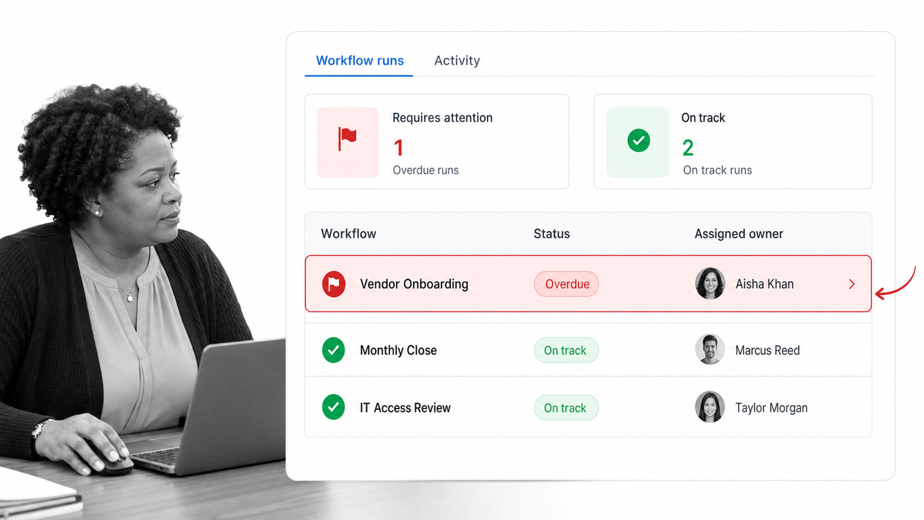
Process Street is the strongest choice for teams that need an operations management dashboard tied directly to repeatable execution. Workflow runs generate the status data. Tasks have owners and due dates. Approvals, forms, conditional paths, automations, and activity records stay connected to the process rather than being reconstructed in a separate reporting layer.
The Workflow Dashboard brings connected automations, activity, workflow runs, analytics, assignments, and running options into one control surface. Reports add filtered saved views across workflows, which helps an operations leader isolate overdue work, a client queue, a department, or a recurring exception. See the Workflow Dashboard documentation for the current product surface.
Choose Process Street when the operating requirement is control, not just observation. It is especially useful for onboarding, vendor review, quality checks, finance close, policy approvals, compliance workflows, and other high-stakes processes where the dashboard should point back to an auditable record of work.
Microsoft Power BI
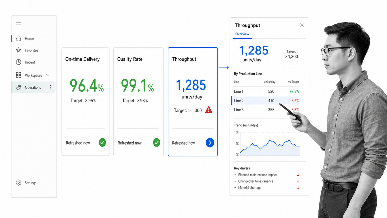
Power BI is a strong fit when operations data already lives across Microsoft services, databases, and line-of-business systems. It supports single-page dashboards made from visual tiles, with each tile linked to underlying reports and models. That structure works well for executive monitoring and analytical drill-down.
Microsoft’s Power BI dashboard documentation explains how users view tiles, open the underlying report context, use alerts, and work with refreshed data. Choose it when data modeling, broad source coverage, and the Microsoft ecosystem matter more than running the operational process inside the dashboard.
Tableau
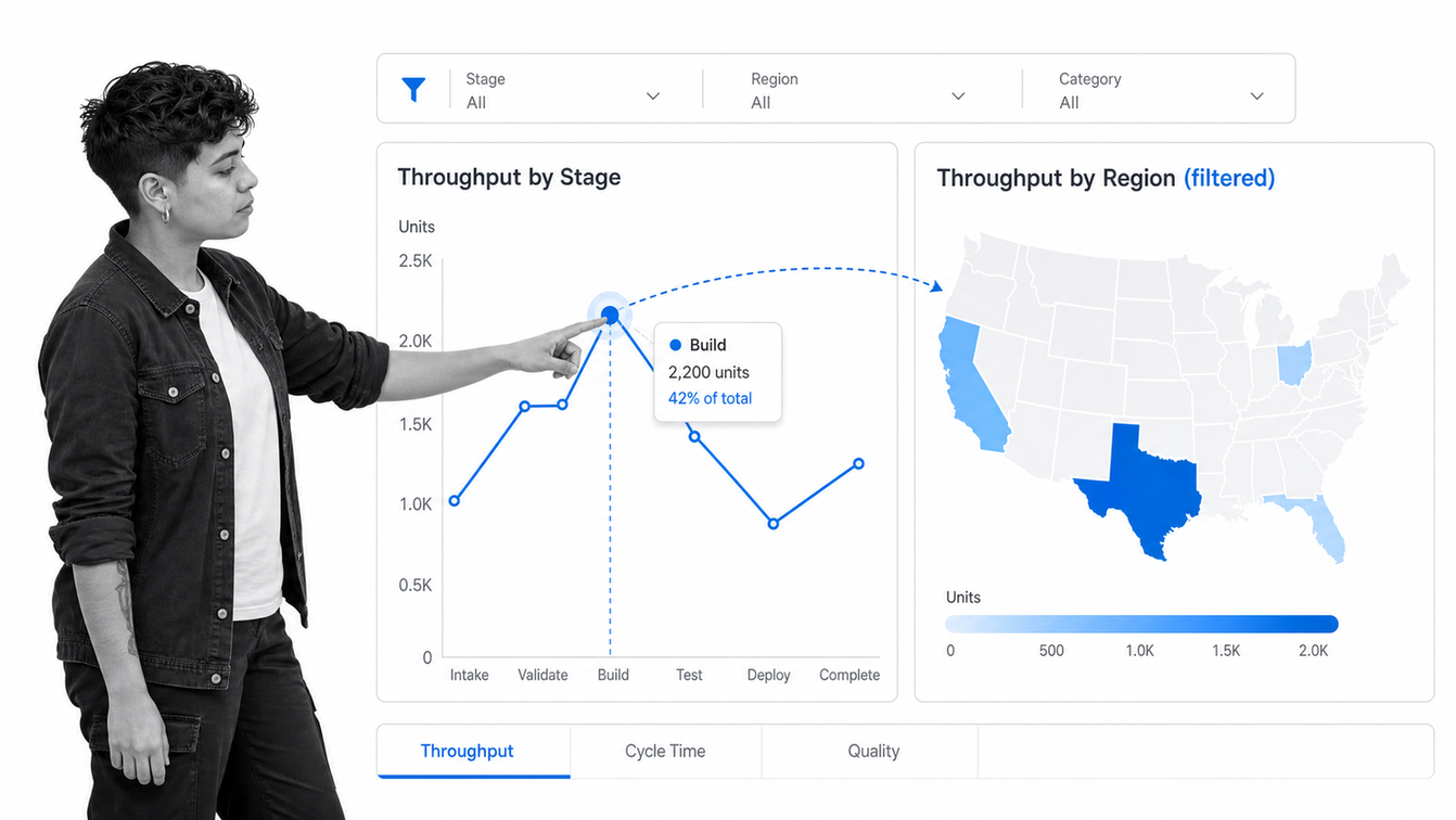
Tableau is suited to teams with analysts who need flexible visual exploration. A dashboard can combine several views so users compare related measures without moving between worksheets. Filters, actions, and drill-down behavior make it useful for diagnosing why performance changed, not only seeing that it changed.
The Tableau product overview describes its hosted and self-managed analytics surfaces for creating and sharing visualizations, data sources, and flows. Choose Tableau when visual analysis and exploratory depth are central, and pair it with a workflow system when an insight needs to trigger controlled action.
Looker
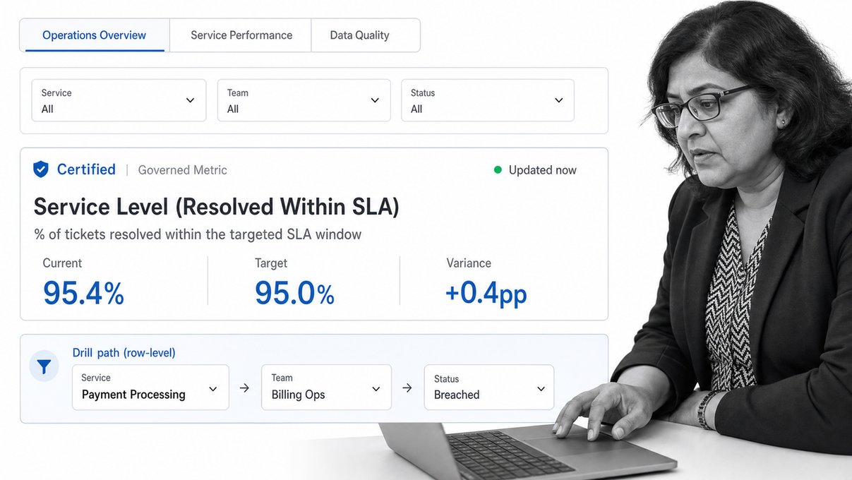
Looker is a strong option for organizations that want dashboards built on governed data definitions. Its model-driven approach helps teams keep the meaning of operational metrics consistent across functions. That is useful when finance, operations, and leadership all need to read the same measure the same way.
Google’s Looker dashboard documentation covers live database queries, tiles, tabs, filters, permissions, refresh behavior, and sharing. Choose Looker when the data team owns a governed analytics layer and operational leaders need trusted self-service access to it.
Smartsheet
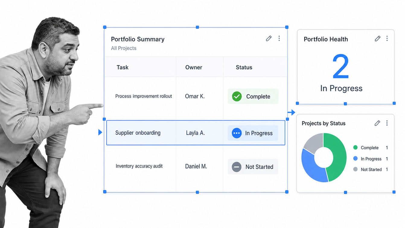
Smartsheet works well for teams that manage operations in grid-based plans, reports, and forms. Its dashboards provide a visual layer over that work, using metrics, charts, reports, shortcuts, images, and embedded web content. The setup is approachable for teams that think naturally in rows, columns, and portfolio summaries.
The official Smartsheet dashboard guide describes dashboards as a way to summarize and share real-time data, status, and KPIs with stakeholders. Choose it when the work already runs in Smartsheet and the dashboard mainly needs to communicate progress and aggregate reports.
Domo
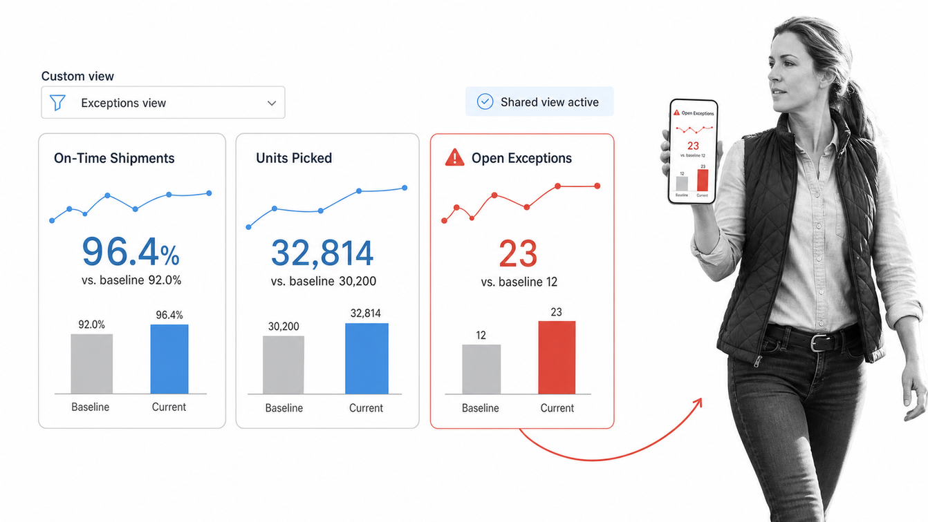
Domo is designed for organizations that want data integration, visualization, and distribution in one analytics environment. Its dashboard surface supports interactive views, filters, custom layouts, and mobile access, which can help operations teams share the same performance picture across locations and roles.
Domo’s business intelligence product page describes interactive dashboards, real-time sharing, adjustable views, and mobile-ready access. Choose it when operational reporting needs to reach a broad internal audience and data must be combined before it becomes useful.
Klipfolio
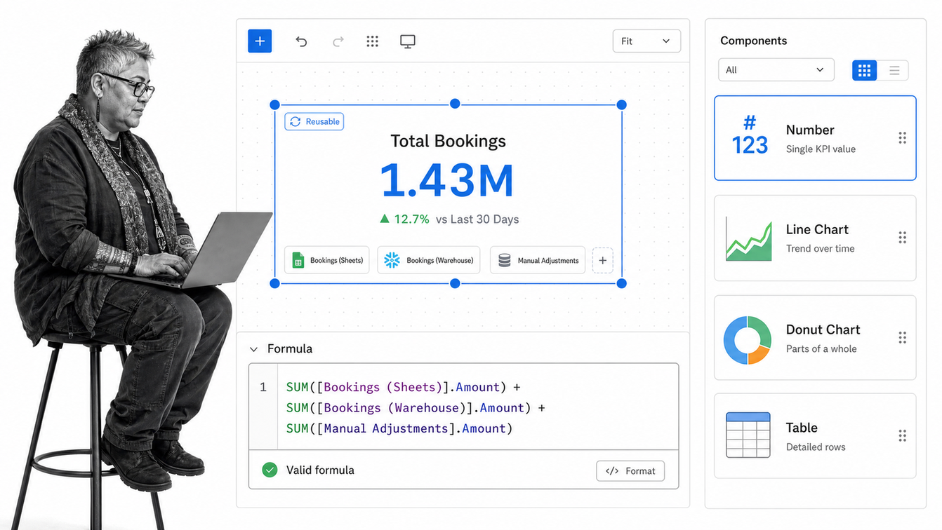
Klipfolio is a focused dashboard builder for teams that want control over layout, visual presentation, and data formulas without adopting a broader enterprise analytics stack. It can combine several sources within a visual component and supports reusable dashboard elements, which is useful for agencies, consultants, and operators who create similar views for different teams or clients.
Choose Klipfolio when the main job is building and distributing polished KPI dashboards, especially when spreadsheet-style logic is familiar. It is less suitable as the system that enforces the underlying process, so operational actions should still be routed into the workflow or system of record.
Geckoboard
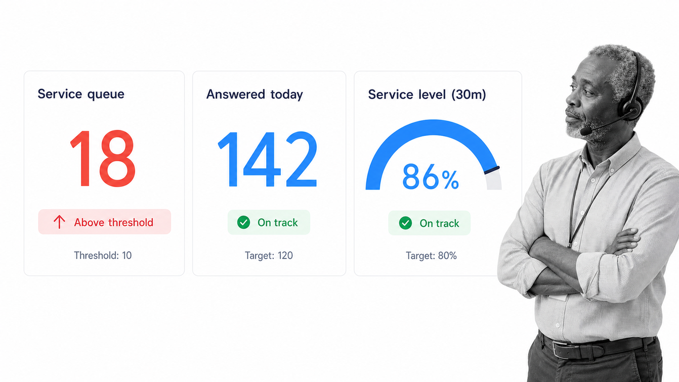
Geckoboard is built for focused KPI communication. Teams can connect common business tools, spreadsheets, databases, or custom data sources, then display a concise dashboard on a shared screen or distribute it through links and scheduled snapshots. This makes it useful for service teams, support operations, sales floors, and other environments where a small set of metrics should stay visible.
Choose Geckoboard when clarity and ambient awareness matter more than deep analysis. It is strongest as a display layer. A separate workflow platform should own assignments, approvals, escalations, and evidence when the team must act on a threshold breach.
Which tool fits each operating model?
A shortlist becomes easier to evaluate when each product is mapped to the kind of operating system it supports. These tools overlap, but they are not interchangeable. The first decision is whether the dashboard must run work, analyze data, summarize managed work, or broadcast a small set of trusted signals.
| Tool | Best fit | Primary strength | Important boundary |
|---|---|---|---|
| Process Street | Recurring and high-stakes operations | Connects status, ownership, approvals, and evidence to executable workflows | Use a dedicated BI layer for complex cross-system modeling |
| Microsoft Power BI | Microsoft-centered analytics teams | Combines modeled data with executive dashboards and report drill-down | Does not replace the workflow that owns the response |
| Tableau | Analyst-led visual exploration | Flexible interactive analysis across related views | Requires a separate execution path for exceptions |
| Looker | Organizations with governed data models | Consistent metrics and controlled self-service analytics | Depends on strong data ownership and modeling discipline |
| Smartsheet | Grid-based work and portfolio reporting | Accessible dashboard widgets over sheets and reports | Complex process enforcement may require a workflow platform |
| Domo | Broad internal data distribution | Integrated data, dashboards, sharing, and mobile consumption | Implementation scope can extend beyond a focused operations view |
| Klipfolio | Custom KPI reporting for teams or clients | Flexible presentation and formula-driven dashboard building | Not the system that governs the operating process |
| Geckoboard | Visible team KPIs and wallboards | Fast, focused communication of a small metric set | Limited depth for analysis and controlled response |
Most larger operations teams need more than one layer. A workflow platform can own the procedure, assignment, approval, escalation, and audit record. A BI platform can then combine that workflow data with financial, customer, inventory, or production data for deeper analysis. The architecture stays clear when each metric has one source of truth and every exception has one response path.
Avoid buying two tools for the same job. If a dashboard already answers the daily operating question, adding another visualization layer may only create reconciliation work. Add a second layer when it solves a distinct need, such as governed cross-system metrics, advanced analysis, customer-facing reporting, or a persistent wallboard.
How do you choose an operations management dashboard?
Start with the operating decision, not the vendor list. Write down who will use the dashboard, what they need to decide, how quickly they must decide it, and which system contains the evidence. A plant supervisor needs a different cadence and level of detail from a COO. A compliance leader needs proof and ownership that a wallboard does not provide.
- Choose a workflow-first platform when the dashboard must assign work, enforce required steps, route approvals, escalate delays, or preserve an audit trail.
- Choose a BI platform when the primary need is to combine data, define metrics, compare segments, explore causes, and support executive analysis.
- Choose a work-management dashboard when the team already runs from sheets, plans, or portfolios and needs a simpler reporting layer.
- Choose a KPI display tool when a small set of trusted measures needs to stay visible throughout the day.
Then evaluate data freshness, metric ownership, permissions, drill-down, alerting, mobile access, export needs, implementation effort, and the path from a red metric to a named action. The final criterion is often the most important. A dashboard that exposes a problem but leaves the response in chat and email creates observation without control.
What should an operations dashboard track?
A useful dashboard tracks a balanced set of flow, quality, service, cost, capacity, and control signals. The exact metrics depend on the process, but each one should have a clear owner, source, threshold, and response.
- Flow: throughput, work in progress, queue size, cycle time, and aging.
- Service: on-time completion, service-level attainment, response time, and backlog.
- Quality: first-pass yield, error rate, rework, defects, and reopened work.
- Capacity: utilization, workload by owner, bottleneck stage, and available coverage.
- Control: overdue approvals, skipped required steps, missing evidence, policy exceptions, and unresolved escalations.
- Cost: cost per unit, labor effort, waste, variance, and the financial impact of delay.
Avoid filling the first screen with every available measure. Put the signals that change daily decisions at the top, then provide drill-down paths for diagnosis. The operations dashboard guide goes deeper on dashboard types, KPI selection, and layout patterns.
How to implement an operations management dashboard
Implementation works best as an operating-design exercise, not a visualization project. Begin with one recurring process where delays, quality failures, or ownership gaps create a real cost. Map the decision points and identify the smallest group of signals that reveals whether the process is healthy.
- Define the audience and the decisions the dashboard must support.
- Name the source system and owner for every metric.
- Set thresholds and specify what action each threshold triggers.
- Build the first view around exceptions, flow, and accountability.
- Connect every alert to a workflow, owner, and due date.
- Review false alarms, missing signals, and unused widgets with the operating team.
- Expand only after the first dashboard changes decisions reliably.
For teams running high-stakes operations, the dashboard should sit on top of standardized workflows. That creates a closed loop: the process generates trusted data, the dashboard identifies the exception, the workflow assigns the response, and the activity record preserves proof. Process Street’s operations management software is designed around that execution layer.
Operations management dashboard FAQs
What is the main purpose of an operations management dashboard?
Its main purpose is to show whether recurring work is healthy and direct attention to the exceptions that require action. It connects performance signals with owners, thresholds, and operating decisions.
What is the difference between an operations dashboard and a BI dashboard?
An operations dashboard focuses on current work, exceptions, ownership, and immediate response. A BI dashboard is usually stronger at combining data, governing metrics, analyzing trends, and supporting deeper exploration across systems.
How many KPIs should an operations dashboard include?
Include only the KPIs needed for the decisions made from that view. Start with a small group covering flow, service, quality, capacity, and control, then add drill-down views instead of crowding the main screen.
How often should an operations dashboard refresh?
The refresh cadence should match the decision window. A live service queue may need frequent updates, while a capacity or quality trend may be useful daily or weekly. Always show data freshness so users know what they are seeing.
Can an operations dashboard replace workflow software?
Usually not. A dashboard can expose a delay or exception, but workflow software assigns the response, enforces required steps, routes approvals, and records completion. The two surfaces are strongest when connected.