
Turn every policy into automated workflows with built-in enforcement and audit-ready proof.


Onboarding Dashboard
An onboarding dashboard is a focused view of workflow health, performance, exceptions, and outcomes. It helps onboarding owners see what is happening, understand where work is slowing down, and decide what action should happen next.
Useful onboarding dashboards do more than display charts. They connect each signal to a definition, owner, threshold, source, and response path. That turns a collection of metrics into an operating tool for daily management and continuous improvement.
This guide explains what an onboarding dashboard is, which components and metrics matter, how to design and build one, and how to connect dashboard insights to accountable execution.
In this article, we are going to cover:
- What is an onboarding dashboard?
- Why onboarding dashboards matter
- Onboarding dashboard components
- Onboarding dashboard metrics
- Onboarding dashboard design principles
- How to build an onboarding dashboard
- Onboarding dashboard in Process Street
- How to improve your onboarding dashboard
- FAQs
What is an onboarding dashboard?
An onboarding dashboard is a visual control surface for one or more business processes. It combines a small set of measures, workflow states, trends, exceptions, and ownership information so a defined audience can assess onboarding health and respond.
The useful word is control. IBM dashboard guidance describes dashboards as interfaces that let authorized users view process information, filter the view, identify work that needs attention, and act. An onboarding dashboard should therefore help someone manage the onboarding journey, not merely observe it.
Onboarding dashboard versus business dashboard
A business dashboard can summarize broad results such as revenue, customer activity, or departmental performance. An onboarding dashboard focuses on how work moves from trigger to outcome. It shows the state of onboarding cases, tasks, queues, handoffs, delays, exceptions, and completion quality.
Onboarding dashboard versus report
A report usually explains what happened during a period. A dashboard supports an operating rhythm by making current state and exceptions easy to scan. Reports are useful for analysis and retrospective review. Dashboards are useful for deciding what deserves attention now.
Onboarding dashboard versus onboarding journey map
An onboarding journey map shows how work should flow. An onboarding dashboard shows how that flow is performing. Teams often need both: the map defines the intended route, while onboarding process software reveals whether real work is following it and where the operating pattern is changing.
Start with workflow fundamentals if the underlying flow is not yet clear. A dashboard cannot compensate for a process that has no agreed boundary, owner, or completion condition.
Why onboarding dashboards matter
Onboarding dashboards matter because onboarding problems are often invisible until they become customer complaints, missed deadlines, control failures, or expensive rework. A dashboard shortens the distance between a change in the onboarding journey and a decision by the person who owns the response.
They expose bottlenecks and aging work
Queues, cycle time, wait time, work in progress, overdue tasks, and handoff delays reveal where flow is slowing down. When those measures are segmented by onboarding stage, owner, team, customer type, or priority, the dashboard helps people locate the constraint instead of arguing from anecdotes.
They create shared operating language
A good dashboard makes definitions explicit. Everyone sees the same meaning for started, active, blocked, overdue, completed, rejected, or reopened. This reduces status meetings and prevents different teams from using the same metric name for different calculations.
They connect results to execution
Outcome measures tell you whether the onboarding journey produced the desired result. Flow measures tell you how the work moved. Quality measures tell you whether it was done correctly. onboarding platform brings these views together so improvement work targets the real cause rather than the loudest symptom.
They support governance and proof
High-stakes processes need evidence that required reviews, approvals, checks, and escalations happened. An onboarding dashboard can show open exceptions, evidence state, unresolved approvals, and control completion, but the underlying workflow must preserve the record that proves the response occurred.
This is where onboarding management software becomes practical. Management is not a one-time mapping exercise. It is a repeating loop of design, execution, measurement, correction, and learning.
Onboarding dashboard components
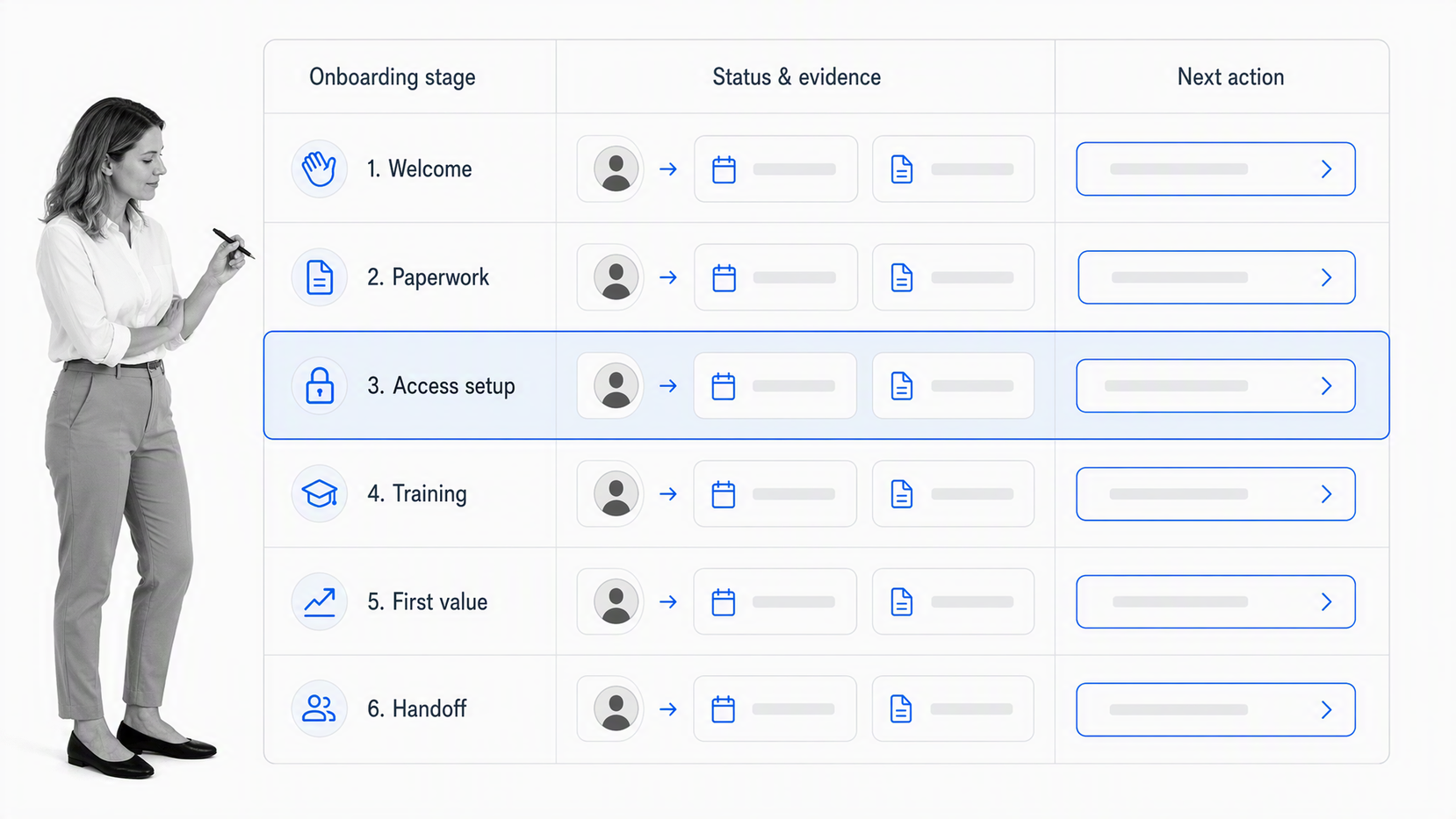
An onboarding dashboard should include only the components needed to answer a defined set of operating questions. Adding more widgets can make the dashboard harder to use if the viewer cannot tell which signal matters or what to do about it.
Onboarding scope and audience
Name the onboarding journey, its start and end points, the audience, and the decisions the dashboard supports. An executive needs portfolio-level risk and outcomes. An onboarding owner needs flow, exceptions, workload, and control state. A frontline lead needs current queues and tasks.
Status and volume
Show how many onboarding cases are waiting, active, completed, canceled, or failed. Volume gives context for timing and quality. A long cycle time on two unusual cases may mean something different from the same delay across hundreds of routine cases.
Time and flow
Useful timing views include end-to-end cycle time, time in each step, waiting time, processing time, age of open work, and completion trend. Show distribution or range where possible because one average can hide a small group of severely delayed cases.
Ownership and workload
A dashboard should show who owns the onboarding journey, who owns each exception, and whether work is balanced across teams. Ownership is not decoration. It is the bridge from visible status to accountable response.
Exceptions, controls, and action state
Show threshold breaches, missing information, rejected approvals, rework, control failures, and open escalations. IBM business onboarding dashboard guidance distinguishes passive observation from a closed-loop approach where issues can create assigned actions. That action state is what keeps the dashboard operational.
Drill-down and evidence
Summary measures should lead to the underlying onboarding case, task, event, or evidence. Without drill-down, people must search across other systems to understand the signal, which slows response and undermines trust.
Onboarding dashboard metrics
Onboarding dashboard metrics should be chosen for decisions, not because the data is easy to extract. A metric belongs on the dashboard when movement in that measure changes how an owner prioritizes, investigates, or improves the onboarding journey.
Flow metrics
Flow metrics include cohort size, completion rate, time to first value, stage age, waiting time, processing time, and handoff delay. They help teams see whether demand and capacity are in balance.
Quality metrics
Quality metrics include first-pass completion, missing-information rate, rework, rejected approvals, reopened tasks, and access exceptions. Pair quality with volume so a small number of failures is interpreted in context.
Service metrics
Service metrics include on-time completion, service-level attainment, response time, resolution time, backlog age, and customer wait time. They make the onboarding promise visible from the recipient’s perspective.
Outcome metrics
Outcome metrics measure what the onboarding journey is meant to accomplish. Examples include readiness, activation, first value, adoption, retention, productivity, or successful handoff. The correct outcome depends on the onboarding goal, not on a universal dashboard template.
Control and compliance metrics
Control metrics include approval completion, evidence presence, policy checks, review timeliness, access exceptions, corrective action status, and audit findings. These measures should link to the required proof and the person responsible for resolving the gap.
Official IBM documentation on IBM onboarding metrics guidance uses volume, cycle time, and rule violations as core process measures. That combination is useful because it balances demand, speed, and conformance rather than optimizing one dimension in isolation.
A user onboarding software view can then show whether the response workflow itself is moving, not just whether the headline onboarding metric changed.
Onboarding dashboard design principles
Onboarding dashboard design should make the next decision obvious. The dashboard succeeds when a user can understand onboarding health, locate the important exception, and enter the response path without interpreting a dense wall of charts.
Design for one operating question
Begin each view with a question such as: Which onboarding cases are at risk? Where is approval work aging? Which controls lack evidence? Which onboarding stage creates the most rework? A dashboard built around a question is easier to keep focused.
Use a clear visual hierarchy
Put the few most important status and exception signals first. Follow them with trend, segmentation, and instance detail. Avoid giving every metric equal weight. The viewer should know where to look before reading every label.
Show context beside every alert
A red status without context creates noise. Show the threshold, direction, owner, affected segment, age, and action state. If the viewer cannot tell why the signal matters or who owns it, the dashboard is incomplete.
Separate leading and lagging measures
Lagging measures show the result after the onboarding journey finishes. Leading measures show conditions that predict the result, such as queue growth, missing inputs, or approval delay. Use both so teams can intervene before an outcome is lost.
Design permissions and data quality
Limit sensitive details to the roles that need them. Document the source, calculation, refresh cadence, exclusions, and known gaps for each metric. A dashboard that looks precise but uses inconsistent definitions will produce confident mistakes.
Use onboarding workflow software to validate which step, handoff, or rule should be measured before adding another visualization.
How to build an onboarding dashboard
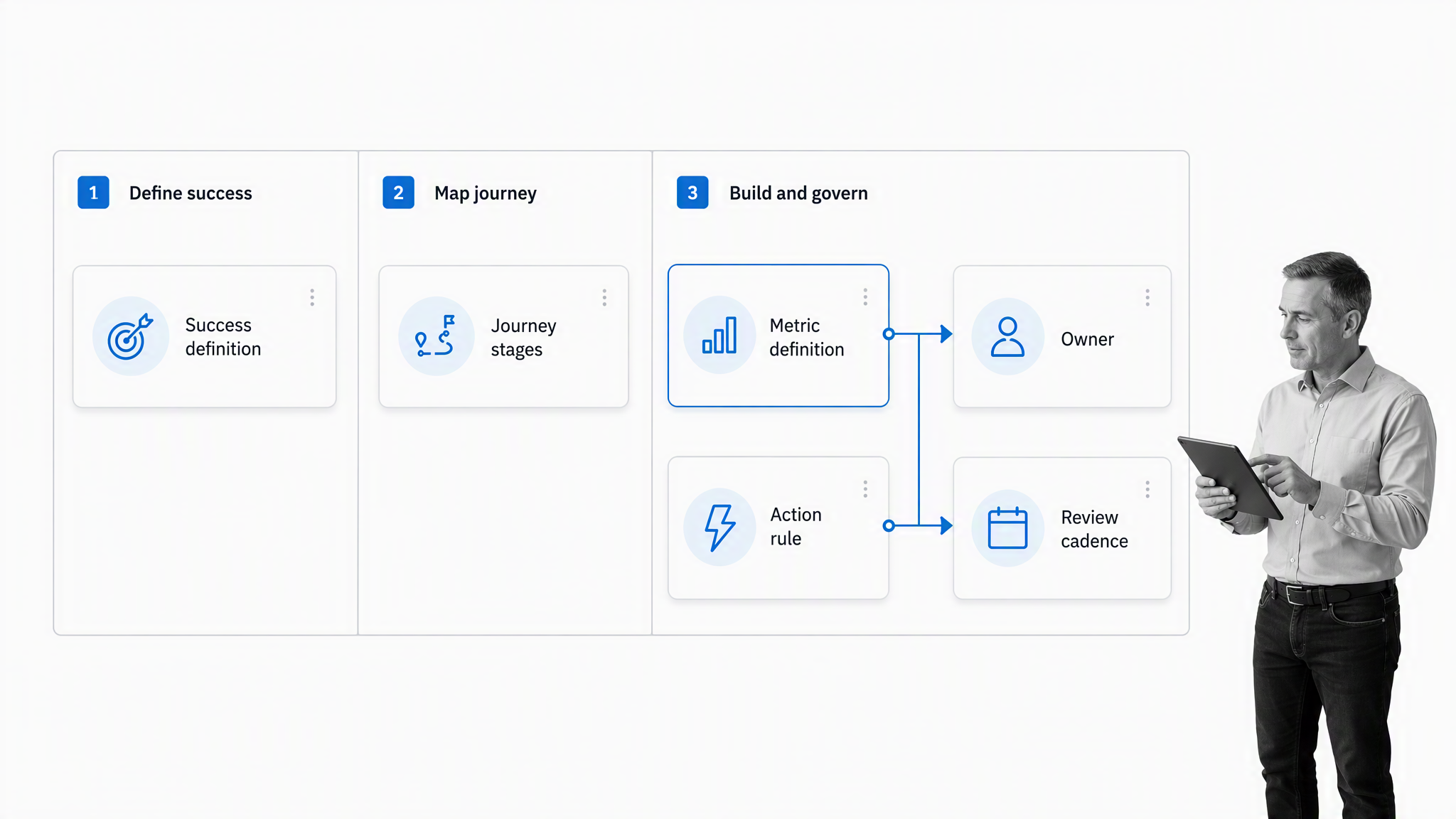
To build an onboarding dashboard, start with the onboarding journey and decision, then work outward to metrics, data, design, and response. Beginning with available data usually produces an attractive report that does not help anyone manage work.
Step 1: Define the decision
Write one sentence that names the audience, process, and decision. For example: the onboarding lead needs to see cases at risk of missing the promised completion time and assign corrective work before the due date.
Step 2: Set the onboarding boundary
Identify the trigger, completion condition, major stages, owners, customers, systems, and exceptions. A boundary prevents the dashboard from mixing activities that look related but follow different operating rules.
Step 3: Choose the smallest useful metric set
Select one or two measures for cohort demand, progress, quality, outcome, and control only when each supports the decision. Define the formula, source, refresh rhythm, segmentation, owner, and threshold before building the visual.
Step 4: Connect trustworthy data
Map each metric to its system of record and verify that identifiers, timestamps, status values, and completion events are consistent. Decide how missing, duplicate, reopened, canceled, and transferred cases should be handled.
Step 5: Build the action path
For every threshold or exception, define the response: who reviews it, what evidence they need, which task starts, when approval is required, how escalation works, and what closes the issue. This is the difference between measurement and management.
Step 6: Test with real cases
Use several normal cases and several edge cases. Check whether the dashboard reflects the correct state, whether drill-down reaches the underlying work, and whether the response path assigns the right people without exposing unnecessary data.
Step 7: Establish a review cadence
Decide who reviews the dashboard daily, weekly, or monthly and what decisions happen in each rhythm. GOV.UK guidance on measuring success recommends selecting performance data that supports the service goal and reviewing measures so teams know whether changes improve results.
A structured employee onboarding checklist can help teams agree on ownership and measurement, while a customer onboarding process template can turn the findings into a repeatable improvement loop.
Onboarding dashboard in Process Street
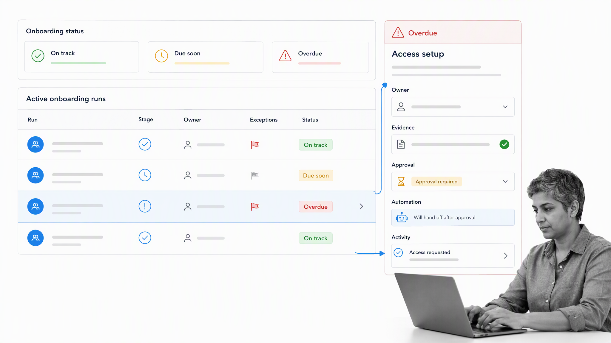
An onboarding dashboard in Process Street connects visible workflow status to the execution behind it. Teams can review active work, timing, assignments, and exceptions, then open the workflow run or task that needs action.
Use Workflow Dashboard for one process
The Workflow Dashboard shows workflow run and task status, completion timing, active runs, analytics, activity, assignments, and connected automations. This gives onboarding owners a focused view of one workflow and the work currently moving through it.
Use Reports for cross-process views
Reports lets teams create saved views across workflow runs, choose columns, filter by status, workflow, assignee, or captured fields, and identify work that may be going off track. That supports departmental, customer, portfolio, or exception views without changing the underlying workflows.
Use Analytics to inspect performance
Analytics adds charts for workflow run and task data. The useful operating pattern is to move from summary, to trend, to the underlying workflow run, and then to the task or action that requires attention.
Turn exceptions into controlled action
A dashboard signal can lead to an assigned review, evidence request, approval, escalation, remediation workflow, or follow-up task. Required fields and approvals make the response consistent, while activity history provides proof of what happened.
Connect the wider stack
Process Street connects with other systems through direct integrations and automation connectors. That helps teams bring onboarding signals into the right workflow and send approved outcomes back to systems of record while keeping ownership and proof in the execution path.
Teams choosing a workflow management system should test whether the product supports this complete loop: detect, diagnose, assign, act, approve, hand off, and learn.
How to improve your onboarding dashboard
An onboarding dashboard should improve as the onboarding journey changes. Treat it as part of the operating system, with an owner, review rhythm, change history, and retirement rule for measures that no longer support a decision.
Remove vanity metrics
If a metric does not change a decision, priority, or action, move it to a report or remove it. A smaller dashboard with trusted measures is more useful than a complete inventory of available data.
Investigate metric drift
When a measure changes sharply, check the onboarding journey and the data pipeline. A new form field, status label, routing rule, team structure, or integration can change the calculation even when real performance is stable.
Review thresholds and segments
Thresholds that trigger constant alerts teach people to ignore the dashboard. Thresholds that never trigger hide risk. Review them against actual cases and segment the onboarding journey when one group behaves differently from the overall average.
Close the learning loop
Use evidence from the dashboard to change the onboarding journey, then watch whether the measures improve. onboarding app helps make ownership and experiments repeatable, while onboarding solution supports the next cycle of redesign when the constraint moves.
Avoid common onboarding dashboard mistakes
- Building from available data instead of a decision
- Using one dashboard for every audience
- Showing averages without distribution or aging
- Displaying alerts without owners or response state
- Mixing metric definitions across teams
- Adding charts without removing obsolete ones
- Measuring outcomes without the flow and quality signals that explain them
The strongest dashboards operate as part of a management cycle. IBM workflow dashboard guidance highlights status, duration, workload, wait time, rework, and throughput as related views. Together they help teams see both the result and the operating conditions that produced it.
A recurring new customer onboarding checklist can keep dashboard review tied to action, ownership, and documented decisions instead of becoming a presentation exercise.
FAQs
What is an onboarding dashboard?
An onboarding dashboard is a focused view of workflow status, timing, volume, quality, exceptions, ownership, and outcomes. It helps a defined audience understand onboarding health and decide what action should happen next.
What should an onboarding dashboard include?
An onboarding dashboard should include the onboarding scope, audience, status, volume, timing, workload, ownership, exceptions, controls, outcomes, and action state needed for a specific decision. It should also let users reach the underlying onboarding case or evidence when they need detail.
Which metrics belong on an onboarding dashboard?
Useful metrics usually cover flow, quality, service, outcomes, and controls. Common examples include throughput, work in progress, cycle time, waiting time, on-time completion, rework, error rate, backlog age, control exceptions, and outcome completion.
How do you build an onboarding dashboard?
Define the audience and decision, set the onboarding boundary, choose a small metric set, document each metric, connect trustworthy data, design the view, create a response path for exceptions, test real cases, and establish a review cadence.
What is the difference between an onboarding dashboard and a report?
A report usually summarizes what happened during a period. An onboarding dashboard supports ongoing management by showing current status, trends, exceptions, owners, and action state so teams can respond while work is still moving.
How does Process Street support onboarding dashboards?
Process Street provides Workflow Dashboard, Reports, and Analytics views for workflow runs and tasks. Teams can move from an onboarding signal into assigned work with required fields, evidence, approvals, automations, and activity history.