


Turn every policy into automated workflows with built-in enforcement and audit-ready proof.



Quality Control Tools
Quality control tools are simple visual and statistical methods for collecting data, finding patterns, identifying possible causes, and deciding where improvement work should begin. The classic set is often called the seven basic quality tools or the 7 QC tools.
Each tool answers a different question. A check sheet captures what happened. A histogram shows how measurements are distributed. A control chart shows whether a process is stable over time. A cause-and-effect diagram helps a team explore why a problem may be happening.
This guide explains all seven tools, gives a practical example for each one, and shows how to move from analysis to a controlled corrective-action workflow. You can use the methods in manufacturing, healthcare, finance, customer operations, software delivery, and any other process where quality depends on consistent execution.
In this article, you will learn:
- Quality control tools at a glance
- How the seven quality control tools work together
- 1. Cause-and-effect diagram
- 2. Check sheet
- 3. Control chart
- 4. Histogram
- 5. Pareto chart
- 6. Scatter diagram
- 7. Stratification, flowchart, or run chart
- How to choose the right quality control tool
- Turn analysis into controlled action with Process Street
- FAQs
Quality control tools at a glance
The American Society for Quality describes the basic seven as practical tools that help quality professionals understand and improve processes. They work best as a sequence: define the problem, collect trustworthy observations, analyze patterns, investigate causes, and then control the improved process.
| Tool | Best for | Standout feature | Pricing |
|---|---|---|---|
| Cause-and-effect diagram | Exploring possible root causes | Branches causes around one defined effect | Method, not software |
| Check sheet | Collecting observations consistently | Captures counts at the source in a prepared form | Method, not software |
| Control chart | Monitoring process stability over time | Compares time-ordered values with control limits | Method, not software |
| Histogram | Seeing distribution shape and spread | Groups measurements into frequency bins | Method, not software |
| Pareto chart | Prioritizing the biggest contributors | Ranks categories and adds cumulative contribution | Method, not software |
| Scatter diagram | Testing a possible relationship | Plots paired values for two variables | Method, not software |
| Stratification | Separating hidden sources of variation | Splits combined data into meaningful layers | Method, not software |
The comparison is not a ranking. The right choice depends on the question in front of you. Most improvement projects use several tools because evidence that reveals a pattern rarely explains the cause by itself.
How the seven quality control tools work together
Start with a precise problem statement
A tool cannot rescue a vague question. Define the defect, delay, error, or unwanted outcome in observable terms. State where it occurs, when it occurs, who or what is affected, and what acceptable performance should look like. This keeps the analysis focused on a real process instead of opinions about people.
Collect data before explaining the problem
Teams often jump to a fishbone diagram because brainstorming feels productive. Start with a check sheet when you do not yet trust the data. Consistent observations create the raw material for a histogram, Pareto chart, control chart, or stratified view. The sequence protects the team from building a polished explanation around an untested assumption.
Use one tool to challenge another
A Pareto chart may show that one defect category dominates, but stratification can reveal that the category comes almost entirely from one shift or supplier. A scatter diagram may suggest a relationship, while a control chart shows that the process changed at a specific time. Combining views makes the conclusion more useful and less fragile.
A broader quality system gives these analyses a home. Teams comparing digital execution options can also review quality management system software and practical process tools. The goal is to connect the quality question to owners, procedures, corrective actions, evidence, and review rather than leaving the chart in a presentation.
1. Cause-and-effect diagram

Best for: exploring possible root causes after the problem has been defined with evidence.
A cause-and-effect diagram, also called an Ishikawa diagram or fishbone diagram, places the observed effect at the head and groups possible causes along major branches. Common categories include people, methods, machines, materials, measurement, and environment, but the categories should match the process rather than become a ritual.
How to build a useful fishbone
- Write one measurable effect at the head.
- Invite people who perform and receive the work.
- Create cause categories that fit the process.
- Ask what could produce the effect, then ask why again for each branch.
- Mark claims that need data instead of treating every idea as a cause.
The diagram is a hypothesis map, not proof. Its value is that it makes assumptions visible and gives the team a shared list of causes to test. Pair it with a check sheet, stratification, or designed experiment before changing the process.
For higher-risk failures, a structured failure mode and effects analysis helps the team assess severity, occurrence, and detection before choosing corrective actions. A focused root cause analysis process keeps investigation, evidence, and conclusions connected.
2. Check sheet
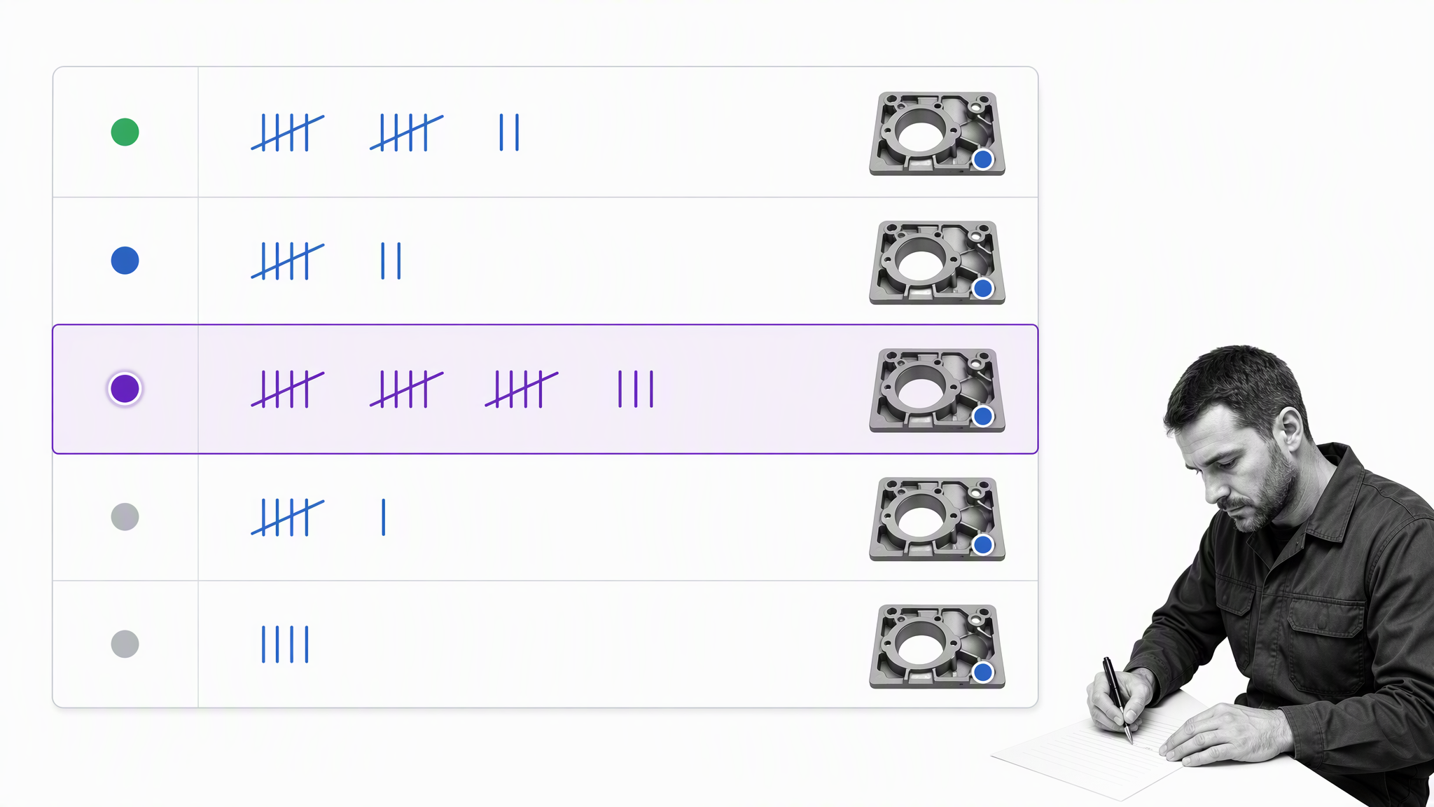
Best for: collecting consistent counts, locations, or categories at the place where events occur.
A check sheet is a prepared data-collection form, not the same thing as a checklist. ASQ defines a check sheet as a structured form for collecting and analyzing data. The observer records each occurrence with a mark, category, location, or short code so the team can analyze the pattern later.
Design the sheet around one decision
Decide what the team needs to learn before adding fields. If the question is where scratches occur, use a defect-location diagram. If the question is which error type is most common, use clear category rows and time periods. Every extra field adds effort and increases inconsistency.
Define categories so two people classify the same event alike
Write operational definitions for each category, test the form during a short trial, and review disagreements. A large sample of inconsistent observations is less useful than a smaller sample collected with shared definitions.
Once the pattern is understood, move the response into a repeatable quality assurance nonconformance workflow so the observation creates ownership and follow-through.
3. Control chart
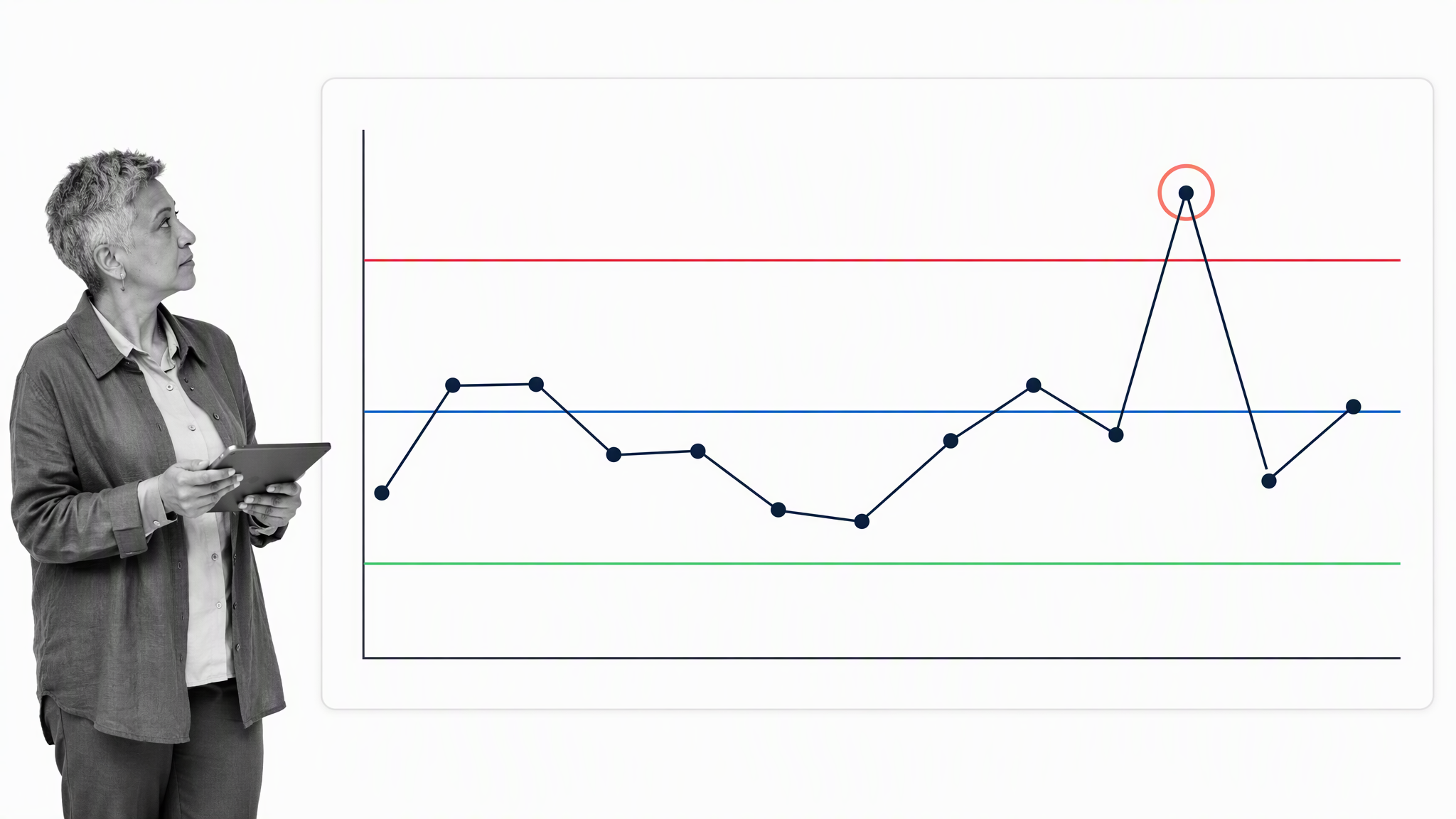
Best for: distinguishing routine process variation from signals that deserve investigation.
A control chart plots a process measure in time order, with a center line and calculated upper and lower control limits. The ASQ control chart reference explains that comparing current data with these lines helps a team judge whether variation is consistent or affected by a special cause.
Control limits are not specification limits
Specification limits describe what a customer, standard, or design accepts. Control limits describe what the current process has been producing. A stable process can still produce unacceptable results, and an unstable process can briefly produce results inside specification. Quality teams need both views and should connect signals to documented internal controls rather than substitute one limit for the other.
Look for patterns, not only points outside the limits
A point beyond a limit is a clear signal, but runs, trends, cycles, and long sequences on one side of the center line can also indicate change. Apply one agreed set of interpretation rules so the team does not hunt for patterns after seeing the outcome.
The NIST process stability guidance explains why stability matters before capability claims. When a signal appears, launch a controlled investigation rather than adjusting the process after every ordinary fluctuation.
4. Histogram
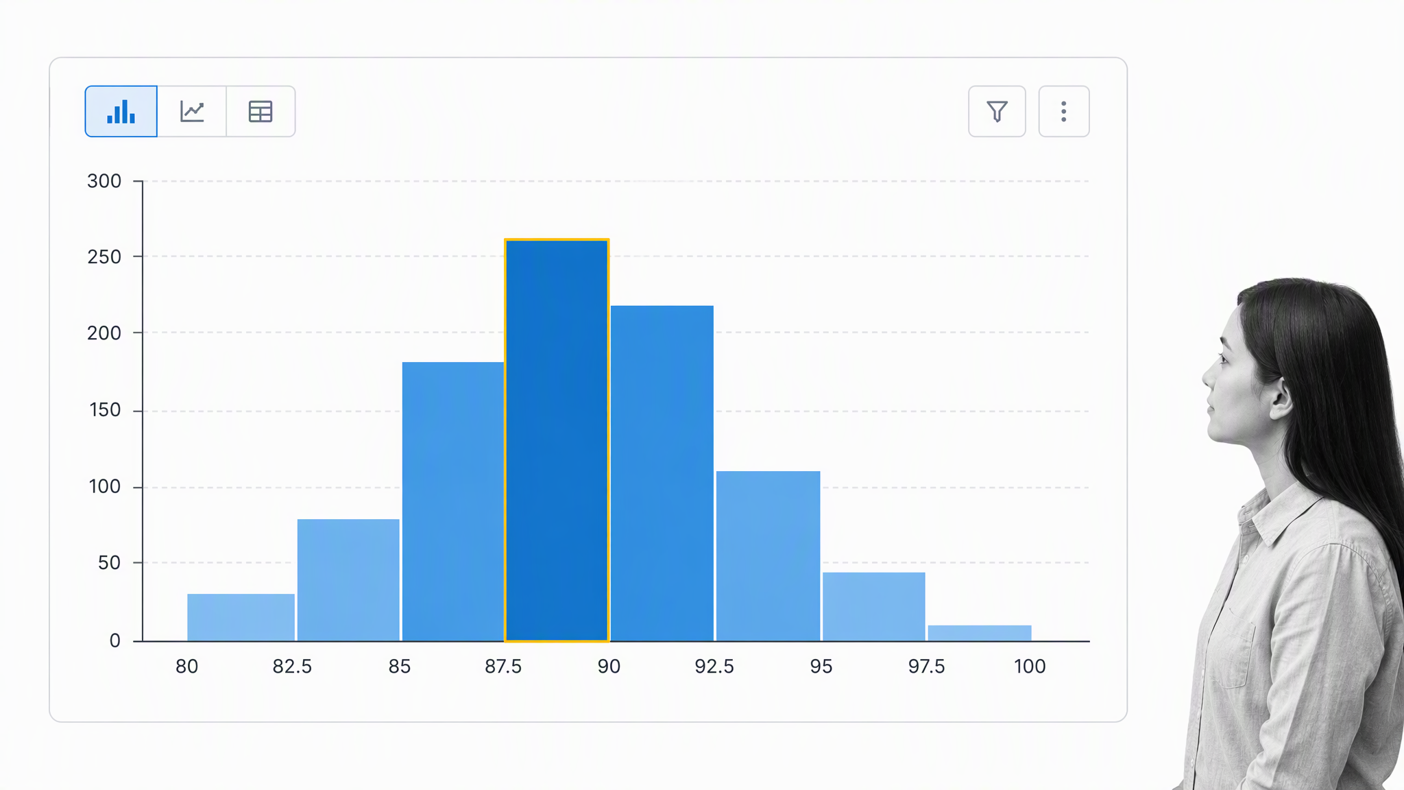
Best for: seeing the shape, center, spread, and unusual features of measured output.
A histogram groups numeric observations into intervals and displays how frequently values fall into each interval. It turns a column of measurements into a picture of the distribution. Teams can see whether values cluster tightly, spread widely, form more than one peak, or stretch into a long tail.
Choose bins that reveal rather than distort
Too few bins hide useful structure. Too many bins turn ordinary noise into a jagged story. Use consistent intervals, include the full range, and record the sample size. If groups may have different behavior, create separate histograms or stratify the data before drawing conclusions.
A histogram does not show time order
Two processes can produce the same histogram while behaving very differently over time. One may be stable; the other may shift between states. Use a run chart or control chart when sequence matters, and use the histogram to understand the overall distribution.
A structured Lean Six Sigma measure phase helps a team document definitions, sampling, collection, and validation before interpreting the shape.
5. Pareto chart
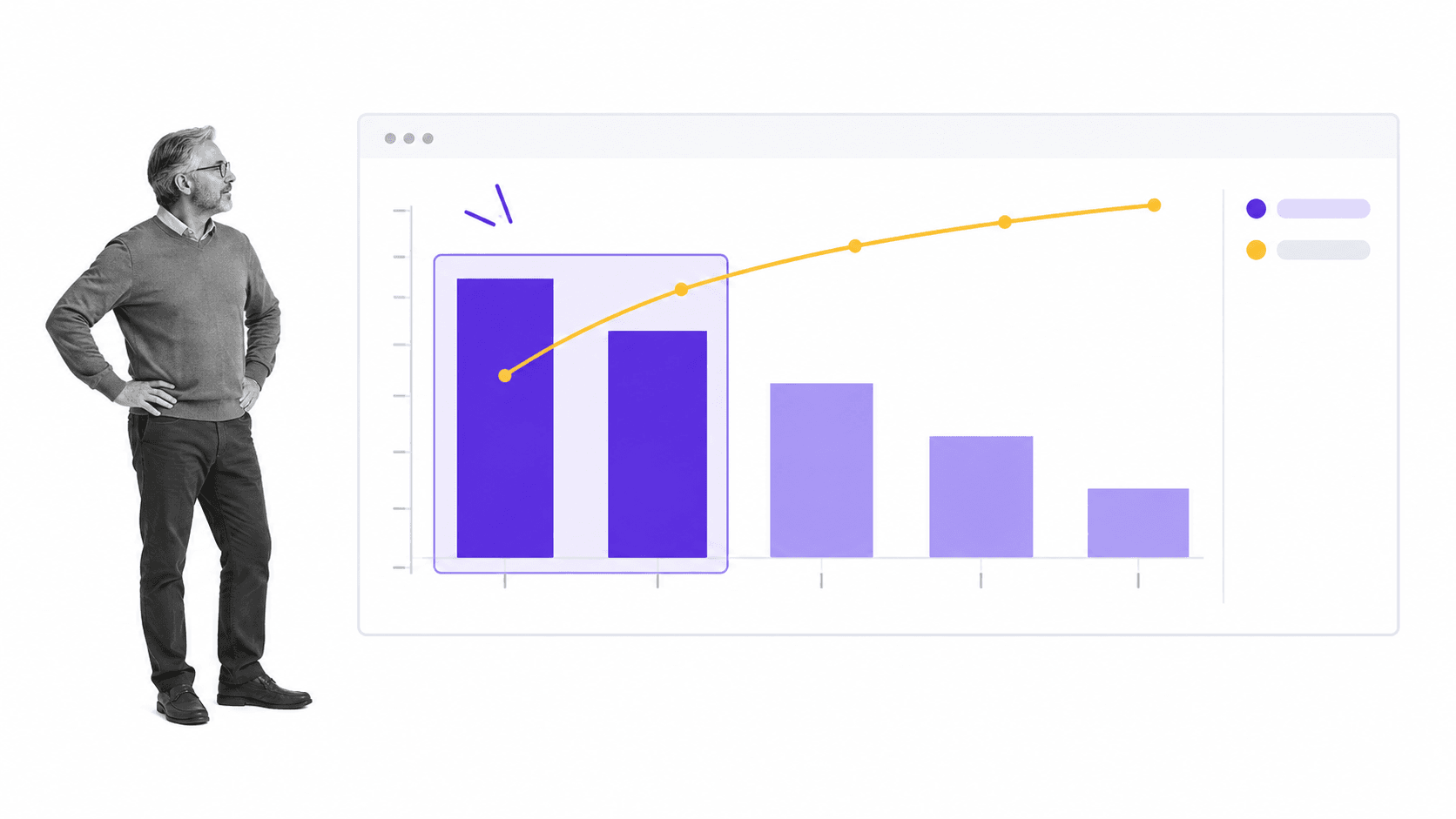
Best for: deciding which categories deserve attention first.
A Pareto chart sorts categories from the largest count or impact to the smallest and adds a cumulative line. The chart helps a team focus on the few categories that contribute most to the observed problem instead of spreading effort evenly across every issue.
Select the measure that matches the decision
Frequency is common, but it is not always the best measure. A rare failure may create more customer harm or cost than a frequent minor defect. Build separate Pareto views for count, cost, delay, or risk when the priority could change with the measure.
Rebuild the chart after improvement
The first bars should shrink if the corrective action works. When they do, another category may become the next priority. The chart is part of an improvement cycle, not a one-time slide.
Use the DMAIC improvement method to connect the selected priority to an owner, target condition, actions, evidence, and review date.
6. Scatter diagram
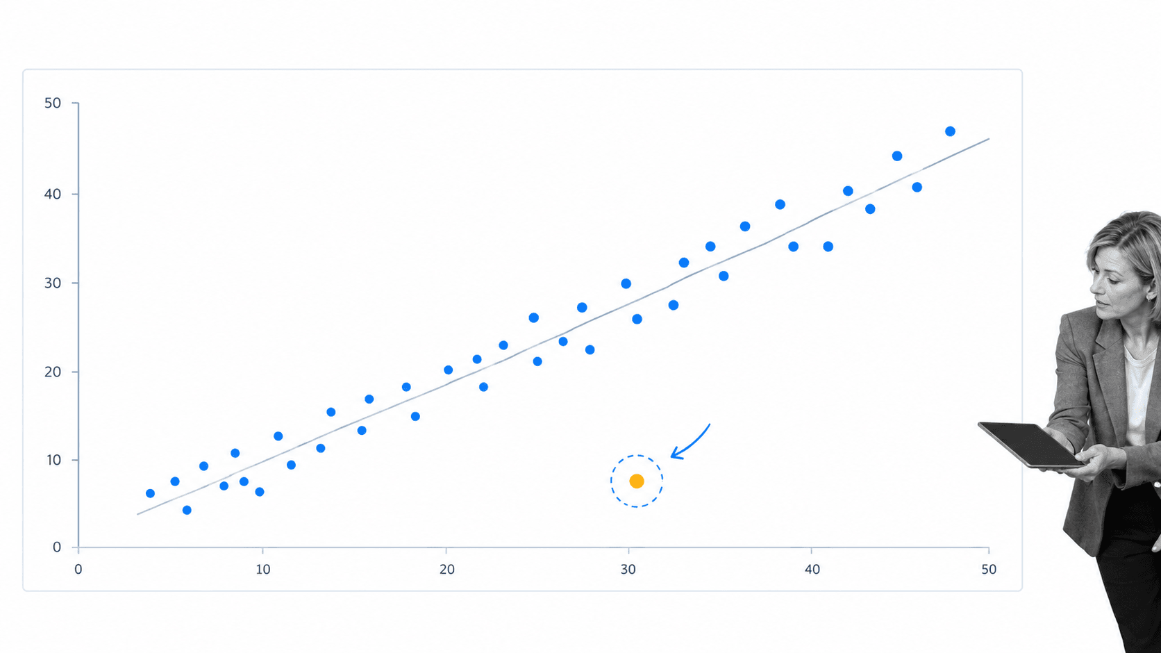
Best for: checking whether two measured variables may move together.
A scatter diagram plots paired observations, one variable on each axis. A rising, falling, curved, clustered, or random pattern can guide the next investigation. For example, a team might compare machine temperature with defect rate or training hours with error frequency.
Correlation is a clue, not a cause
A visible relationship does not prove that one variable causes the other. Both variables may respond to a third factor, the range may be restricted, or the apparent pattern may come from mixed groups. Use process knowledge and controlled testing before making a causal claim.
Plot meaningful paired observations
Each point must represent values that belong together. Measurements from different units, batches, or time windows can create a misleading cloud. Label the collection method and inspect unusual points instead of deleting them automatically.
A disciplined Six Sigma workflow can carry the analysis from measurement through verification and control.
7. Stratification, flowchart, or run chart
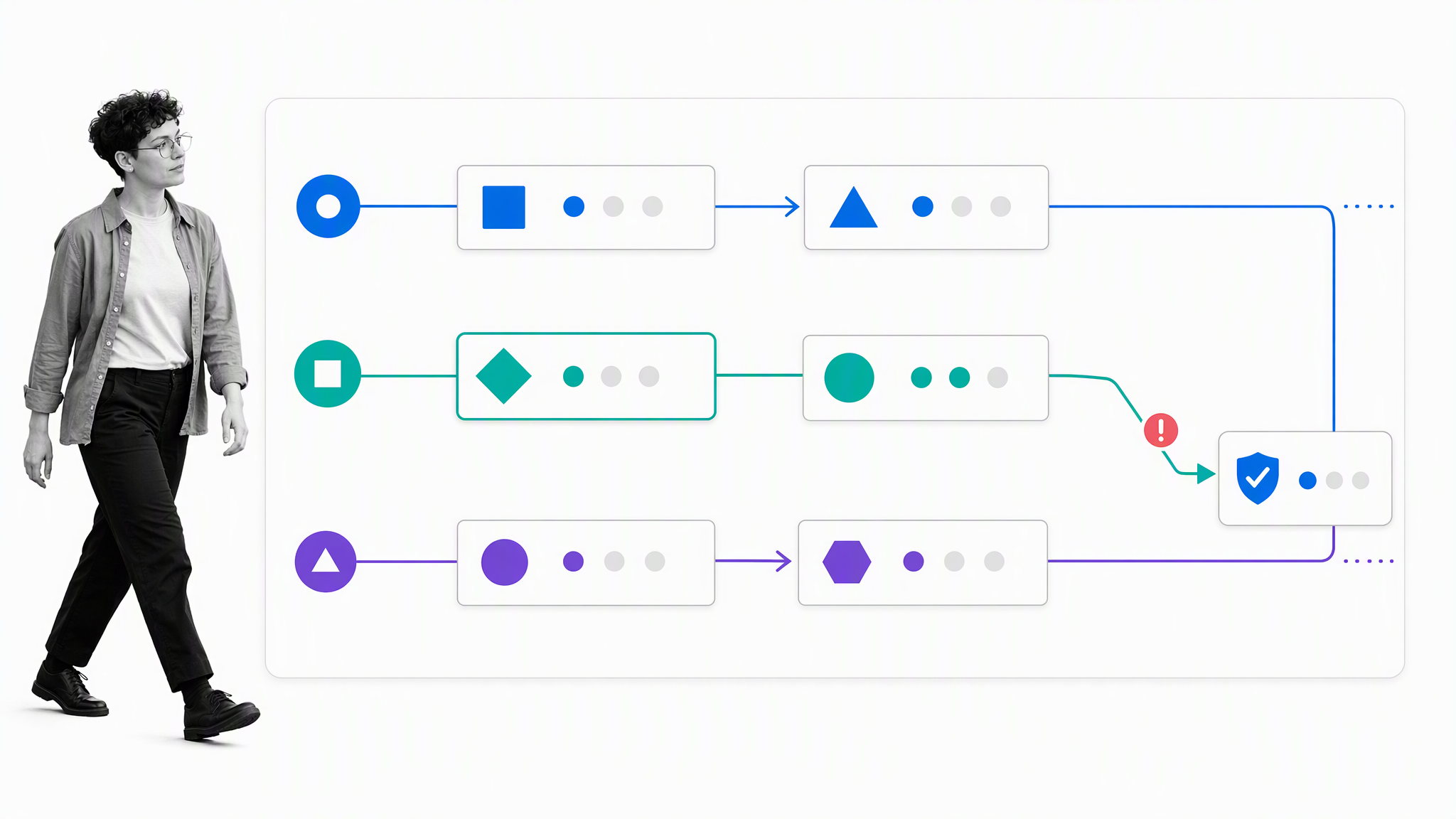
Best for: separating mixed data so a hidden source, pathway, or time pattern becomes visible.
Stratification divides observations into meaningful layers such as supplier, shift, product type, location, channel, or operator group. A pattern that disappears in the total can become obvious when the data are separated. ASQ notes that modern lists sometimes substitute a flowchart or run chart for stratification, because each also exposes structure the combined data can hide.
Use a flowchart to expose the path
A flowchart shows the steps, decisions, handoffs, loops, and exception routes in a process. Compare the documented flow with what people actually do. Rework loops and unofficial shortcuts often explain quality variation better than another summary metric.
Use a run chart to expose change over time
A run chart connects observations in time order without control limits. It is a practical starting point when the team needs to see shifts, trends, cycles, and unusual events before it has enough stable data to calculate a control chart.
A gemba walk brings the team to the place where work happens, which helps validate strata and process paths against reality instead of assumptions.
How to choose the right quality control tool
Use the question as the selector
- What is happening and how often? Use a check sheet.
- Where should we focus first? Use a Pareto chart.
- How is the output distributed? Use a histogram.
- Is the process stable over time? Use a control chart.
- What might be causing the effect? Use a cause-and-effect diagram.
- Do two variables appear related? Use a scatter diagram.
- Is a source or pathway hidden in combined data? Use stratification or a flowchart.
Match the tool to the maturity of the evidence
Early in an investigation, collect and organize observations. Later, analyze distribution, priority, stability, and relationships. Return to the process map and cause hypotheses as evidence improves. Choosing a sophisticated chart before the data is trustworthy creates false confidence.
Keep the analysis reproducible
Record definitions, source systems, collection periods, exclusions, formulas, and interpretation rules. Another trained person should be able to recreate the view and reach the same conclusion. Reproducibility turns a useful chart into durable quality evidence.
Turn analysis into controlled action with Process Street
Analysis finds the problem; execution fixes it. Process Street is a Compliance Operations Platform that connects governed procedures with recurring workflows, approvals, evidence, and audit history. That makes it useful after a quality tool identifies a priority or signal.
Convert findings into assigned corrective action
Create a workflow when a control-chart signal appears, a Pareto priority is selected, or a check-sheet threshold is reached. Assign the investigation, require supporting evidence, route the proposed correction for approval, and schedule effectiveness checks. The workflow makes the response repeatable across teams.
Keep quality controls inside the work
Required fields, approvals, and conditional logic place controls in the procedure instead of relying on memory. Teams can use Process Street workflows to connect analysis, action, and evidence in one execution record.
Start from a quality workflow, then adapt it
The quality management template library includes audit, nonconformance, control-plan, and improvement workflows. A team can also begin with an ISO 9001 internal audit checklist and adapt the evidence and approval steps to its own quality system.
FAQs
What are the seven basic quality control tools?
The seven basic quality control tools are the cause-and-effect diagram, check sheet, control chart, histogram, Pareto chart, scatter diagram, and stratification. Some modern lists use a flowchart or run chart instead of stratification. Together, the tools help teams collect data, see patterns, investigate causes, and control process performance.
What is the difference between a check sheet and a checklist?
A check sheet is a prepared form for recording observations and counts for later analysis. A checklist is a list of actions or conditions that someone confirms as complete. One collects evidence about a process; the other guides execution of a process.
Which quality control tool should you use first?
Use the tool that answers the next unanswered question. If the team lacks reliable observations, start with a check sheet. If data already exists, choose a histogram, Pareto chart, control chart, scatter diagram, or stratified view based on whether you need distribution, priority, stability, relationship, or source information.
Can the seven quality control tools be used outside manufacturing?
Yes. The methods apply to any repeatable process with observable outcomes. Healthcare teams can analyze errors, service teams can study response delays, finance teams can monitor exceptions, and software teams can track defects and process stability.
How do quality control tools support continuous improvement?
Quality control tools make current performance visible and help a team choose focused changes. The team collects new data after the change, checks whether the result improved, and standardizes the better method. Repeating that cycle turns isolated analysis into continuous improvement.
How can Process Street operationalize quality control findings?
Process Street turns a quality finding into an assigned, repeatable workflow with required evidence, conditional routing, approvals, and execution history. That connects analysis to corrective action and makes it easier to verify whether the response was completed and effective.