
![]()
“Knowledge has to be improved, challenged, and increased constantly, or it vanishes.” – Peter Drucker
Lean management, Six Sigma, and lean Six Sigma all walk into a bar. Lean management orders a Scotch. Six Sigma orders bourbon. Then lean Six Sigma orders a hot toddy. The bartender says, “So that’ll be a whisky, a whiskey, and a bit of both.”
Are you seriously writing another post about lean Six Sigma?
Yes. Yes, I am.
While you’d be forgiven for thinking that these methodologies are all essentially the same, it is important to remember that they are, indeed, separate. The principle of lean Six Sigma is simple: it combines the waste reduction and workflow efficiency of lean manufacturing with the defect-elimination process of Six Sigma.
To break it down:
- Lean: A method to reduce or eliminate any activity that doesn’t add value to a process (read more)
- Six Sigma: A system to create a defect-free process (read more)
- Lean Six Sigma: The best of both worlds used to eliminate process waste and variation (read more)
Some may say Six Sigma is outdated, or just another example of “business bullshit,” Process Street keeps lauding the benefits for one simple reason: lean Six Sigma works.
From Motorola to Amazon, Fortune 500s have been incorporating Six Sigma practices since the mid-80s. In the early 2000s, Dell, Inc. did the same and by 2004 had saved the company $1.5 billion in costs. In 2020, Dell Technologies reported total revenue of $92 billion and as well as the increasing popularity of their systems.
In this post, I’ll break down Lean Six Sigma into the five corresponding DMAIC process categories, and provide the most relevant tools for each stage. Feel free to jump ahead:
- Six Sigma tools: Define
- Six Sigma tools: Measure
- Six Sigma tools: Analyze
- Six Sigma tools: Implement
- Six Sigma tools: Control
- Final thoughts & further reading
Otherwise, dear reader, let’s begin!
Six Sigma tools: Define
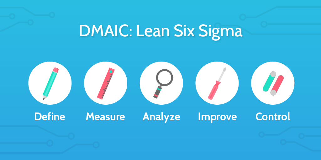 The first step to accomplishing anything is to define exactly what it is you want to achieve. In this section, I’ll go over two different tools you can use to do this. The first – a process flow chart – is a fairly simple tool to execute while the failure mode and effects analysis (FMEA) is a bit more evolved.
1. Process flow chart
A process flow chart (aka process mapping or flow diagram) is a visual representation of each step in a process and is usually one of the first tasks in improving a process.
A process flow chart:
- Provides clear understanding of the process
- Identifies non-value-added activities
- Facilitates communication and collaboration
- Ensures consistent knowledge spread
While there are many symbols used in process flow charts, you can see a few of the most common in the image below.
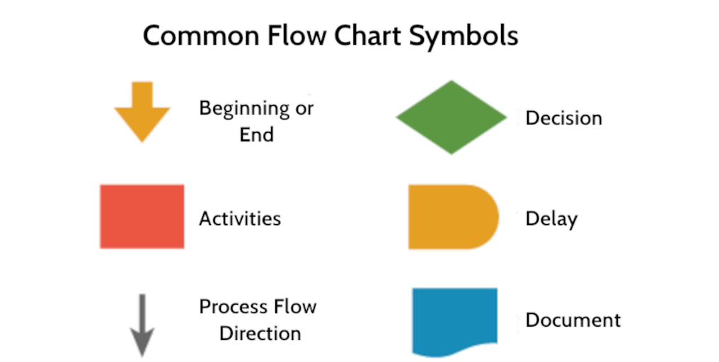
Creating a basic process flow chart in a program like Microsoft Word or Excel is fairly simple. The more complex your process is, the more data you should incorporate on the flowchart to increase communication and build team understanding. Personally, we’re partial to draw.io at Process Street, which makes creating super sleek flowcharts a breeze.
Below is an example of one of the content creation workflows we use on a daily basis. Even with slightly customized symbols, the order is still clear, and the diamond shape still indicates a decision needs to be made. For this workflow, the decision is whether the editor approves the content (which is then published) or rejects it (further edits are made).
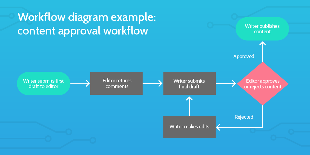
By breaking down the workflow into basic components and presenting it as a visual map, it becomes easy to identify where there may be problems or bottlenecks in the process.
For example, in this content approval workflow, let’s say that the editor notices they are sending a majority of content back for significant revisions or rewrites, which is creating a backlog for the editor. This impacts how quickly writers can make those revisions, have final drafts approved, and publish their content.
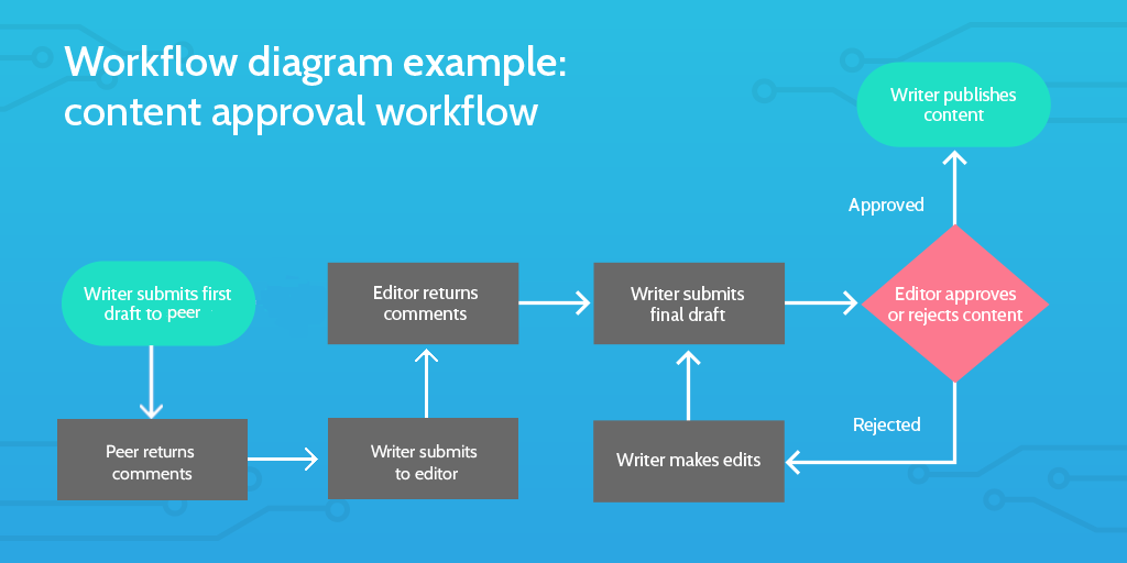
By looking at the flowchart, we can identify that the bottleneck is happening when the writer submits their first draft: these drafts require more feedback than the editor has time to give. While there are a few solutions to this problem, the simplest is to add a few extra steps to the process.
As you can see in the updated version, the writer now submits the first draft for a peer review and makes corrections before submitting it to the editor. This allows the editor to review a more polished version, thus reducing the amount of time it takes to provide comments and makes the overall process run more smoothly.
2. Failure mode & effects analysis (FMEA)
I’m not being dramatic when I say that performing a thorough FMEA can save lives. The FMEA process measures risk and can be used in a multitude of situations. The risk in question may be financial (as in the case of British Airways £100 million process failure) or the safety of your customers and employees.
Either way, you need to know what potential process failures you face, and what the effects of those failures will be if they happen. Once you do that, you can decide which to prioritize and how to address them.
In basic terms, failure modes are all the points where a thing can go wrong, and the effects analysis is what happens when that thing goes wrong.
The first step of the process is to identify all of the probable failure modes. Nancy R. Tague recommends using a grid system like the one below in her book, The Quality Toolbox:
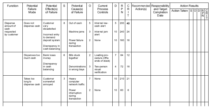
Once all failure modes are identified, then a value ranging from 1-10 (10 being the most severe) needs to be assigned for each of these three areas:
- Severity (S)
- Probability of occurrence (O)
- Probability of detection (D)
Next, you want to calculate your Risk Priority Number (RPN). The RPN allows you to rank each failure mode, with the highest number being the highest priority in terms of any improvements or error-proofing.
The equation is: S x O x D = RPN
You also need the criticality score (CRIT in the above table) which is: S x O = CRIT
The criticality score needs to be used in conjunction with the RPN to accurately determine which failure needs to be addressed first. In this table, the “machine jams” cause has the highest RPN (240) but the “out of cash” cause has the highest criticality (40). Since it also has a high RPN (200), and the jam cause has a much lower CRIT, the bank should address the “out of cash” reason first.
Conducting an FMEA can seem daunting, particularly if you’re looking at an entire system of processes rather than a single one. If the grid system makes your eyes glaze over, check out this free template that you can run every time you conduct the failure mode and effects analysis:
Six Sigma tools: Measure
Alright, kids, hold on to your hat: if you thought FMEA got complicated, just wait until we get to statistical process control (SPC).
(I’m kidding – SPC only looks scary. I promise it won’t bite.)
The next two tools will be used to gather all the necessary data about your processes and where your improvements should happen first. The Pareto chart is essentially your elementary school bar graph with a very slight twist, while the SPC method is a flowchart on steroids.
One step at a time, though.
3. Pareto chart
In 1897, economist Vilfredo Pareto created a formula to represent the distribution of wealth – now known as the 80/20 rule. Pareto intended to highlight the disparity of wealth (20% of the population possess 80% of the wealth), but the 80/20 rule has transcended Pareto’s initial goal.
In terms of business, the 80/20 rule means that 80% of the result comes from only 20% of the effort.
Several decades after Vilfredo Pareto’s realization, engineer and management consultant Dr. Joseph M. Juran published his book, Quality Control Handbook, which outlined his three principles of quality management.
The first principle? Pareto’s 80/20 rule, which eventually became the Pareto chart that we all know and love today. Organizations now use Pareto charts as a vital tool for root cause analysis and quality management.
(The other two principles are management theory and the Juran trilogy, if you want to know more.)
Juran realized that most defect distributions follow a pattern very similar to the 80/20 rule: a small number of issues creates the majority of defects. The Pareto chart, then, shows the relative frequency of defects in rank-order which allows you to prioritize improvements.
Pareto charts tend to take the standard bar graph appearance and can be created with little effort using any spreadsheet or charting software. Below is an example of a basic Pareto chart I made in Microsoft Word to assess causes of customer churn.
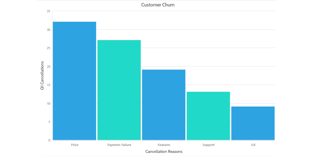
At a glance, you can see right off the bat that the primary reason customers have for canceling their accounts is the product’s price. With that in mind, you can examine your current strategies and consider the best option for reducing churn in the future.
See? Simple.
Now, you could stop there, or you could do something pretty amazing: you could add a line.
Do not underestimate the humble yet esteemed line, dear reader; it’s more valuable than you think.
Let me explain:
For a basic Pareto chart, you will only use the standard X/Y format, and your bars will be organized from highest to lowest, left to right (as above).
In the example, the Y-axis shows the frequency a cause occurs during the first quarter of the year, while the X-axis lists the individual causes.
The line is for the Z-axis, or the cumulative percentage of all issues that can be removed if the most important ones are resolved. Getting the cumulative percentage will take a little bit of math, but it’s nothing too complicated. (Trust me: I am the worst at math.)
- Add each sum together to get a grand total: 32 + 27 + 19 + 13 + 9 = 100
- Get the percentage for each item by dividing the sum by the grand total:
- (32 / 100) x 100 = 32%
- (27 / 100) x 100 + a = 59%
- (19 / 100) x 100 + b = 78%
- (13 / 100) x 100 + c = 91%
- (9 / 100) x 100 + d = 100%
- Chart a line on your graph by connecting the points for each percentage.
- Once finished, your Pareto chart should look something like this:
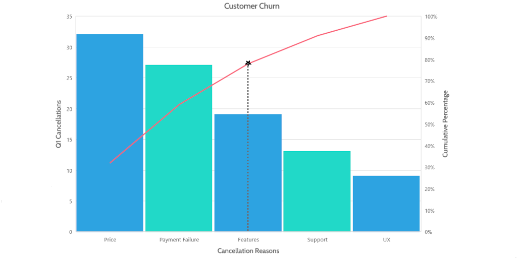
Now, locate the 80% mark on the Z-axis and trace across until you intersect the cumulative percentage line (in red above). Drop a dotted line down from that point. The issues to the left of the dotted line are the “vital few of many” to focus on for the greatest effect.
As I said, Pareto charts can be made using a variety of programs from the Microsoft suite to Creately, goleansixsigma’s template, our Pareto Chart checklist which takes you through creating one in Excel step-by-step.
4. Statistical process control (SPC)
SPC is, in very, very basic terms, a gamma-radiated process flow chart.

Initially developed in the 1920s at Bell Laboratories, it was later expanded by Dr. W Edwards Deming (of Deming cycle fame) who introduced it to the Japanese industry post-WWII. It has since been globally adopted by organizations as the primary tool to improve product quality by reducing process variation.
An SPC chart will help you gather information about your problem and identify possible causes. Then you can measure the impact of any changes to see whether or not they’ve been beneficial. The chart is generally used throughout the life cycle so you’re able to chart a baseline and assess any differences.
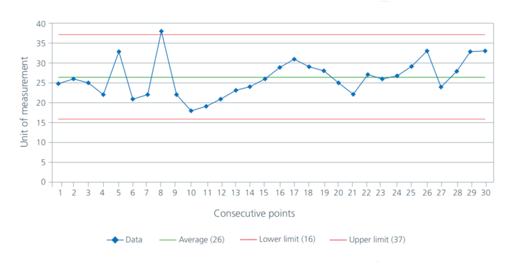
As shown in the example above, an SPC chart has an average mean with two control lines above and below. This allows us to chart any variation that currently exists in the process we want to improve. SPC’s premise is that all processes will have some amount of variation, however much we try to perfect them.
Just to clarify exactly what it is we’re going to look at:
- (S)tatistical: data used to understand processes
- (P)rocess: make the world go ‘round (ie how we do things)
- (C)ontrol: consistency, stability, predictability
Like many of the tools, you can use specialist software to create your SPC chart, but they are equally easy to create in a program like Excel.
At first blush, SPC can seem overly complicated. There are plenty of sites out there with long, complicated equations that it’d take a math whiz to decipher. If you want to get into all of that, I recommend this article by MoreSteam which offers a fairly thorough explanation of the whole process.
Some things to keep in mind when constructing your chart:
- Chart a minimum of 25 data points (ideally more) in time order
- Calculate and display the mean (the green line in the example)
- Calculate the upper and lower control limits (the red lines)
- Common cause variation is predictable and part of the process
- Special cause variation is unpredictable and usually has an external reason
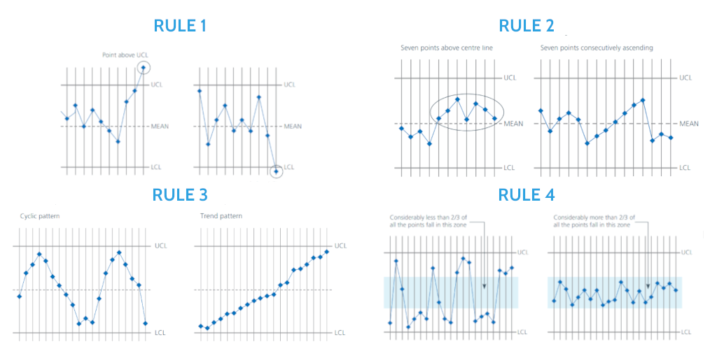
There are four rules to help you with interpreting your SPC chart. If any of the rules are broken, this means your process has a special cause variation that needs to be identified and removed. It’s absolutely vital to ensure that you only have a common cause variation before changing your process. Changing the process itself will not necessarily eliminate a special cause variation, which may not have anything to do with the actual process.
To interpret your chart, see if it breaks any of the following rules:
- Any single point lies outside the control limits
- A run of 7 points all above or below the mean (a shift); a run of 7 points ascending or descending (a drift)
- Any unusual pattern or trends within the control limits
- Less than two-thirds of the total number of points fall between the control limits
Once you’ve handled any special cause variations, you can then begin improving your processes using a method like the PDCA or PDSA cycles (more on both and eliminating process errors in this post).
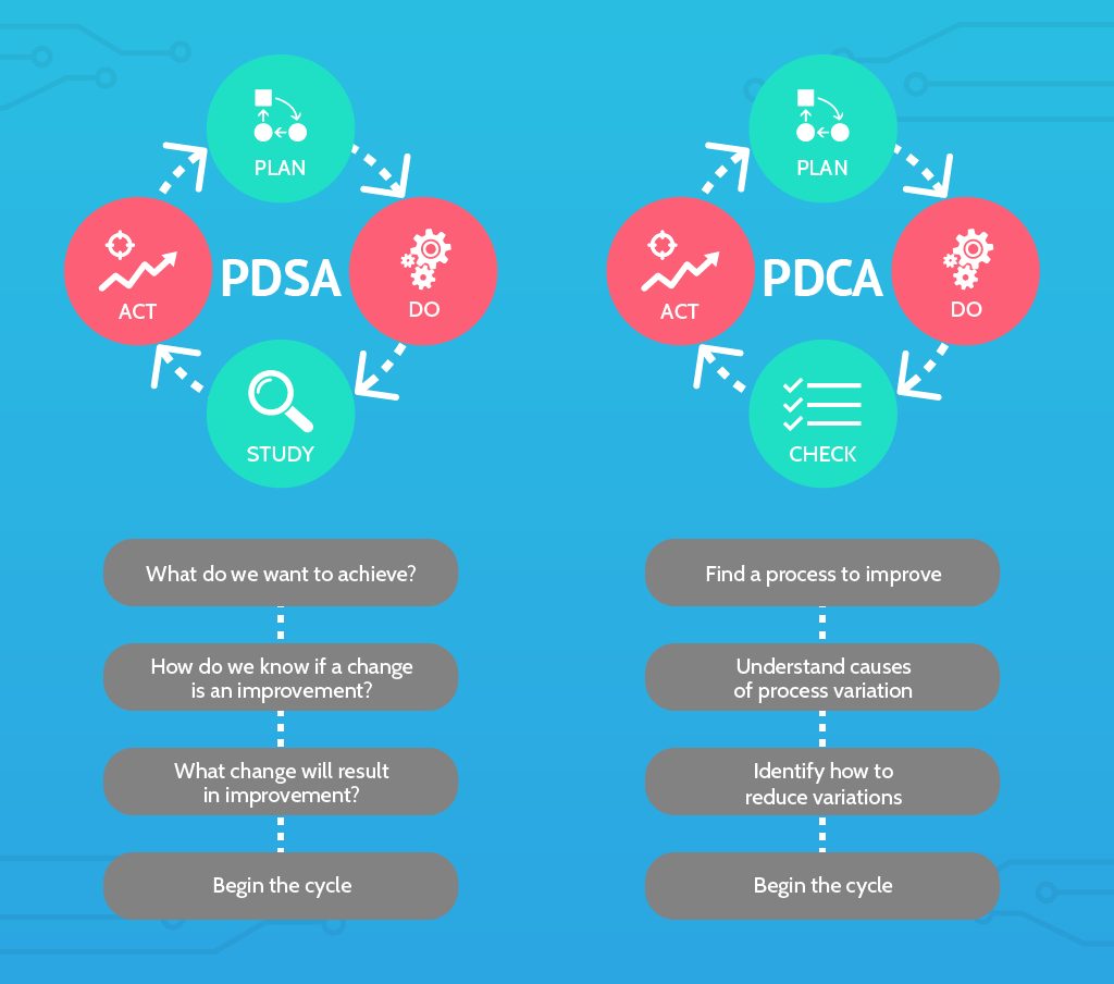
Six Sigma tools: Analyze
The next few tools are a little easier to use. At least, they don’t require any math to complete.
Both the 5-Why analysis and the Fishbone diagram are actually used quite well in conjunction with each other, with the Fishbone diagram serving as a natural extension of the 5-Whys.
5. 5-Why analysis
If you’ve ever spent any length of time with a small child, you’ll be very familiar with this method. To perform the 5-Why analysis, you ask yourself “Why?” five times in succession. The goal behind this is to understand the root cause of the problem.
“For want of a nail a shoe was lost,
for want of a shoe a horse was lost,
for want of a horse a rider was lost,
for want of a rider an army was lost,
for want of an army a battle was lost,
for want of a battle the war was lost,
for want of the war the kingdom was lost,
and all for the want of a little horseshoe nail.”
– Benjamin Franklin, Poor Richard’s Almanack (1732)
Franklin’s example, converted into a modern 5-Why analysis, would look something like this:
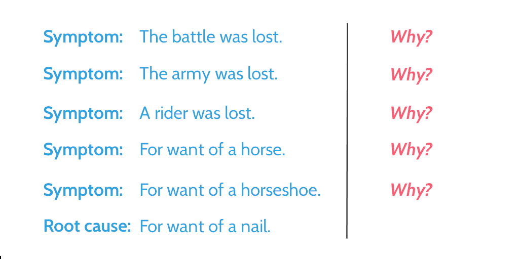
The 5-Why analysis shows how a seemingly inconsequential issue can have wide-ranging – and incredibly serious consequences. It encourages teams to look beyond the simple defect at all possible causes, and treat the disease rather than the symptoms.
6. Fishbone diagram
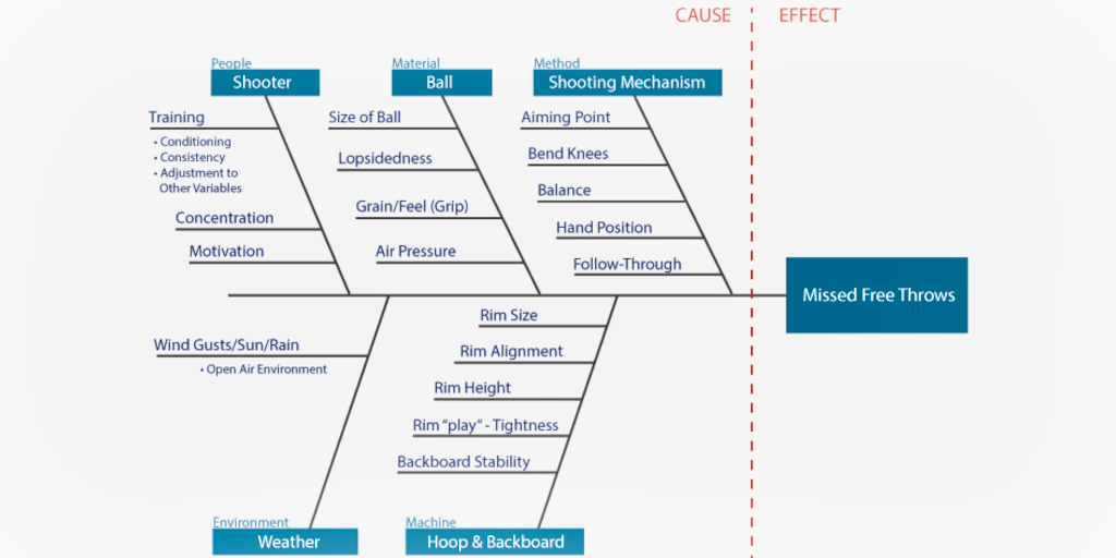
A fishbone or Ishikawa diagram follows a similar process, but uses a visual approach to documenting the answers.
The fishbone is made by creating a graphic that looks (shockingly )like a fish skeleton. This is primarily a team-based analysis that can be done using anything from Post-It notes to software suites (Excel, EngineRoom, etc.).
The steps themselves are easy:
- Write the problem (or effect) on one side of the workspace and draw a “backbone” across the page.
- Decide whether to categorize the causes by function (most common approach) or process sequence.
- Once you have your initial categories, you need to list sub-categories, either through data collection or brainstorming. (This is a good stage to use the 5-Whys.)
- Identify the root cause of the effect and create a strategy to address it.
Six Sigma tools: Implement
After all of that, we now know what’s wrong with our process and how to fix it. Implementing it, while initially a very simple action is much more difficult in sustaining through the long term.
Fortunately, lean Six Sigma has tools for that, too.
7. 5S tool
5S references five Japanese words (all beginning with the letter “S”) that should govern workplace organization:
- Seiri
- Seiton
- Seiso
- Seketsu
- Shitsuke
Translated into English, the five concepts of the 5S tool are:
Sort
Separate necessary and unnecessary items, then remove all unnecessary ones.
- What’s the purpose of this item?
- How often is it used?
- Does it really need to be here?
Set in order
Optimize your workstation so necessary items can be reached quickly and easily.
- Which items are used most frequently?
- Where is the best placement for the items?
- Is more storage needed to stay organized?
Shine
Keep your workspace clean and organized. This reinforces process discipline and adherence by emphasizing that positive working conditions matter.
Standardize
Standardize your processes to prevent deviation normalization: create schedules, assign tasks, and set reminders so cleanliness and organization are maintained.
- What tasks need to be completed every day? Every week?
- Who should be responsible for each task?
- Are processes documented and optimized for adherence?
Sustain
Keep the entire team involved in maintaining your processes so the changes are sustainable and become integrated into your organization’s culture.
- Are new employees taught the proper processes?
- Is the whole team holding each other accountable?
- Can the processes be improved in any way?
8. Kaizen
![]()
“Being satisfied with the status quo means
you are not making progress.”
– Katsuaki Watanabe, CEO of Toyota Motor Corporation
Kaizen is continuous improvement. With kaizen, every employee is encouraged to take ownership, identify improvement opportunities, and implement these changes on a continual basis.
One of the ways we apply this at Process Street, is that every team member is encouraged to not only think about how we can perform processes more efficiently, but actively identify irrelevant tasks and think about how the process can be improved. Every time we complete a task or a checklist, we ask ourselves: Is this step still beneficial to the process? Is there a more effective way we can accomplish the same goal?
As a result, our processes are constantly evolving to meet our current needs, which means increased process adherence. After all, if the processes are working, there’s no reason not to follow them.
By encouraging this consistent re-evaluation of established processes, kaizen ensures that your processes do continue to work for the people who use them most.
Six Sigma tools: Control
Personally, I don’t think control is the best word here, but no one asked me when they came up with the acronym.
The final stage of DMAIC is where you make sure your new processes are running consistently and efficiently. Process documentation is the name of the game at this point; you want a clear, accessible plan outlining the changes that are being made, the order they’ll be made in, and who will be making them. That way you’re able to monitor the improvements to ensure they actually are improvements. Alternatively, you’ll also be able to see where the improvements aren’t.
9. Corrective action matrix
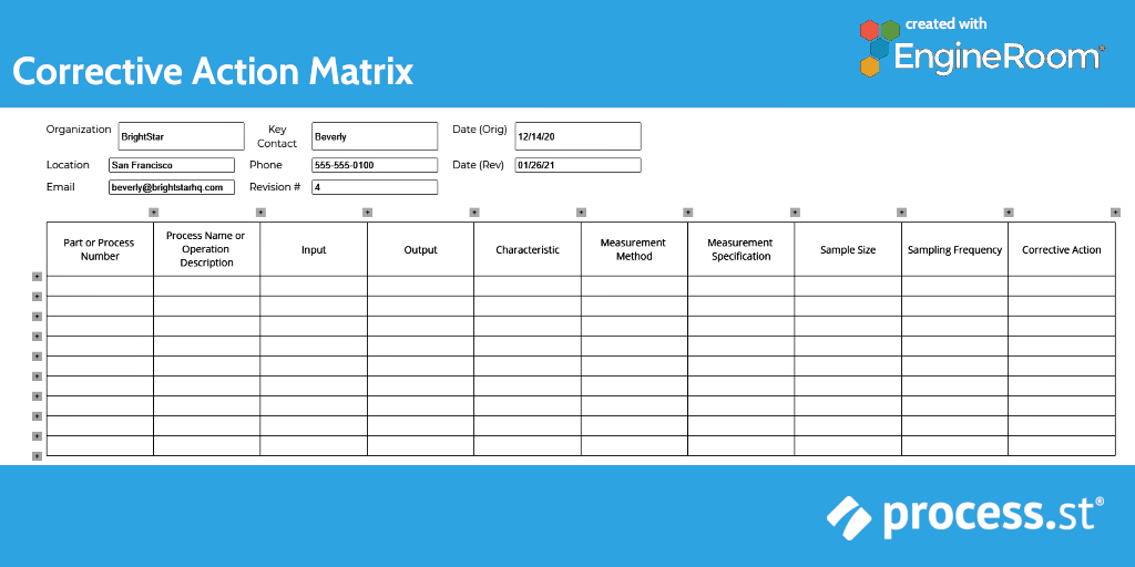
The corrective action matrix, or control plan, is used once you’ve identified what improvements need to be made to your processes. Like any project, process improvement needs to be monitored and managed so every step is completed correctly and in the right order.
The corrective action matrix is a documented plan of what needs to be done by whom, when. Using this tool, you’ll be able to track which improvements have been implemented, which still need to be accomplished, and what effect any ongoing changes have on the organization as a whole.
Like many lean Six Sigma tools, the matrix can be as simple or complex as you need it to be. The example below is a simple spreadsheet version that is suited to more basic improvements. Complex projects may need a more detailed approach, such as a gantt chart.
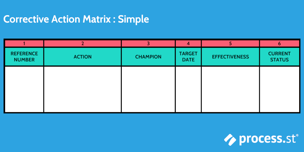
Above is an example of a simple matrix created in Microsoft Word. To get an idea what a more complex version might look like, here is one that I made with EngineRoom:
Final thoughts & further reading
These are just my personal favorites of the lean Six Sigma tools. While I do not like solving equations at all, I do enjoy a good diagram, so that makes it worth the effort.
Diagrams and visual representations also make it very simple to communicate process flows, where those flows aren’t working, and what needs to be improved to others – on your team, within the organization, or external collaborators.
Not only are these methods powerful tools for improving individual processes, but if you document the procedure as you go through each step, you can reuse that outline again and again every time you need to adjust or improve one of your processes.
Check out the following articles for some extra insight into lean Six Sigma, process improvement, and business process management:
- How to Ensure Your Business Processes Are Ready for Lean Six Sigma Improvement
- How to Solve Your Problems With Lean Six Sigma (Free DMAIC Checklist)
- 14 BPM & Six Sigma Courses You Can Take to Become a Systems Expert
- Gap Analysis: How to Bridge the Gap Between Performance and Potential
- What is Process Mining? 9 Tools to Optimize Your Process Management
What’s your favorite lean Six Sigma tool? Did I leave one out that you think deserves more attention? Is Sig Sigma “business bullshit”? Let us know in the comments!


Leks Drakos
Leks Drakos, Ph.D. is a rogue academic with a PhD from the University of Kent (Paris and Canterbury). Research interests include HR, DEIA, contemporary culture, post-apocalyptica, and monster studies. Twitter: @leksikality [he/him]