
When I was about 7 years old, I made a deliberate decision to stop caring about math.
I remember the moment clearly. I started sitting closer to the back of the class, stopped answering questions, and, eventually, I stopped being asked questions by the teacher.
I told myself that it wasn’t worth learning because we have tools like computers and calculators. Consistently, I got mediocre grades in the topic and only scraped through the finals with a borderline passing grade…
It wasn’t until I started working at Process Street that I cared about data, charts, spreadsheets and correlations.
Research and data manipulation skills are extremely important for pretty much anyone that has to devise their own solutions.
Not only that, studies are incredible marketing tools. Original data attracts links and shares like nothing else because it’s one of the few newsworthy things a company can do. You’ve got product releases, funding announcements, and research.
And it’s not just my own theories that say studies attract high-quality backlinks…
The huge benefits of writing detailed studies with original data
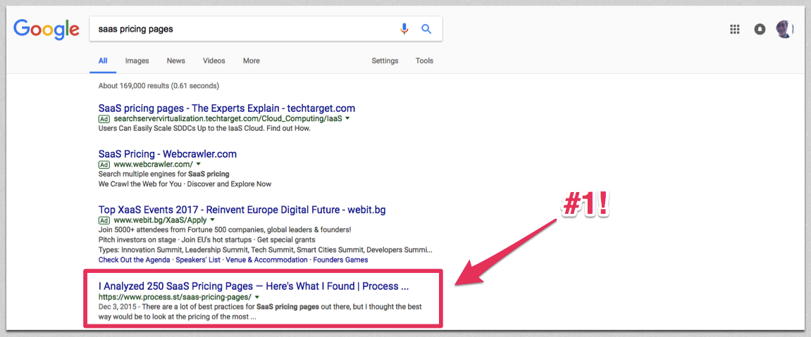
My SaaS pricing page study, for example, was syndicated on The Next Web and ranks #1 for its target keyword.
It’s picked up links from a variety of high-authority sites:
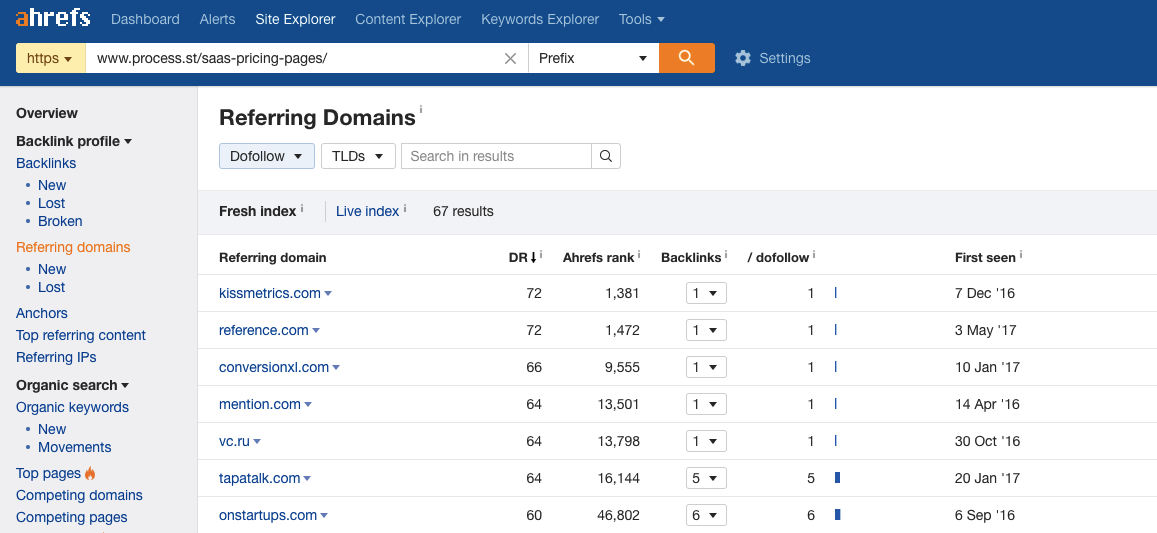
This kind of content naturally gets backlinks because other companies will want to write posts referencing data from a study. If they reference the data, they have to give you a backlink to back up their own claims.
Here are the studies I’ve written so far:
- I Analyzed 250 SaaS Pricing Pages — Here’s What I Found
- 386 Startup Pricing Pages Analyzed (OnStartups)
- I Analyzed the Copy on 87 SaaS Startup Landing Pages — Here’s What I Found
- I Analyzed 12,844 Tweets to Find How the Top SaaS Companies do Twitter Support
All of these posts involved scraping data, formatting it into a database, and making sense of the patterns in line with a hypothesis.
In this post, I’m going to show you a collection of methods I used for each study, and then explain how to make the most out of your data to get backlinks, shares and exposure.
Come up with one big hypothesis
A hypothesis is a statement you make without seeing the full data. Something to prove or disprove, like:
- The bigger the SaaS company, the lower the quality of support
- Enterprise SaaS companies use less benefit-driven headlines
- Smaller SaaS companies are more likely to show their pricing
These all came from casual observations, and they were questions I tried to find the answer to on Google before setting off to do my own research.
Since the data for these questions wasn’t available, I realized that was a gap in the available content and a chance to get exposure with original never-seen-before data.
Scrape source data and lists
In the past, I’ve used both the Montclare SaaS 250 and Angel List’s top startups. The structured data exists already, so it’s best to check before hacking together a scraping method.
Search Google for ‘list of X’ or ‘top 100 X’ and check to see if someone or some organization has already compiled a (reliable, not opinion-based) list.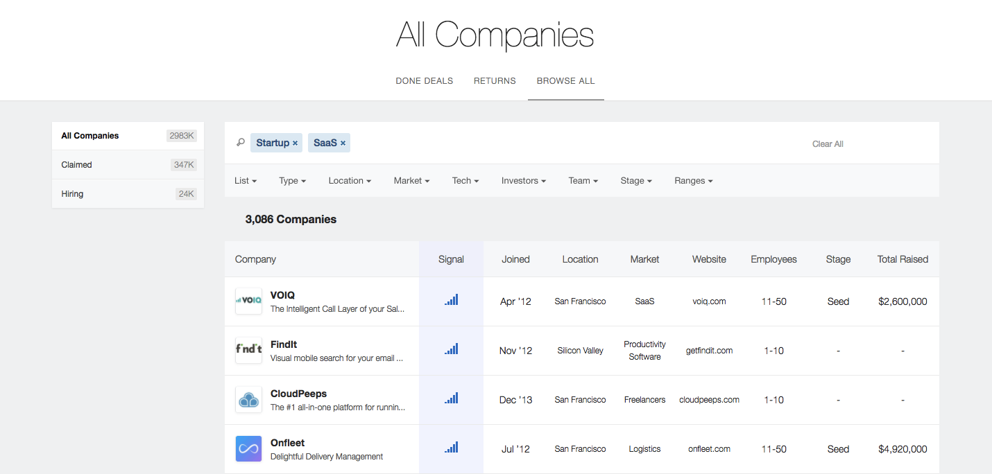
Scraping Google search results
We all know Google can be used to generate simple (if slightly random) samples of content by keyword, but it can also be used to generate tight lists of domains for analysis, with precise queries.
For example, if you wanted to get a list of gaming blogs that accept contributions, you could do a query like this:
gaming intext:"write for *" OR contribute OR "submit a *"
Once you’ve found the perfect query (or range of queries), you can scrape the returned URLs using a SERP scraper like Scraperr. You’re restricted to 100 at a time because of Google’s API limitations, but it’s not much work for thousands of URLs.
Scraping specific sites with import.io
When you want to scrape all data from a page (for example, when getting a list of company names from the top 250 SaaS companies), you’re going to want to use an automated method instead of copy-pasting.
For this, I’d recommend import.io.
Most websites that list content are sensibly structured, so import.io’s web-based tool, Magic, should work. Here you can see a spreadsheet generated from just pasting a URL:
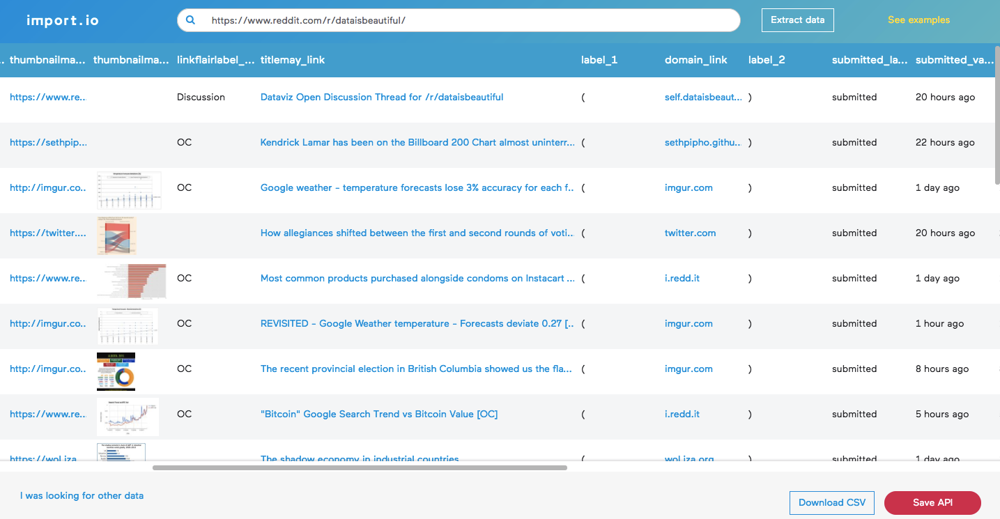
If that simple method doesn’t work, you’ll have to try one of their other three tools. I don’t have the space to go into how import.io works in this post, but there’s a guide here on using it to scrape AngelList, an example here about how I used it to scrape header images off of my blog, and their help guide here. It’s so much easier than it first seems.
Exporting content marketing data from BuzzSumo or Ahrefs
For content or SEO data, BuzzSumo and Ahrefs have it all.
- What kind of content is most popular in X niche?
- How many backlinks do list posts get? Do they get less than non-list posts?
- Who are the most influential people in X niche?
- Do longer or shorter posts get more shares?
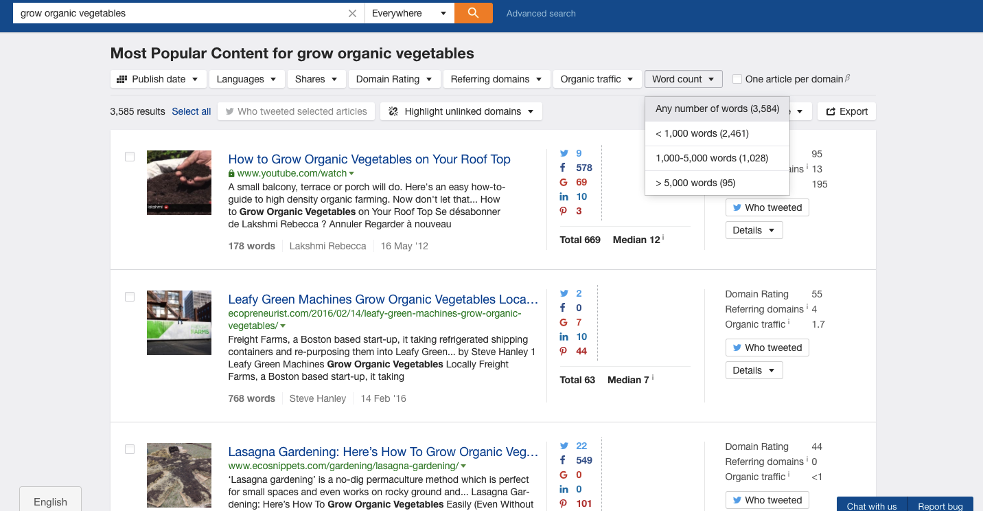
You can use their content databases to get all kinds of amazing data, exported straight to a CSV or Excel file for analysis.
Want to see the most popular posts about growing organic vegetables? I’m not sure why you might need it, but it’s an example using Ahrefs nonetheless:
Scraping manually into a spreadsheet
Sometimes, like with my SaaS pricing and landing page studies, there’s no amount of scraping you can do to get away from the fact that it’s a laborious, manual process. For the pricing page study, I visited every URL, took a full-page screenshot and then manually added the data to a spreadsheet. Open the first image. How many pricing tiers, what’s the cheapest package? Sometimes this work is insanely manual, but it can pay off.
Scraping Twitter data
As a Twitter madman, t by sferik is one of the most useful tools for me. It’s a free command line tool that runs on Ruby, so it can be used on either Windows or OSX.
OSX should already come with Ruby installed. If you’re on Windows, download it here.
Once you’ve got Ruby, you can use the command gem install t in Terminal to get access to a huge range of Twitter power tools. For example, if I wanted to get a CSV file of Tableau Support’s latest 1,000 tweets, I could do that in just one command:
t timeline @tableausupport --csv --number 1000 > tableausupport.csv
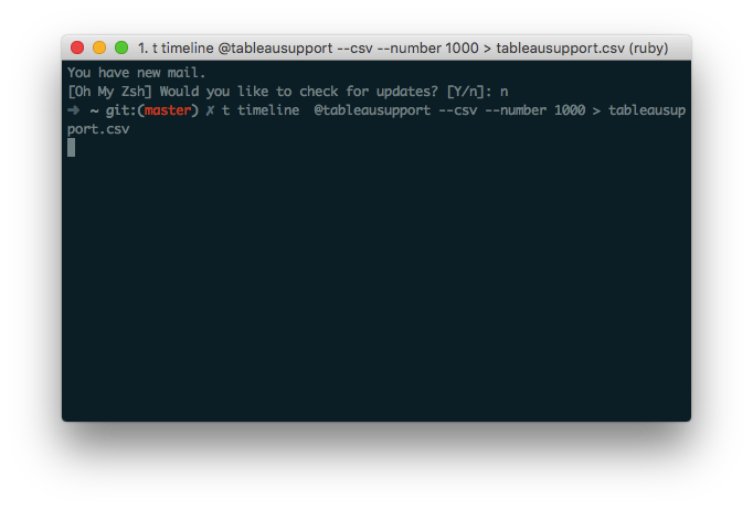
You can also use t to retrieve stats for multiple users, scrape hashtagged tweets to a CSV file, and more. Read the full documentation here, or just type help if you get stuck.
Use Zapier to collect sent emails
For an upcoming study, we signed up to hundreds of the top SaaS companies with a dummy email address to stockpile their marketing communications for analysis. We wanted to know how the best SaaS companies handle this area of their business.
As it turns out, almost everything can be solved with a simple zap. We linked the Gmail account of the dummy user to a Google Sheet spreadsheet, and every time the account was sent an email, Zapier formatted it up into the sheet. That way, we didn’t have to retroactively scrape the Gmail account for data, it was nicely formatted as it came in. You can use Zapier to collect any kind of dynamic incoming data, like reddit posts made on a certain subreddit, RSS items added to feed, or even attachments sent to a specific email address.
Here’s the zap we used:
De-clutter your data to make it easy to analyze
Scraped data is terribly messy, and no data that you gather yourself is going to be ripe for analysis immediately. The next step after you’ve scraped the data is to tidy it up. That means removing duplicates, standardizing it, filtering out records that are irrelevant, and more.
Mostly, I use TextWrangler, Airtable, and Google Sheets. All tools are free, and you can also use pretty much any advanced text tool in place of the Mac-only TextWrangler.
Using find and replace to tidy up messy data
You never know what to expect when scraping data. It could have all kinds of weird artifacts that need removing so you have a standard set.
For example, when I was scraping a list of niche sites that accept guest posts from Google, I was given a list of URLs with a strange string at the start of the cell. So, I pasted the whole column into TextWrangler and replaced every instance of the string with a blank (in effect, deleting it).
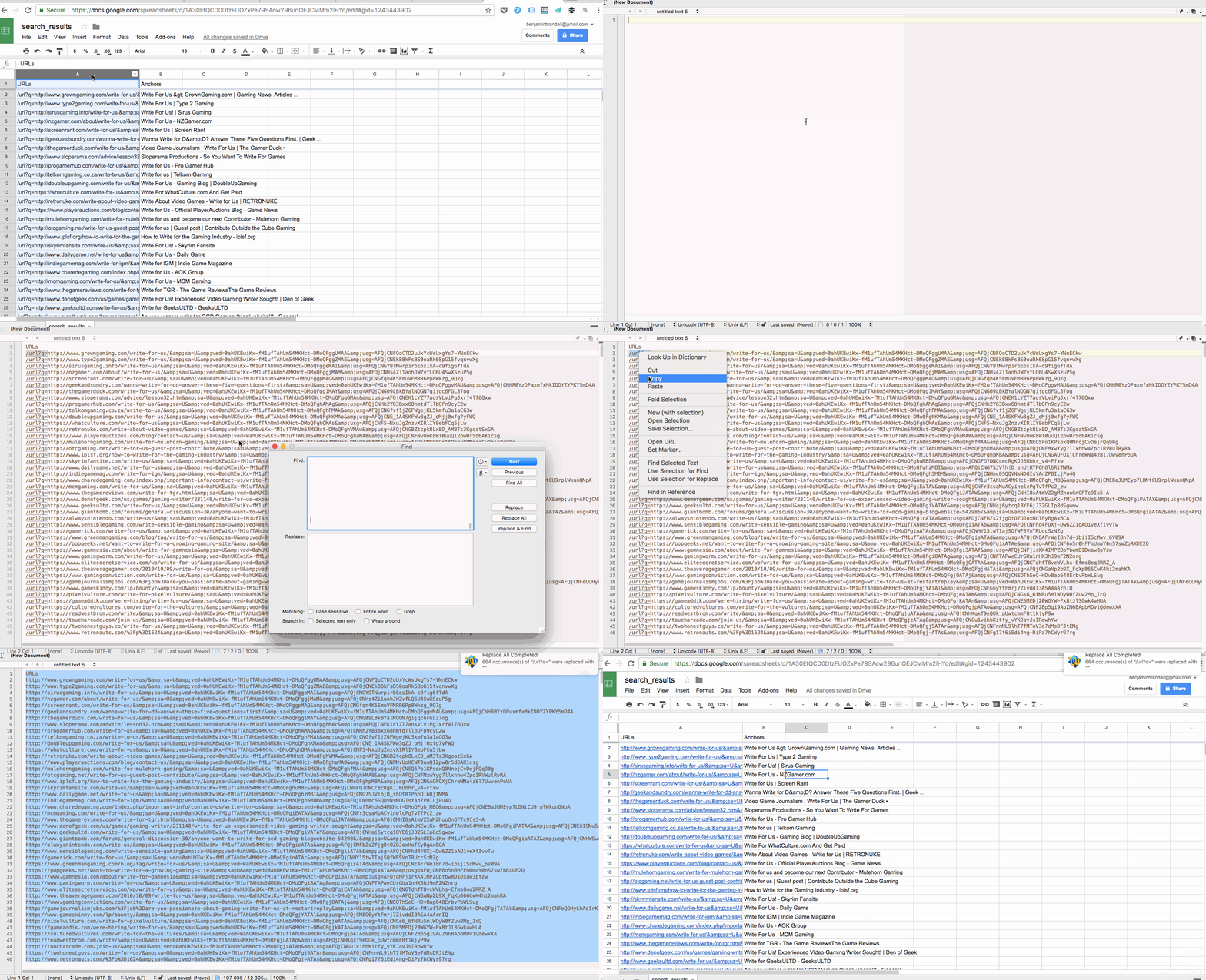
You can use find and replace for most problems, but sometimes you’re going to want to find every cell or row that matches a certain pattern not a certain verbatim string. In those cases, you’d use grep or RegEx.
In TextWrangler, you can search text using a variety of tools, and one of which is grep. It’s a Unix command for searching inside plain text, but you can also use its power to manipulate data.
For example, if I wanted to find every row in a file that contained any URL, I could use this command in TextExpander’s grep search:
http://ex[a-zA-Z.-]*/[a-zA-Z.-]*/[a-zA-Z.,-]*
I realize that it looks terrifying and nonsensical, but grep is talked about a lot on sites like StackExchange so you can usually find the exact command you’re looking for with a simple Google search.
Manipulating data in a text editor
TextExpander — a free textpad for OSX — has a ton of built-in text manipulation features in its Text menu:
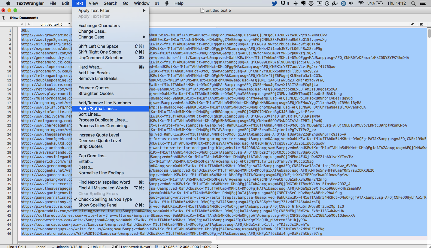
With this, you can do all kinds of things:
- Surround lines in quotes
- Remove all lines that contain certain strings
- Sort lines numerically or alphabetically
- Remove line breaks
- Change commas to line breaks
- Remove duplicate lines
- Etc, etc, etc…
For Windows, Notepad++ is the closest viable option (and has the advantage of RegEx and grep search), and for an alternative on Mac try the free version of BBEdit.
Here’s an example of creating a multiple site search query from a list of raw domains:

Remove duplicate rows in a spreadsheet
Often when you’re merging several sheets together into a database, you’re going to run into problems with duplicates. For example, if I wanted to combine a list of the top 5,000 startups in the U.S.A and the top 100 startups in Texas, I might end up getting the same companies on the list twice. In order to not pollute the data, I’d remove duplicates in Google Sheets using Remove Duplicates, like this:
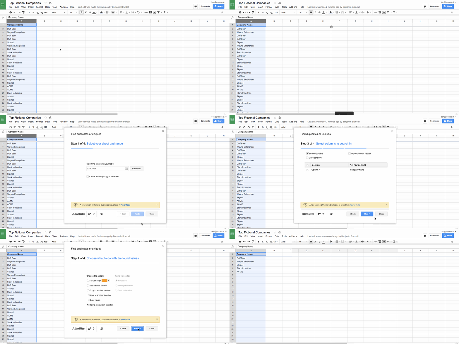
Remove duplicates is also a feature of most advanced text editors, and of Microsoft Excel.
Filtering, sorting, and grouping data in Airtable
To match the gathered data up to your hypothesis, you’ll need to sort and filter the data to show only the relevant records. For this, I always turn to Airtable. As a powerful (yet user-friendly) database, Airtable lets you store filtered snapshots of the database and then group them by a field.
In the gif below, I run through a sample of my Twitter support research, filtering the data to show only Dropbox’s tweets, and then filtering them to show only the positive ones. You also notice the tweets are grouped by sentiment (which was found out with Aylien’s Text Analysis API):
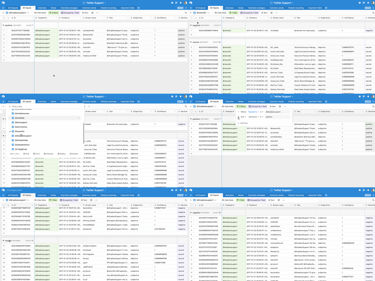
This makes it easy for you to create one view in Airtable per data point.
For example, if I was looking for every company that said ‘sorry’, ‘apologies’, or ‘apologize’, I’d want to filter the main tweet list by tweets that only contain those words, and then create a view called ‘Tweets with apologies’. From inside that view, because the data isn’t polluted, I’d easily be able to sum up apology count by company, and more.
Finalize the data points you want to look at
It’s likely that you had some idea of what you were looking for before you started scraping, but having the full data in front of you will guide you towards some more bullet-points you might want to look at.
For example, when I had the list of landing page copy in front of me, I realized that it all fell into categories. There were headlines like ‘the best X software for Y teams’, and each headline had its own sentiment, keywords, etc.
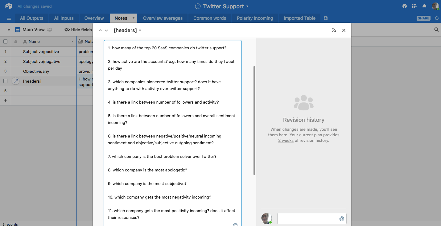
Before you get to building formulas and organizing the data in a way that helps you draw conclusions, list out which conclusions you want to draw.
Here are the things I knew I wanted to find out for certain from my Twitter support data:
Extract key findings from your data
Once you’re at this stage, you’re past the hard part. The hardest part is matching methods of sorting and filtering data to the data points you set out to get. That said, there’s no one true way to extract findings…
A lot of the work will be deciding on the best way to filter the data set so you can summarize it. This might mean building formulas into a particular row so you can sum and find percentages, or it might just mean sorting the data so you can find the top 10 records against a certain metric.
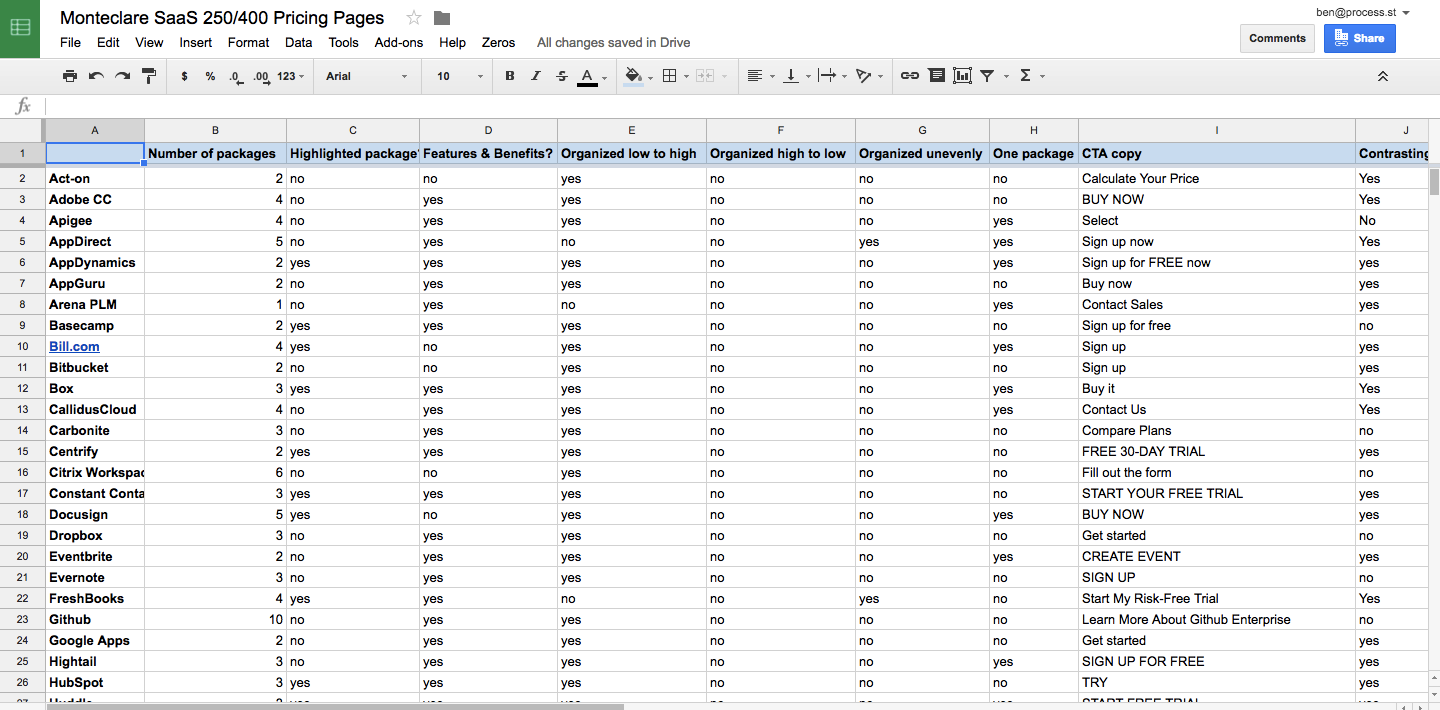
Here’s an example of my final findings and how they’re organized for my SaaS 250 research project:
Turn your key findings into content that gets a ton of links and shares
What’s the best way to write and structure a study? You’re going to want to show your key data points early so the reader can see the instant value of the post, and then dive deeply into each in its own section before drawing a conclusion.
Roughly, I use the following structure:
- Introduction: why did you decide to write this study, and what major things did you find out?
- Key findings: a bullet-point list of every data point
- Data point #1 – Data point #x: a description of what you found, plus a handful of theories from other sources as to why that might be the case, like this:
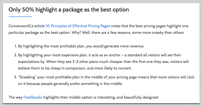
- Finally, when you’ve gone through every data point you stated at the top of the page, it’s time to wrap it up with a conclusion. What’re the most interesting takeaways? How can the data inform your readers to make smarter choices?
With all the work you’ve done to gather and analyze original data, it’d be a shame to just write a blog post about it and forget about it. You can turn your study into a variety of content, including:
- Graphs / images for social media
- A slide deck
- An infographic
Now I’ll explain each type of content, and the best way to create it to promote a study:
Creating graphs that make your studies instantly appealing
Graphs are awesome for social media. They communicate the value of the post in the best way possible because readers are used to seeing data condensed in graphs (and because graphs are literally the way to display data in a readable format).
I analyzed 12,844 tweets to find which #SaaS company is best at Twitter #support —> https://t.co/Ddy24zE4dR pic.twitter.com/UfJeqKzExj
— Benjamin Brandall ✨ (@benjbrandall) May 11, 2017
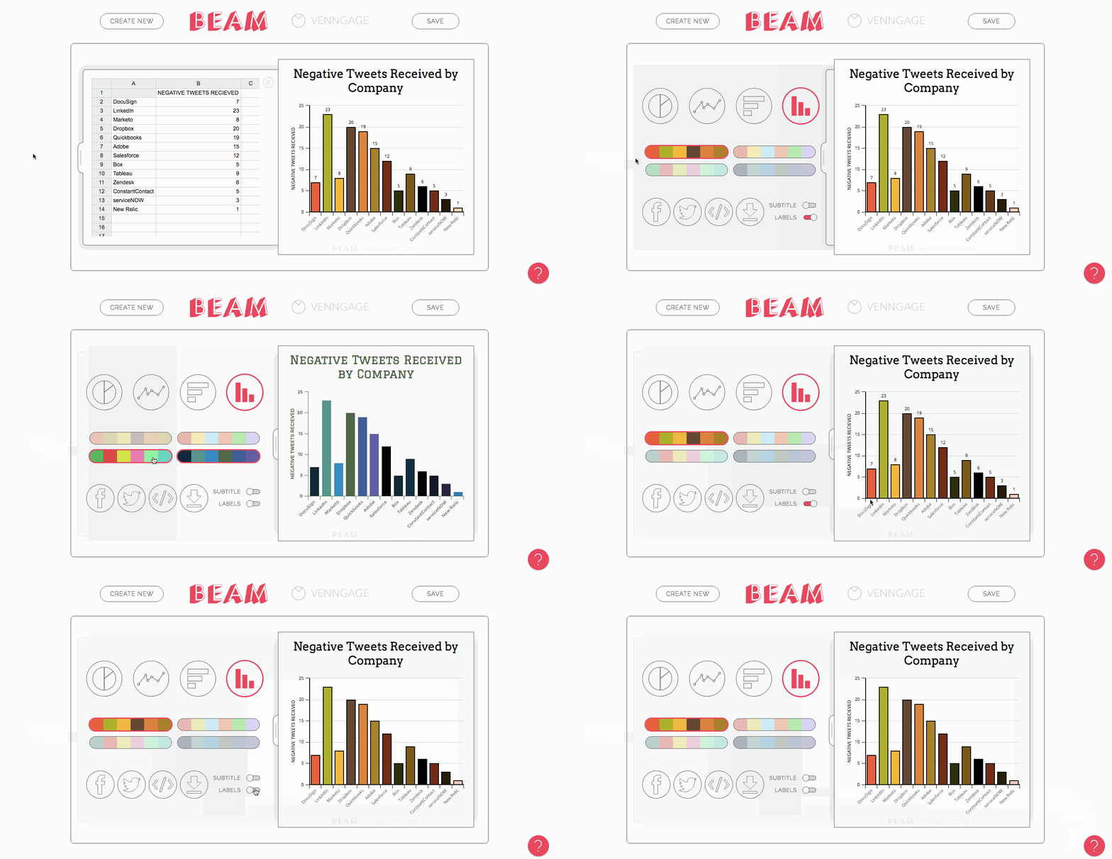
The way we made that particular graph isn’t the most DIY way — we asked our talented in-house designer, Adam — but you don’t have to get the help of a pro. There are a lot of tools out there for making graphs. Three of my favorites are:
- amCharts (free online editor)
- Google Sheets (not as nicely designed as others, but easy if you’re used to spreadsheets)
- Beam (the simplest option)
Since you have the CSV data already, making charts is simple. Just paste the data into whichever tool you’re using, then find the right graph type to display it.
Create a slide deck to upload to Slideshare
Decks are easier to digest than entire blog posts, so it makes sense to provide a visual summary of your data that you can upload to Slideshare to get some extra views.
Here’s the deck we made for my Twitter support post:
To create it, I just used a basic template from Google Slides and then had a customer first slide designed by Adam to make it look more unique and eye-catching. I made sure to include every major point, every graph, and an explanation of what each graph means.
Create an infographic and let readers easily digest the data
What better way to show data in a readable and appealing format?
Infographics can be cut into smaller chunks for sharing on social, and are also great to pitch to other sites that might want to include some visually appealing data in their relevant blog posts.
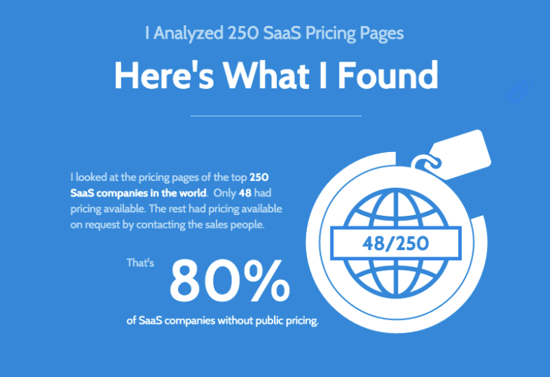
Use a free infographic tool like Venngage to quickly create eye-catching data visualizations. Venngage themselves actually made us the infographic using their own tools on the SaaS pricing pages study. Here’s a sample:
Be transparent with your methodology
In all of my studies, I try to be as clear as I can about how I’ve obtained the data and why I came to the conclusions I did.
For example, in a study about the top 100 health blogs, it’s entirely possible that the entire study could be made worthless if the ‘top’ 100 blogs were outdated, inaccurate, or actually just someone’s opinion from an article. For that kind of reason, it’s vital to show your methodology.
Make sure to:
- Explain where the data came from
- List all of the tools you used and how you used them
- Explain your terminology and its meaning (e.g. what classes a tweet as ‘negative’, in this study?)
Here’s an example of a description of methodology from my Twitter study:
“This study draws from the Montclare SaaS 250 to find the top 20 SaaS companies and their Twitter support feeds. For companies without a dedicated Twitter account but also offering support on its general Twitter, I used the general Twitter for data but filtered only direct @mention tweets, which indicated they were offering support directly to a user. If the company only broadcast from their account and never talked directly to user I counted them as not having a support Twitter account.
Using the t command line tool, I exported 1,000 incoming and outgoing tweets per company (limited by some accounts which had tweeted less than the total times) and loaded the data into Google Sheets.”
(Etc…)
This way, the reader knows they can trust the data because it was gathered properly.
Add a content upgrade
A content upgrade is a piece of bonus content you can offer in your main blog post in exchange for an email address.
And so, the benefits of writing studies are actually threefold:
- Get visibility from social media shares
- Improve your SEO by getting backlinks
- Collect email subscribers with content upgrades
The cool thing about studies is that you’ve already done so much of the background work that you have a lot of material to hand. You could offer readers the full spreadsheet of data, copies of all the images files or documents you analyzed, or any kind of additional content you can think of.
For example, in my SaaS landing page copy study, I figured out the most common headline formulas and created a spreadsheet that used them as a template for users to automatically generate headlines. To host the content upgrade, we use Sumo’s List Builder with a click trigger. More on how we use content upgrades here.
Draw a strong conclusion
I concluded my Twitter support study with a couple of key takeaways for SaaS companies offering support on Twitter, proven by the data I’d just spent the whole post explaining:

To write a strong conclusion to your study, it’s best to share what the sum of your findings mean to you, and what they could mean for other businesses.
I hope this article explaining how I write studies using original data has been helpful. If you have any questions, or suggestions of any extra tips I should know about, let me know in the comments — I’m always excited to know more about research and data.


Benjamin Brandall
Benjamin Brandall is a content marketer at Process Street.