




How rational do you think you are?
According to Richard Thaler and Cass Sunstein, the answer is not very.
Thaler and Sunstein popularized the idea of choice architecture: the observation that every decision is presented to us inside an environment, that the environment shifts what we pick, and that somebody designed that environment whether they meant to or not. Humans run on a long list of documented biases that make us both think and act irrationally, and those biases are exactly what a well-designed environment can work around.
For our prehistoric ancestors, those biases saved time and cognitive effort. In the modern business world they impose real costs: bad hires, skipped controls, missed renewals, decisions nobody can explain a quarter later. Choice architecture is the framework for designing around them.
This article starts with where the idea came from, defines what choice architecture actually is, and walks through the six elements the framework is built on. Then it covers sludge, the mirror image of a nudge, the real-world examples that show the concept working, the honest limits of the evidence, and how Process Street turns all of it into something you can run every day:
- A brief history of choice architecture
- What is choice architecture?
- The elements of choice architecture
- Sludge, the reverse of choice architecture
- Choice architecture in action
- The evidence, and its limits
- Bias, and what it means for your business
- Using processes to design better decisions
- Choice architecture FAQ
Let’s get started.
A brief history of choice architecture
To understand where choice architecture came from, travel back to 1968, to the Hebrew University of Jerusalem.
Here we meet Amos Tversky and Daniel Kahneman, rising stars of the university’s psychology department. Cramped into a small seminar room, the two started arguing about the rational human mind. It is the sixties, so we have mop tops, drainpipe jeans, and a settled consensus that humans are rational thinkers.
That consensus was already being chipped away. Psychologists such as Herbert Simon had begun to scrutinize human rationality and to argue that real decisions are made under limits of time, attention, and information.
For Kahneman and Tversky, the work began after Kahneman attended a seminar presented by Tversky. Tversky detailed cutting-edge experiments on how people learn from given information. Those experiments characterized human decision-making processes as close to rational. Every human was portrayed as a sort of intuitive statistician.
Kahneman was skeptical. To him, the experiments lacked the scientific rigor needed for plausible results, and he went after Tversky hard, as people do in academic environments.
At that point most people would sulk over their flawed investigations. Tversky did not. He took the criticism in his stride and teamed up with his critic to explore human rationality further.
What followed was a period of extraordinary creativity. Between 1971 and 1979 the pair published work that reshaped economics, culminating in prospect theory, a model of how people actually weigh gains, losses, and probabilities. That work earned Kahneman the 2002 Nobel Memorial Prize in Economic Sciences. Tversky, who died in 1996, did not live to share it; Kahneman has always described the research as jointly theirs.
The essence of their findings was that human decision-making is not rational in the way classical models assumed. We are systematically, predictably irrational. That wave of thinking opened up the field of behavioral economics, and it was from Kahneman and Tversky’s work that choice architecture was born.
What is choice architecture?
Choice architecture is the design of the way options are presented to a chooser. That presentation influences the final choice.
Here is choice architecture explained in one line: you cannot remove human bias, but you can build the environment so that bias has less to work with.
To explain it properly, jump forward from 1968 to 2008 and come with me to a dinner party hosted by Richard Thaler, the economist who would go on to win the 2017 Nobel Memorial Prize in Economic Sciences for his contributions to behavioral economics.
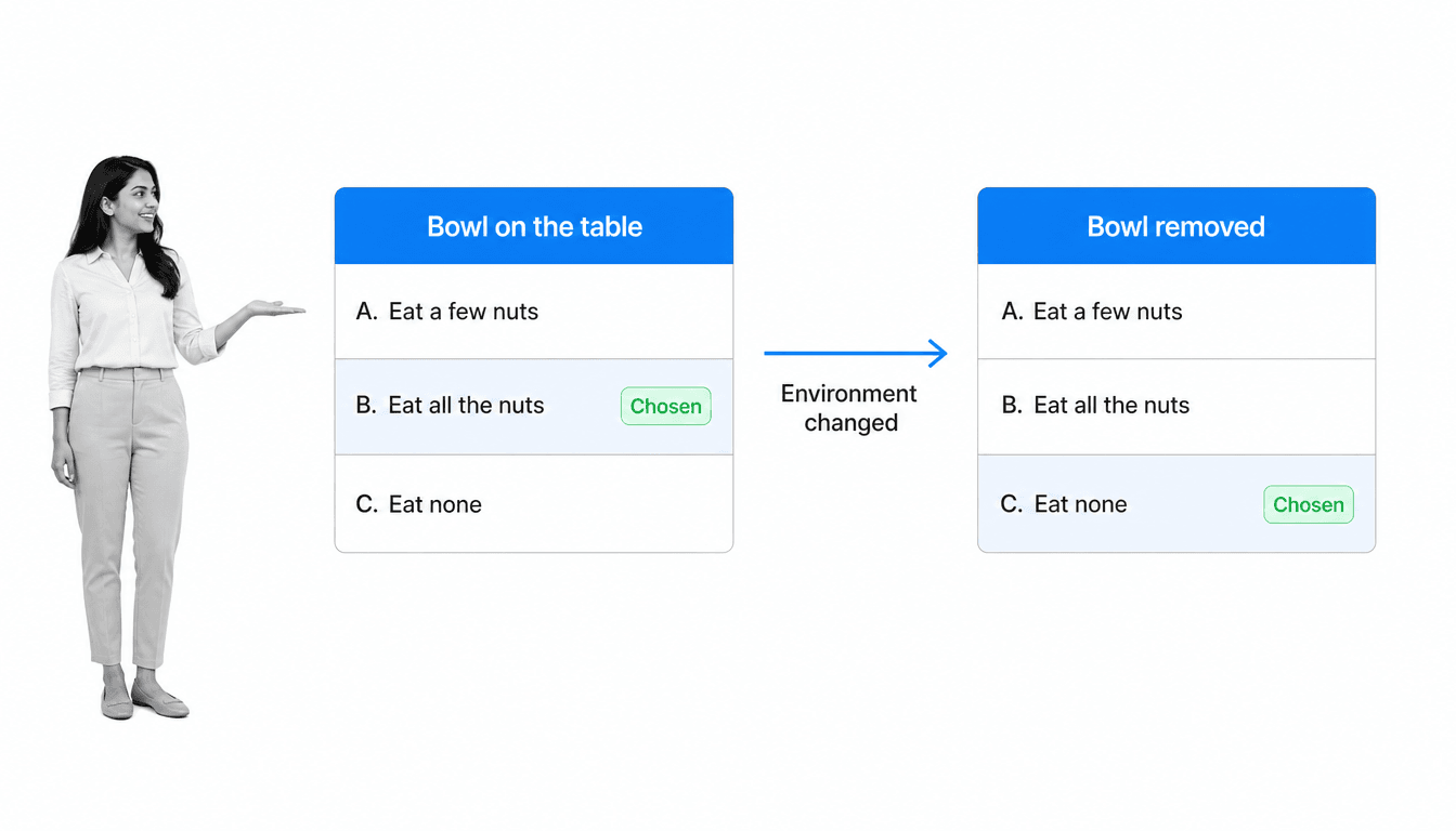
As the evening begins we notice a large bowl of cashew nuts set out in front of us. We have three choices:
- A. Eat a few nuts
- B. Eat all of the nuts
- C. Eat no nuts
If you are anything like me, C is a write-off and A is plausible but unlikely. B is the one I would pick, and you would watch me devour an entire bowl of cashews, with the regret arriving later as I forced down a main course on a nutty stomach.
As it becomes obvious that the bowl is being emptied, Thaler removes it. With the bowl gone, his guests keep enough appetite to enjoy the food still to come. And the whole room, me included, sighs in relief.
How can a room full of people be relieved that a choice was taken away from them? In the land of classical economics that reaction is close to illegal. More options are supposed to be weakly better than fewer.
Nothing about our preferences changed in those fifteen minutes. What changed was the environment. Our decision was made inside a setting full of features, some noticed and most not, that pushed the outcome one way. Thaler re-architected that setting, and with no bowl on the table everyone landed on C, the option we had already rejected.
That is choice architecture. Thaler and Sunstein put it plainly in their book Nudge, first published in 2008 and substantially rewritten as Nudge: The Final Edition in 2021:
A choice architect has the responsibility for organizing the context in which people make decisions.
Richard H. Thaler and Cass R. Sunstein, Nudge
Their argument is that this responsibility is unavoidable. There is no neutral way to lay out a menu, a form, a benefits package, or an approval screen. Some option has to come first, some box has to be pre-ticked or left empty, and every one of those decisions moves behavior. Since you cannot opt out of being a choice architect, the honest move is to design deliberately.
In their book Thaler and Sunstein argued for exactly that: thoughtful design that nudges people toward choices in their own best interests, while leaving every option on the table. In business, the same logic applies to the environment in which customers and employees are presented with a choice. That environment targets common biases through things like:
- The number of choices presented
- The manner in which the attributes are described
- The presence of a default
Each of these shifts the outcome. By designing around predictable bias, you work with bounded rationality, the reality that human rationality is limited by time, information, and attention, rather than pretending it does not exist.
Choice architecture sits inside a broader idea called libertarian paternalism: that private and public institutions can legitimately steer behavior toward better outcomes, provided freedom of choice is genuinely preserved. Remove the freedom and you are no longer nudging. You are compelling.
The kind of decision Thaler and Sunstein wanted to design away is what they call an erroneous decision: one that is not in the chooser’s own interest once you take the broader view. Emptying the nut bowl before dinner is the harmless version. Defaulting an employee out of a pension is not.
The elements of choice architecture
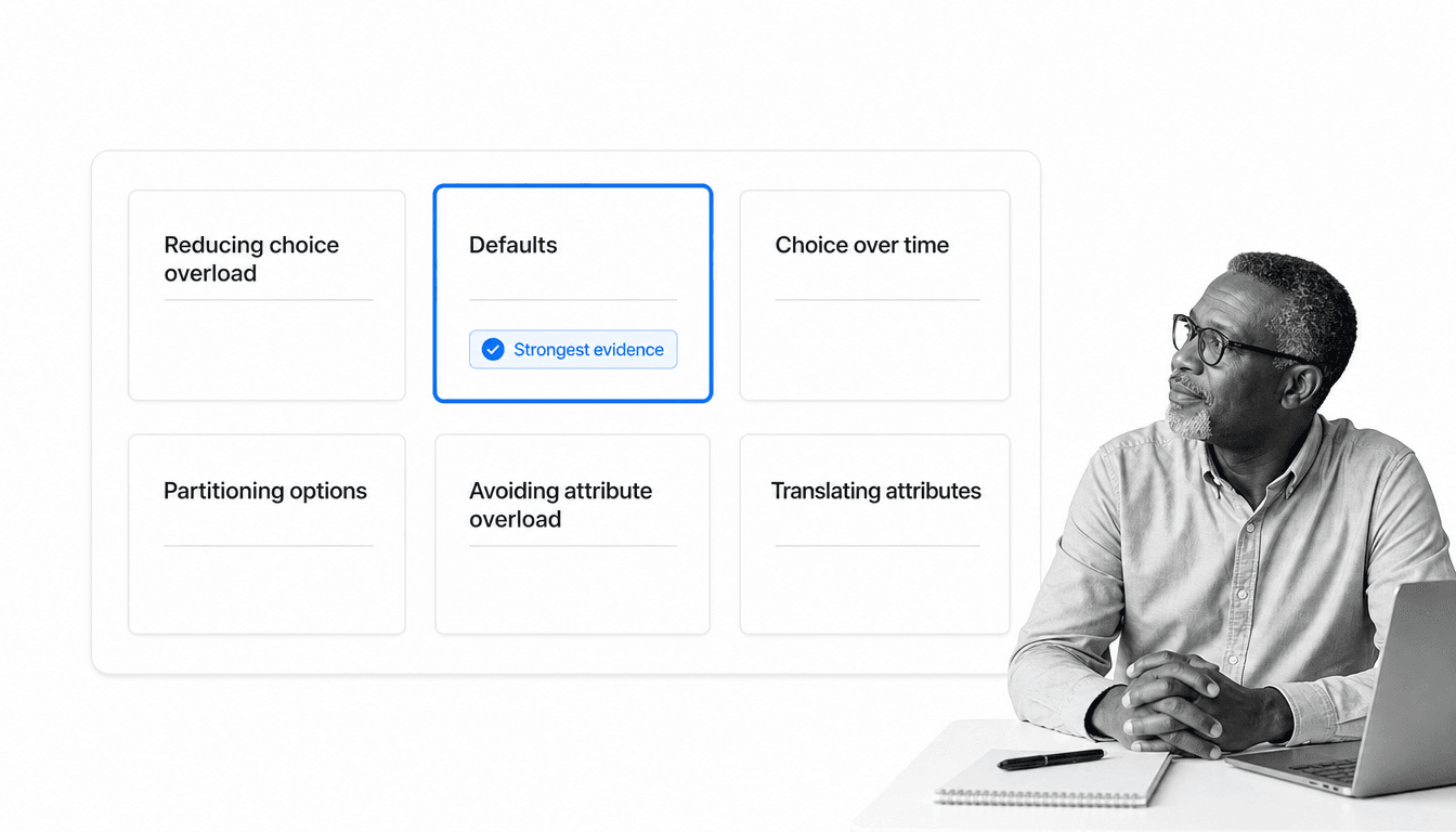
The working toolkit of choice architecture was set out by Eric Johnson and colleagues in Beyond Nudges: Tools of a Choice Architecture. Six elements do most of the work:
- Reducing choice overload
- Defaults
- Choice over time
- Partitioning options and attributes
- Avoiding attribute overload
- Translating attributes
Each one is a lever on a predictable bias. Pull it and the distribution of choices moves, without a single option being removed.
The first element: reducing choice overload
In classical economics, more is better when you are handing someone options. In behavioral economics, more is frequently worse.
Past a certain point, additional options produce choice overload: the effort of evaluating everything outweighs the benefit of the extra range, and customer motivation and satisfaction both fall.
The architect, meaning whoever is shaping the decision, has two levers: cut the number of alternatives, or provide decision support that makes comparison cheap. In 2026 that support layer is usually a ranking model, a recommendation engine, or an AI assistant summarizing the field before a human ever sees it. That is a genuine reduction in cognitive effort, and it is also a transfer of architectural power to whoever tuned the model.
There is usually an ideal number of choices. Above it, the cognitive effort required creates diminishing returns. Below it, the range is too narrow to meet real needs. That ideal is determined by:
- The cognitive effort needed to evaluate each choice
- The heterogeneity of needs
- The spread of preferences across the people choosing
Find that number for your own product or service and you raise satisfaction without adding a single feature.
The second element: defaults
A default is an option that is already selected, so that choosing anything else requires an active step. All else being equal, people take the default option. It is the single most powerful element in the toolkit, and the one with the strongest evidence behind it.
Automatic enrollment into a workplace pension is the classic example. Keep enrollment as an opt-in form and participation stays low. Make it the default and participation jumps, with the same employees, the same plan, and the same money.
Several mechanisms explain the pull of a default: it reads as an implicit recommendation, it avoids the effort of opting out, and it protects the chooser from the regret of having actively picked wrong. All of these are cognitive biases doing quiet work.
Defaults come in several shapes:
- Automatic selection, where an option is pre-chosen on the chooser’s behalf
- Forced choice, where a product or service is withheld until the chooser makes an explicit selection
- Sensory or personalized defaults, where the pre-selected option is set from what is already known about that person
Defaults are the element most likely to get you in trouble, because they work whether or not they serve the chooser. That is where the ethical line, and increasingly the legal one, sits.
The third element: choice over time
Some choices pay out in the future, and several biases distort how we handle them. A myopic chooser prefers a present benefit at the expense of a future one, which produces overspending and overeating.
Projections about the future are also unreliable. Under uncertainty, people overestimate the likelihood of the outcome they want. How many of us believe we will have more time next quarter? Most people believe they will have more time than they end up having.
An architect can work with this by drawing attention to the future outcomes of decisions, or by making the second-best option more salient at the moment of choice.
The limited-time offer is this element in its most commercial form. A deadline uses time itself to nudge the chooser and reduce procrastination. Inside a business, the same lever shows up as a review date on a policy or a due date on a task: a fixed point in time that stops a decision from drifting indefinitely.
The fourth element: partitioning options and attributes
Options and attributes can be grouped, and the grouping changes what gets picked. Both the number of categories and the way they are drawn matter.
Buying a car, you probably weigh fuel economy, mileage, and safety. Those are practical attributes and they group naturally together. Speed, sound system, and styling group together as something else, and people reliably shift their weighting depending on how the groups are drawn.
Partitioning the attributes of your own products the same way helps customers decide, because it tells them which comparisons are the ones worth making.
The fifth element: avoiding attribute overload
A product’s full attribute list can be considered when deciding between options, but as with choice overload, comparing attributes is constrained by the chooser’s cognition.
Again there is an ideal number. Beyond it, you get attribute overload and the chooser falls back on a crude shortcut such as price. Below it, attributes the chooser genuinely cares about never get considered.
Getting that number right is the difference between a comparison table that helps and one that quietly pushes everyone toward the cheapest row.
The sixth element: translating attributes
How information about an attribute is expressed changes how much effort comparison takes. Presenting data in equal metrics often requires conversion, turning a non-linear metric into a linear one so that two numbers can actually be set side by side.
Food labels do this when they render salt content as high versus low. So does spelling out a consequence directly, such as the greenhouse gas emissions attached to a given option, instead of leaving the chooser to compute it.
Translate the attributes of what you offer and you lower the cost of choosing well. Leave them untranslated and you have not been neutral. You have made the effortful comparison the one nobody performs.
Sludge, the reverse of choice architecture
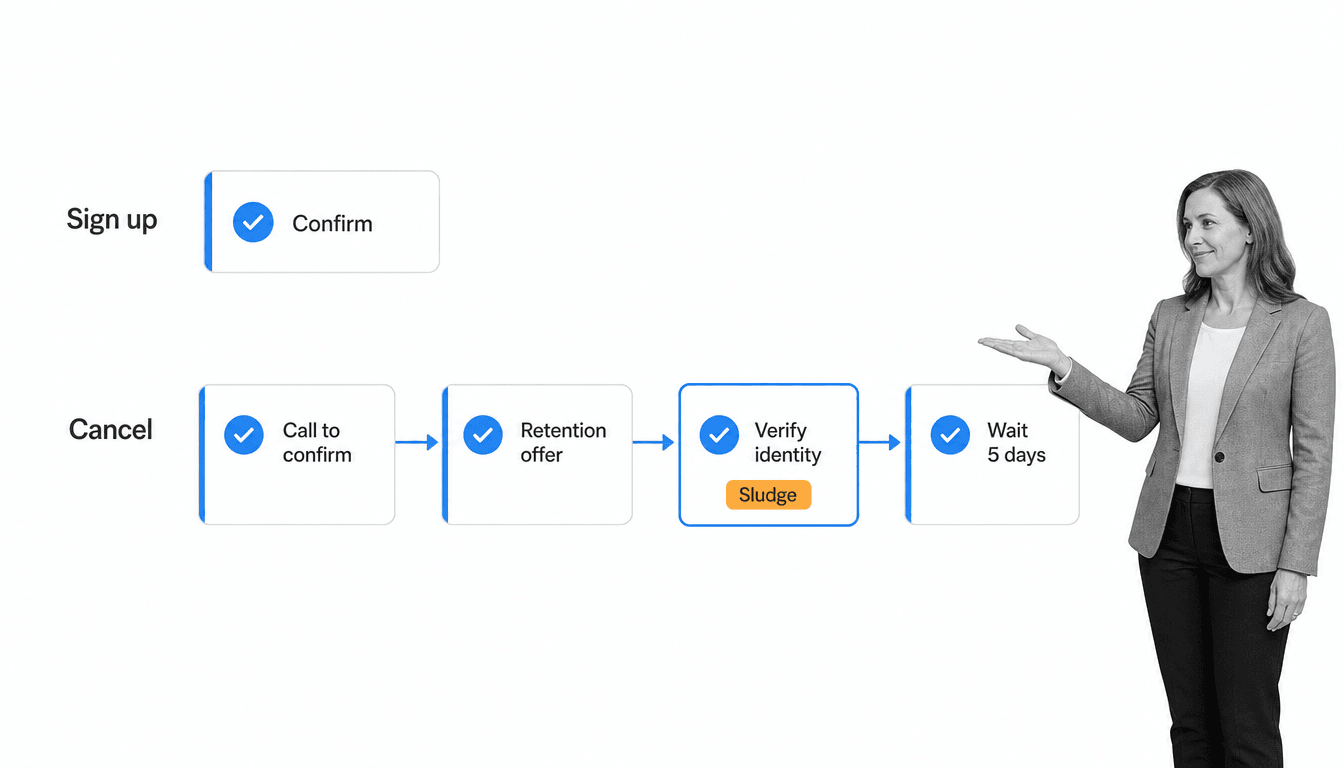
Every element above can be run in reverse. Thaler and Sunstein gave that reversal a name: sludge, friction placed in the path of a choice that would have benefited the chooser.
The signature of sludge is asymmetry. Signing up takes one click. Cancelling takes a phone call, a retention offer, an identity check, and a five-day wait. Nothing has been forbidden. The option is still technically available, which is exactly what makes sludge so easy to defend internally and so effective in practice.
Most sludge is not malicious. It accumulates. A verification step gets added after an incident, an approval gets inserted after a bad quarter, a form grows a field every time somebody asks a question nobody could answer. Nobody designed the obstacle course; everyone contributed one hurdle to it.
The deliberate version has a name too: dark patterns, interface design that steers people into choices they would not knowingly make. That distinction now carries legal weight. In the European Union, Article 25 of the Digital Services Act prohibits online platforms from designing interfaces that deceive or manipulate users, and the Digital Markets Act constrains how the largest platforms handle consent and defaults. In the United States the picture is messier: the FTC’s negative-option rule covering subscription cancellation was vacated by the Eighth Circuit in July 2025 and the agency has moved toward a fresh rulemaking, while state auto-renewal laws continue to apply. The specific rules are in motion; the direction of travel is not.
The practical test is simple, and it is the one Thaler and Sunstein apply. Does the friction protect the chooser, or does it protect your numbers? Identity verification before a payout protects the chooser. A retention offer that must be declined twice does not.
Run that test across your own operations and it turns into an audit you can actually execute. Time every path a customer or employee takes to reach a decision that benefits them, count the steps, and ask which of those steps a regulator would consider protective. Cancellation, refunds, benefits enrollment, expense claims, offboarding, and internal workflow approval chains are where the sludge collects. Removing friction from a good path is usually cheaper and more reliable than adding a nudge somewhere else.
Choice architecture in action
With the elements and their reverse in hand, here are three cases where the architecture did the work.
The recycling bin to garbage bin ratio
Walk past the waste bins in a well-designed office and you will often find that the recycling bin is noticeably larger than the landfill bin, sometimes several times the volume. Nothing is mandated and nothing is banned. The options are partitioned by size, and the larger container reads as the normal one.
It works because the ratio carries information. A big recycling bin next to a small landfill bin implies that most of what you are holding belongs in the first one, and it makes the alternative physically awkward at the moment you are standing there with a coffee cup. That is partitioning applied to a physical space, and it influences the decision without anybody reading a policy.
The same principle scales past waste. Pressure on companies to balance environmental, social, and economic performance keeps rising, and the container-ratio trick generalizes: make the behavior you want the path of least resistance, physically or on screen. If you want a starting point, our guides on creating a sustainable business and environmental management include ready-to-use workflows for the underlying processes.
Organ donation defaults
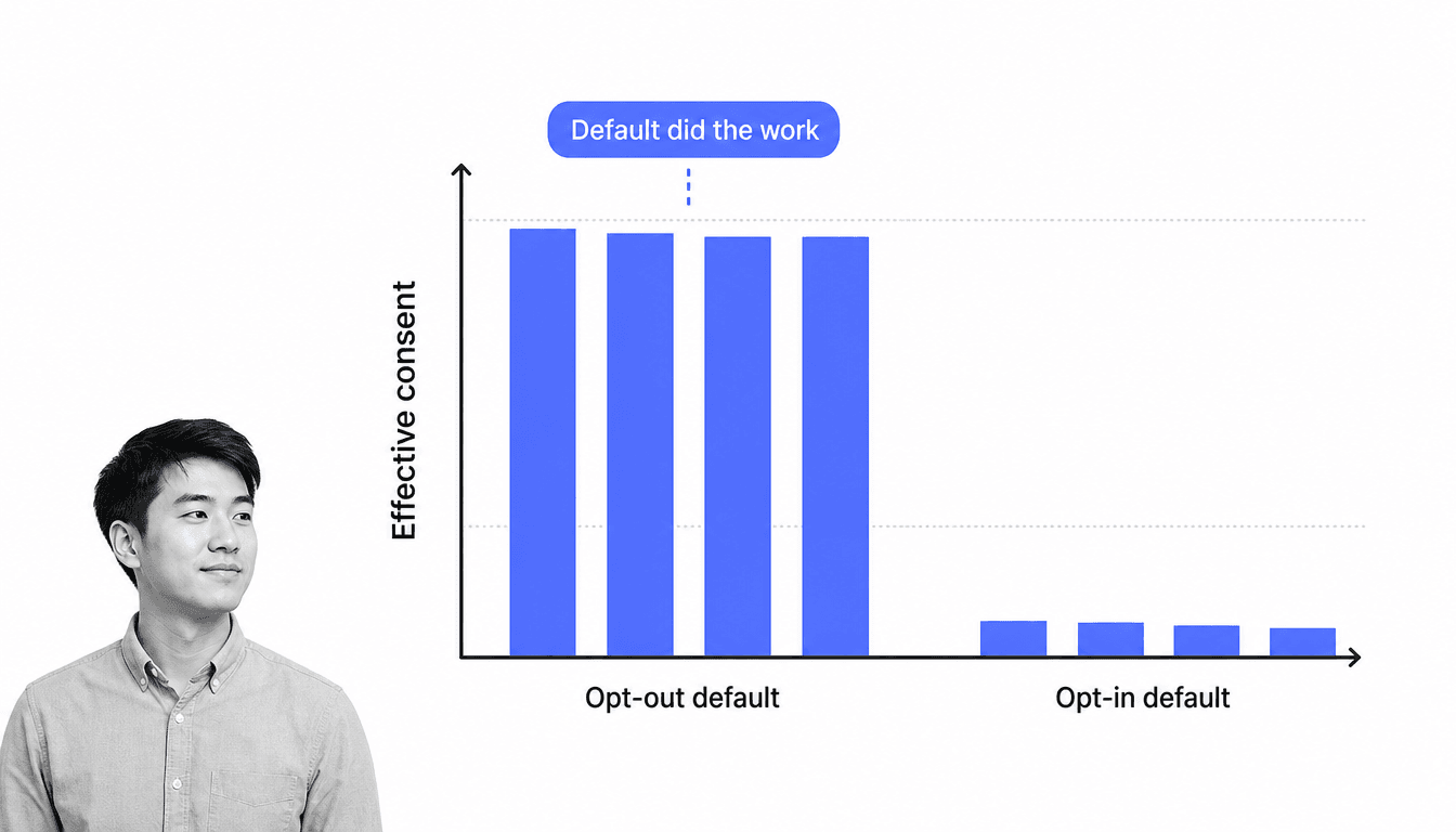
Organ donation is the most-cited demonstration of defaults in existence, and it is worth being precise about which way round it runs.
In presumed-consent countries the default is opt-out: you are a registered donor unless you actively say otherwise. In explicit-consent countries the default is opt-in: you are not a donor unless you actively register. Eric Johnson and Daniel Goldstein compared the two groups and found effective consent close to universal under opt-out defaults and a small fraction of the population under opt-in.
The countries either side of that gap are neighbours with near-identical populations and attitudes. Nobody’s underlying view about donation changed. The form did. This is the cleanest evidence that a default is not a neutral starting position; it is a decision that has already been made on the chooser’s behalf.
The business lesson is the same and the caution is bigger. Any default you set in an onboarding flow, a benefits election, or a permissions screen is doing this to your own numbers, whether you designed it or inherited it. That power is also why consent law now constrains it: in the EU and UK, marketing consent must be affirmative, so pre-ticked opt-in boxes are not a lawful shortcut to a bigger list. Check your obligations under GDPR before you touch a default that affects a customer’s data. Use the lever where it belongs: internal processes, where a sensible default saves your team from a decision they should not have to make twice a day.
If your marketing operations need tightening while you are in there, our Marketing Process Toolkit collects the checklists for it.
Signs at the shopping stall
Signs that label food as the better-for-you option bring the healthy framing directly to the point of choice. This is translating attributes: the relevant property is stated in plain language rather than left inside a nutrition panel, so the cognitive effort of choosing well drops close to zero.
The version you can run this week is unglamorous. Label the healthier options in your canteen, group them so that reaching them is the easy motion, and leave everything else exactly where it is. A healthier workplace tends to be a more productive one, and this is the cheapest intervention on the list.
Keeping a workforce healthy and supported is largely an HR operations problem, and our guide to HR best practices covers the processes underneath it.
The evidence, and its limits
Choice architecture is worth taking seriously, and it is worth being honest about how strong the evidence is, because the popular version of this field oversold itself.
In 2022, researchers led by Maximilian Maier published a reanalysis in PNAS titled No evidence for nudging after adjusting for publication bias. Correcting a large meta-analysis of nudge studies for the tendency of journals to publish positive results, they found that the headline effect largely disappeared. The finding is contested and the debate is live, but it landed hard, and any article on this topic that does not mention it is selling you the 2010 version of the field.
The sensible reading is not that choice architecture does not work. It is that the levers are not equally reliable:
- Well supported: defaults, and the removal of friction from a path you want people to take. Both change the physical or procedural cost of an action rather than trying to change a mind.
- Weaker and noisier: light-touch framing, social-proof messages, and salience tweaks. These sometimes work, sometimes do nothing, and rarely produce the effect sizes the popular literature advertised.
There are two further limits worth stating plainly. Individual differences mean the same intervention produces different responses across a population, so an average effect can hide a group it made worse. And an intervention that improves the immediate choice does not automatically improve the outcome; people compensate elsewhere.
That points somewhere useful for a business. If the reliable levers are structural rather than persuasive, then the most dependable form of choice architecture inside a company is not a cleverly worded prompt. It is the process itself.
Bias, and what it means for your business
Our brains evolved over hundreds of thousands of years, and bias was a feature. Mental shortcuts kept our ancestors alive. The modern world simply does not resemble the one those shortcuts were tuned for.
The volume of complex information arriving daily exceeds what anyone can process deliberately, so we fall back on those shortcuts to decide quickly. The six elements above are the points where those shortcuts are most predictable, which means they are also the points where you can design around them.
Bias in the workplace shows up in many forms, and usually without the person noticing. It shapes hiring, promotion, retention, and culture. Beyond fairness, running on shortcuts means the decision was never really examined, and that thinking gap hinders innovation.
There is a newer wrinkle. Increasingly the first pass over a business decision is made by a model: a shortlist ranked by software, a summary drafted by an assistant, a recommendation generated before any human opens the file. Whatever that model surfaces first becomes the de facto default, and the biases it inherited from its training data and its ranking objective are now part of your decision environment. Treat model output the way you would treat a pre-ticked box: useful, powerful, and never neutral.
Which is the case for putting the architecture somewhere you can see it, version it, and audit it.
Using processes to design better decisions
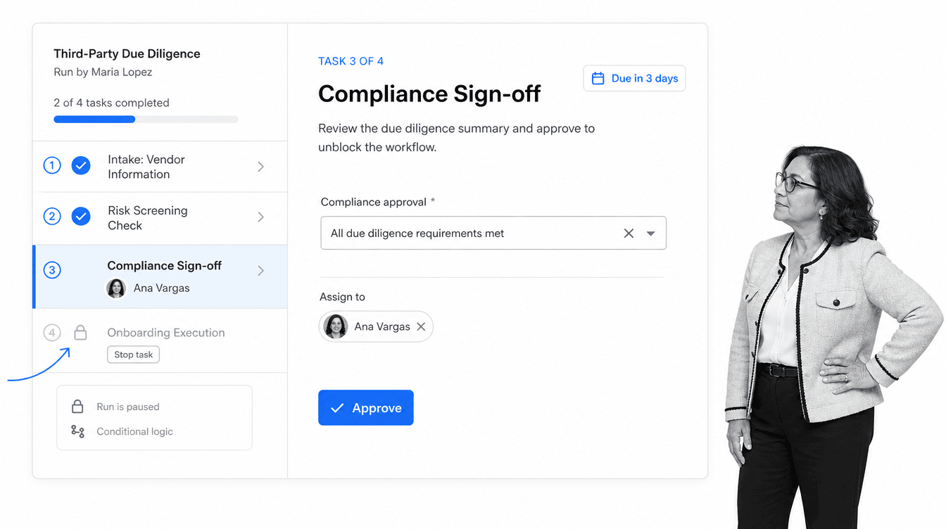
A documented process is choice architecture with teeth. Instead of nudging someone toward the right call and hoping, it makes the right sequence the available one.
The clearest example is the surgical checklist, argued for by Atul Gawande in The Checklist Manifesto and validated in a study across eight hospitals that found significant reductions in complications and deaths. The checklist did not make surgical teams smarter or more motivated. It restructured the decision environment so that the steps most likely to be skipped under pressure could not be.
Compare that with the retirement-plan nudge. Auto-enrollment sets saving as the default and requires an active step to leave, which raises participation reliably. It is also the case that a default works partly by exploiting inertia, and it is fair to ask whether that is removing bias or trading on it. A checklist does not raise the same question. It guides the chooser through a sequence and steers them away from the shortcut, while leaving the actual decision theirs. Process Street’s Quality Financial Plan Checklist is that pattern applied to a personal financial decision: an active choice, made with the relevant considerations in front of you.
The same design moves apply to business processes. A documented workflow reduces the load on memory, attention, and judgment at the exact moment those are most likely to fail.
Process Street is a Compliance Operations Platform. Docs holds the governed version of a procedure, Ops runs it, and built-in AI watches execution, flags risk, and suggests updates. The point for choice architecture is that the policy and the moment of execution are the same surface, so the correct step is the one in front of the person rather than the one filed somewhere they would have to go looking.
Build your own workflows or start from the library. Ours are designed to raise consistency and prevent the mistakes that come from an under-designed decision environment, using features that map directly onto the elements above:
- Stop tasks, which hold a run until the prior step is genuinely complete. This is a forced choice: the shortcut is removed, not discouraged
- Dynamic due dates, which apply the choice-over-time element so nothing drifts
- Conditional logic, which reduces choice overload by showing only the branch that applies
- Role assignment, which removes the ambiguity about who decides
- Direct, universal integrations to 5,000+ systems, so the workflow acts on the systems you already run. Need a new one? An AI agent builds it on the fly
Everything is built in our workflow editor without code, which matters more than it sounds: if changing the architecture requires a developer ticket, the architecture stops being maintained and quietly reverts to whatever it was.
Bias in hiring and promotion is one of the highest-cost versions of this problem, so it is a sensible place to start. The Unconscious Bias Training Guide below is free to run:
Click here to access the Unconscious Bias Training Guide.
Choice architecture FAQ
What is choice architecture?
Choice architecture is the design of the environment in which options are presented to someone. The order options appear in, which one is pre-selected, how many there are, and how their attributes are described all shift the final choice, without any option being removed.
Who invented choice architecture?
Richard Thaler and Cass Sunstein introduced and popularized the term in Nudge in 2008, building on the behavioral economics established by Daniel Kahneman and Amos Tversky from 1968 onward. Kahneman received the Nobel Memorial Prize in Economic Sciences in 2002 and Thaler received it in 2017.
What are the elements of choice architecture?
Six: reducing choice overload, defaults, choice over time, partitioning options and attributes, avoiding attribute overload, and translating attributes. Defaults carry the strongest evidence of the six.
What is the difference between a nudge and a dark pattern?
Who the design serves. A nudge steers toward an outcome that benefits the chooser and keeps every option genuinely available. A dark pattern steers toward an outcome that benefits the designer, usually by hiding or obstructing the alternative. Sludge is the middle case: friction in the path of a choice that would have helped the chooser.
Is choice architecture manipulation?
Not inherently, because there is no neutral presentation to compare it against. Something has to be listed first and some box has to be pre-set. The useful questions are whether the chooser can still easily pick anything else, and whether the design would survive being explained to them.
How do businesses use choice architecture?
Most commonly in defaults on plans and settings, in how pricing options are grouped and limited, and in the design of internal processes. The internal use is the underrated one: an approval sequence, a required field, or a stop task is choice architecture applied to your own operations.
Design the decision, not just the message
Human bias is real, predictable, and mostly invisible to the person carrying it. Choice architecture is the discipline of taking that seriously: recognizing that every decision arrives inside an environment somebody designed, and choosing to design it on purpose.
The evidence supports some levers more than others. Defaults and removed friction are dependable. Light-touch persuasion is not. And the mirror image of a good nudge, the accumulated sludge in your own cancellation, approval, and onboarding paths, is usually the biggest available win, because it is entirely under your control.
Inside a business, the most reliable place to put that design is the process itself. A workflow that holds the run until the check is signed off does not need anyone to remember the rule under pressure.
For a deeper read on the concept, Nudge: The Final Edition is the version to pick up: Thaler and Sunstein rewrote it in 2021, dropped the material that did not hold, and added sludge.
Where does bias cost you most: hiring, approvals, or the paths your customers take to change their mind? Let us know in the comments.